From my knowledge, pie charts alongside with bar graphs and line graphs are the most used type of graphs when it come to comparing data. They each have different uses. For bar graphs, it can be used to compare between different groups or track the progression over time. For line graphs, it usage can be quite the same literally but it can pick out the tiny difference between values and can compare data progression over a much longer period of time and wouldn’t cluster the graph like a bar graph would do. Pie chart does compare between groups or categories. However, a pie chart does not compare the values over time. Instead it compares the data of a whole subject and represents percentage, as if everything would add up to 100%, the total.
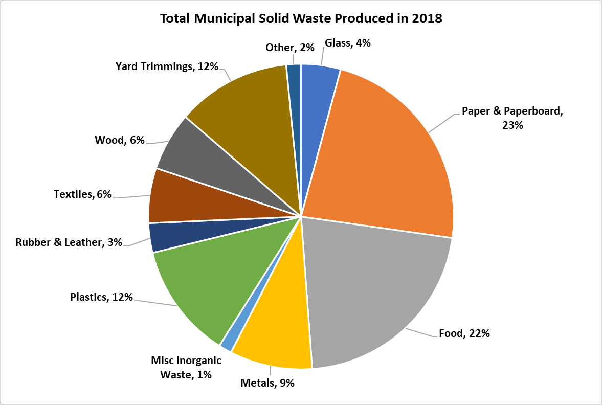
Here I take an example about the total municipal solid waste (MSW) produced in 2018 from the EPA. Using pie chart is ideal here because you would want to compare between each value (type of waste) of an entire subject (waste produced) and each slide of color here represent each value. Readers can easily see the difference base solely on the size of each slide and quickly understand the data. A pie chart of this consist of 11 values and if used on a bar graph, I would think the graph would be clustered with 11 bars and from there you would have to adjust the size accordingly to squeeze every bar into a graph thus made a bar graph a hassle for this type of data. A line graph for this one is also out of consideration. The topic here is the ‘Total amount’ and not ‘Wastes produced from month to month’, there are no over time progression in the data to compare using a line chart. Overall, a pie chart for this type of data is easy to made, easy to understand with minimal effort.