Pie charts, when done the right way, can portray some of the simplest data in a very uniform and easy to comprehend way. The easiest data to portray using a pie chart would be data that represents “parts of a whole”, but this is not the only data that can be used in a pie chart. We can also use percentages to show contributions to a whole. One of the most important things to remember though when creating a chart to show this type of relationship, is that the data values within the pie chart must always add up to 100. It is also important to remember that pie charts, as well as any other chart or infographic, are used to tell stories. Because of this, we have to remember to keep the story as straightforward and concise as possible. Always remember to keep your infographics as clear as possible and to not jumble too much information or design in the graphic.
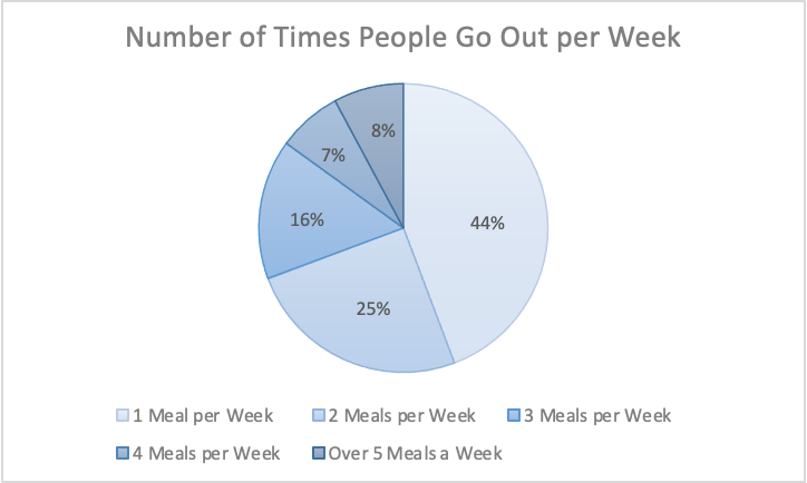
The information I gathered was from a study done of 626 restaurant goers, asking how many times a week they go out to eat. This information gathered from Tasting Table, I believe is best suited in a pie chart because it was presented to me in percentages of people. Percentages are easiest represented in a pie chart because it represents part of the 626 people surveyed.
Link to study: https://www.tastingtable.com/912246/new-survey-shows-how-often-people-typically-eat-out/