Pie charts are something that we are used to seeing, and have been practically since elementary school. They are commonly used for comparisons because they help people visualize a difference and also allow them to understand different categories and severities of things. For this reason, it is always important to make sure a pie chart is used properly, otherwise information can become too overbearing and confusing.
When tasked with creating a pie chart, I felt that it was important to pick something that was equally important to me and had data that was easily comparable, as this is what would work best for a pie chart. The image below shows the pie chart I created with sample data taken from Statista about the percentage of college students who are diagnosed with some sort of mental disorder.

One thing that not many people are aware of (unless they were or are in college) is the amount of stress and hard work that comes with the role as well. More often than not, these stresses cause college students to be diagnosed with some sort of mental disorder, and I felt that as a college student who is also suffering from the stress and pressure put on me, this was a good thing to talk about. The pie chart features five different types of mental disorders that college students are most commonly diagnosed with, with anxiety and depression being the highest amongst them.
I think this data was best shown in this pie chart because it puts the numbers and diagnoses into perspective about how significant and problematic the pressures of college are on a student. Due to the two large percentages taking up more than half of the circle, you get an idea of the severity of it.
As previously mentioned, this sample data was taken from a larger data set on Statista. However, Statista showed this information on a horizontal bar graph (as shown below).
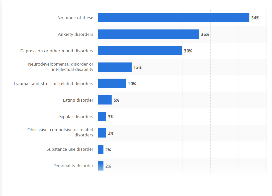
While the bar graph is still a great way to display this information, I think that taking the higher percentages/more common disorders and displaying them on the pie chart created a more urgent and dramatic effect that may not have been seen or fully acknowledged in the bar graph. On the other hand, if I were to include all of this information in the pie chart created, I do not think the pie chart would have as much of an effect or impact as it currently does.
In all, a pie chart is a great way to display certain types of information, including my sample data set on mental disorders in college students. It shows comparison of different categories and allows for easy interpretation and understanding of data. One thing that I discovered while creating this pie chart is that Excel has several hidden tools and features to help you create the pie chart to your liking, including pre-made color palettes that make it easy to keep a theme, as well as different examples of pie charts using your data. For instance, I found that it looked better to have the percentage and category labels on the outside of the pie chart rather than the inside due to clutter and I was able to do so with a simple click of a button. I think it is important to note these features because certain types of information and pie charts may need to be created depending on the data used, and Excel provides easy navigation to do just that!