The humble pie chart, a simple yet effective tool for anyone interesting in making data visualizations. Aside from the necessities that pie charts should represent 100% of a total figure, and the chart should be legible, it’s hard to go wrong with a pie chart.
In addition to the above factors, there are others that make a pie chart go from a working choice to the correct one. For the true strengths of a pie chart to shine the data should tell a story. Components of the chart should be instantly recognizable as a very large or small fraction of the total figure.
For my example I chose the distribution of wealth in the United States, and I was able to find data from 2017. This data has a clear total figure, the sum total wealth owned by civilians in the U.S., and the data tells a clear story.
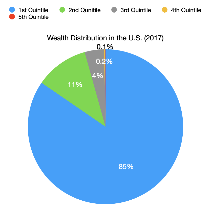
No other chart would tell readers what I was trying to convey as quickly and clearly, that wealth inequality in the U.S. is staggering.
When making your own visualizations, remember to choose a pie chart if the individual components tell a story by their relation to the total figure.