The Strength of Pie Charts
Pie charts are like the unsung heroes of data visualization. They might appear humble, but their ability to convey the composition of a whole is unmatched. They shine when you need to represent percentages and proportions, making it easy to grasp the distribution of elements. For instance, in a recent project, I employed a pie chart to showcase a company’s revenue breakdown by product category. The result was a clear and accessible snapshot of each category’s contribution to the total revenue.
When to Use Alternatives
While pie charts have their merits, it’s crucial to recognize when to opt for an alternative chart type. Bar charts are more effective when comparing many categories, and line charts excel at illustrating time-series data. In cases with numerous subcategories, stacked bar charts or treemaps might be the better choice.
Designing a Winning Pie Chart
To create an impactful pie chart, follow a few design principles. Use labels to identify each segment, explode important segments for emphasis, limit your color palette, avoid 3D effects, and add a legend if needed. These tweaks ensure clarity and readability, making your pie chart an engaging and comprehensible tool for data presentation.
In a world where data speaks volumes, mastering the art of pie chart design is a valuable skill for college students and aspiring data analysts. It’s simplicity combined with its versatility makes it a go-to choice for visually representing data. By understanding when to use a pie chart, and by adhering to these design principles, we can present data effectively and be well-prepared for the data-driven challenges of tomorrow.
Example
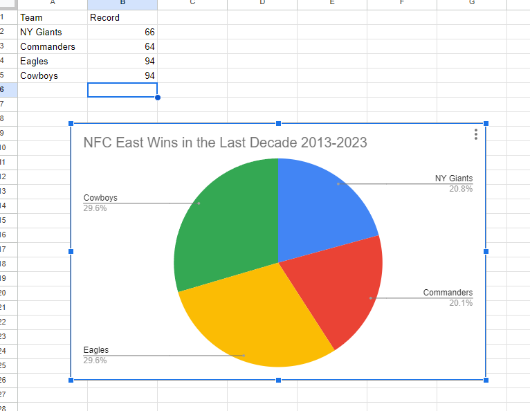
I made a pie chart on the NFC East in the NFL of choice to visualize the data. The chart effectively conveys the distribution of wins among the four teams in the division: the NY Giants, Washington Commanders, Philadelphia Eagles, and the Dallas Cowboys. This choice is compelling because it simplifies the complex data by visually showcasing how each team’s wins contribute to the whole, which, in this case, is the total wins in the division over the specified timeframe.
The pie chart excels when there’s a limited number of categories, which aligns perfectly with our scenario of only four teams. This ensures a clear and straightforward representation, making it easy to understand the proportions of wins each team has contributed. For viewers, this pie chart serves as a quick and intuitive way to gauge the performance of each team in the NFC East during the past decade.
By Shaun Sneddon