In the world of data visualization tools, pie charts appear simple and easy to use upon appearance, but actually require significant prior consideration and thought upon creation. This is due to its simplistic nature and form of distribution, which may lead many to believe that categorical data will translate well.
Pie charts may best be utilized to accomplish several end goals:
- To demonstrate a part to whole relationship
- To place emphasis on a particular segment (smaller or larger)
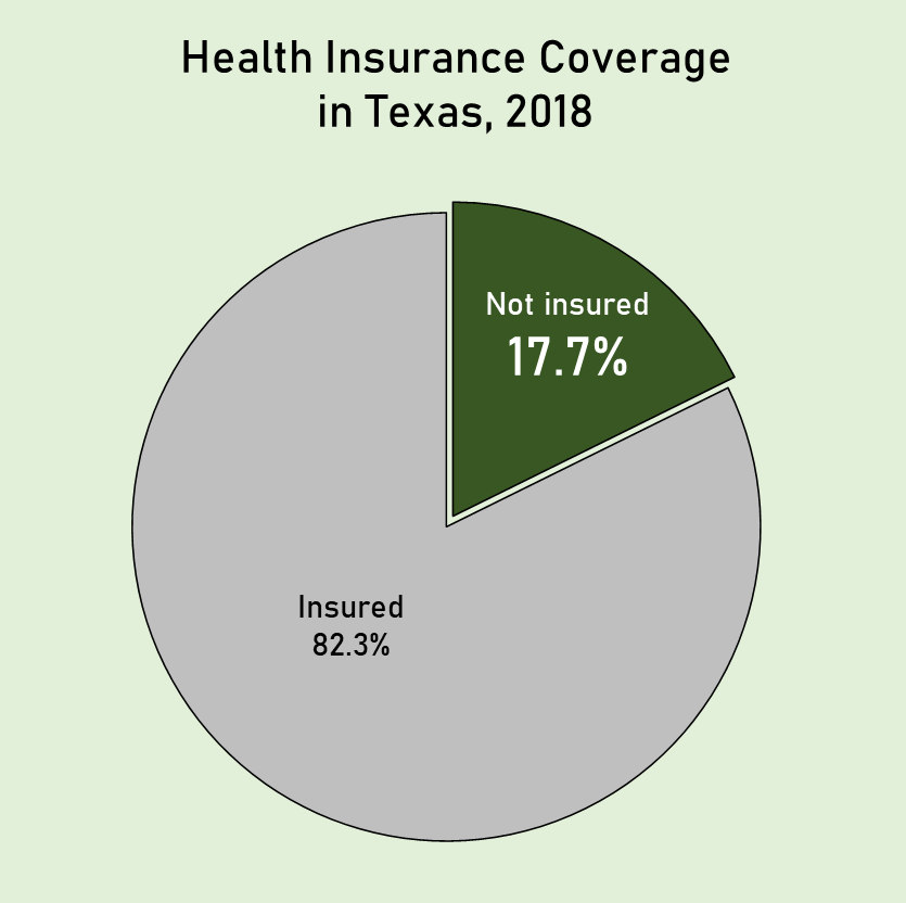
The pie chart I have created attempts to demonstrate how many individuals in the population of Texas lack health insurance coverage. As these two demographics are easily separated into two groups, a pie chart is an extremely effective way of calling attention to this statistic by placing emphasis on one segment.
Source:
Bureau, U. C. (2019, November 7). State-by-State Health Insurance Coverage in 2018. The United States Census Bureau. https://www.census.gov/library/stories/2019/11/state-by-state-health-insurance-coverage-2018.html