By Joseph
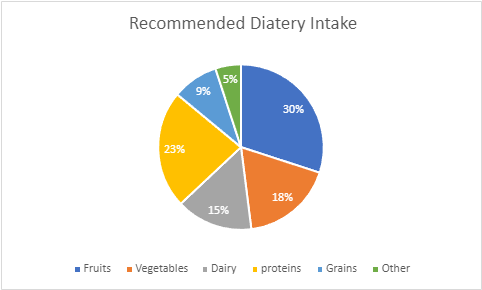
Pie charts are one of the many types of visualizations that one can use to portray both complex or simple data. A pie chart can be especially good when the data being portrayed are all parts of a whole. As shown by the pie chart above, the values for the Recommended diet intake are all individual parts that add up to a 100%. Furthermore there are both small and large data sets that needed to be represented such as, the dairy value and the fruits value. Both data sets are vastly different in terms of percentage and hence the amount of space that they take up visually. To convey this, a pie chart is the perfect visualization to use in this instance. This is especially true when one considers that the appearance of a pie chart also falls in line with the topic of the graph itself which is diet and food intake. the values not only add up to a 100%, but also the data appear to reflect a plate, with each data set representing a specific food intake. Upon making this pie chart, I did come across some suggestions as to how I could improve my data such as changing the color of the data set or make one value stand out by removing color from every value except for one. One could also disconnect a certain piece from the whole to visually represent something to the audience. These design methods are all very valid and useful in data visualization, but I decided to make the pie chart I created very simple to understand. The more elements that one adds to something, the more important it is that the information is clearly conveyed. Not only was there not a need to apply extra designs for the data that was conveyed, but there would also be a risk that the audience may misinterpret certain designs choices if they poorly represent the data. All in all, a pie chart is very efficient visualization to represent data that is part of whole.