Pie charts are commonly used to visualize data that can be divided into distinct categories. Pie charts are used for showing the composition or distribution of a dataset. Using different colors, labels, and percentages, pie charts allow viewers to quickly understand the relative sizes of the categories and compare them visually. In a pie chart, the colors assigned to each slice play a crucial role in conveying information and making the chart easily interpretable. The choice of colors should be made carefully to ensure readability and accessibility. Pie charts are effective for displaying data with a small number of categories or when the differences in proportions are significant. Sometimes, it becomes less effective when too many slicers are created, and hard to understand for the reader. Here are examples of pie charts and how it used in data.
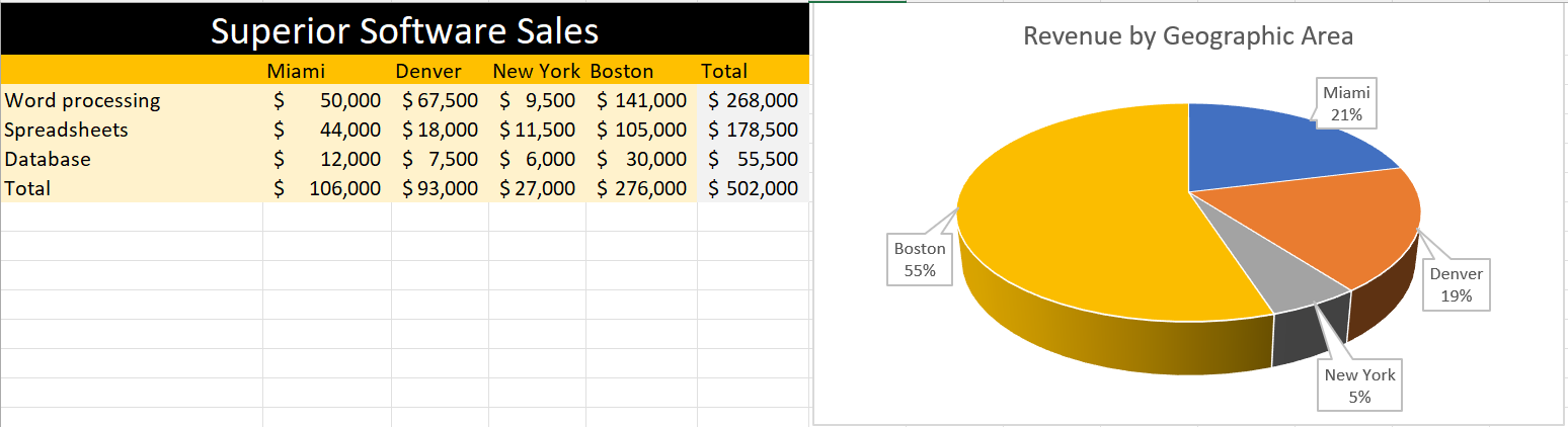
In this pie, I created data on superior software sales based on the top cities in the USA. The pie chart differentiate cities with different color giving the percentage values that Boston is getting 55% which highest and the lowest is New York which is 5%. Looking at the table feels like little complicated to understand but the pie chart attracts at first sight without any complication.
In conclusion, pie charts provide a clear and concise representation of categorical data and can be valuable tool for data visualization and communication.