The perfect time to use a pie chart is to differentiate parts of a whole. A pie chart is easy to understand because slices of a pie are just a percentage of the whole thing. Bigger slices are bigger percentages for that variable. Pie charts need to be used sparingly because when they are used wrong they can be very confusing especially if portions of the graph are similar in size. When pie charts are used in the right scenarios they can be one of the most recognizable forms of data visualization.
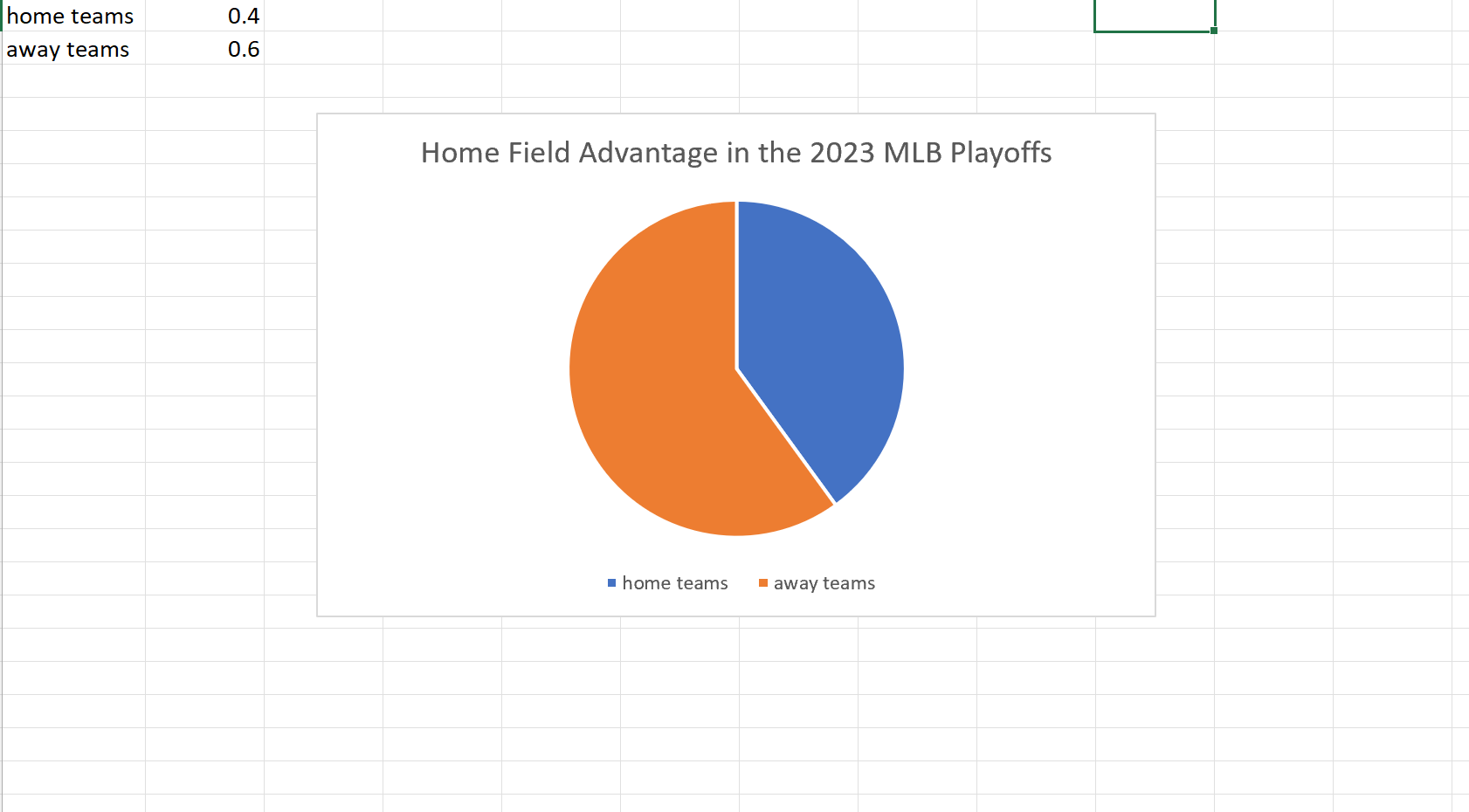
My example of a pie chart takes two variables. The win percentage for the home teams versus that of the away teams in this years MLB Championship Series. Although we usually see home field advantage in sports here we can clearly see a slight edge for the away teams. I found these results surprising but it is a small sample size so that may be why the results could be skewed one way or another.