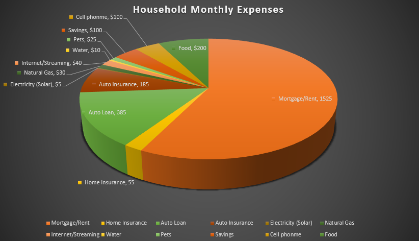
I felt a pie chart was an ideal choice to show monthly household expenses. It provides a clear and visually appealing way to represent various expense categories within a budget in proportion. Viewers can quickly identify the larger and smaller slices, thus providing immediate understanding where the money is going. You are able to make comparisons and it helps with seeing where spending is a priority and make informed decisions. I referred to From data to Viz | Find the graphic you need (data-to-viz.com) which helps you choosing an appropriate graph for your data and excel itself had tutorials that walked you through choosing correct pie chart. I also think a bar chart could work in this example as well.