By Ryan Metch
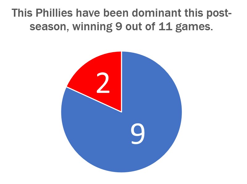
There are many ways to use a pie chart, but also many ways to misused one. The pie chart is a staple in data visualizations and is one of the most popular graphics used. To use a pie chart successfully there a few key pillars to go by; first, make sure that the pieces of the pie add up to a whole number which is already presented to a reader. For example most pie charts have pieces that add up to 100% the number 100% does not need to be displayed to the reader as it is already assumed that the pieces will add up to that number. Only present the number the pieces are adding up to when it is something other than 100, for example the pie chart shown above adds up to 11, and this number is clearly listed above. Second is that the pieces are clearly labeled with a number or image. This ensures that the pieces can easily be identified. Third is that the slices are color assigned to their value to show differences in the data. Fourth and final is that the legends clearly explain the data so the graph is easy to read.