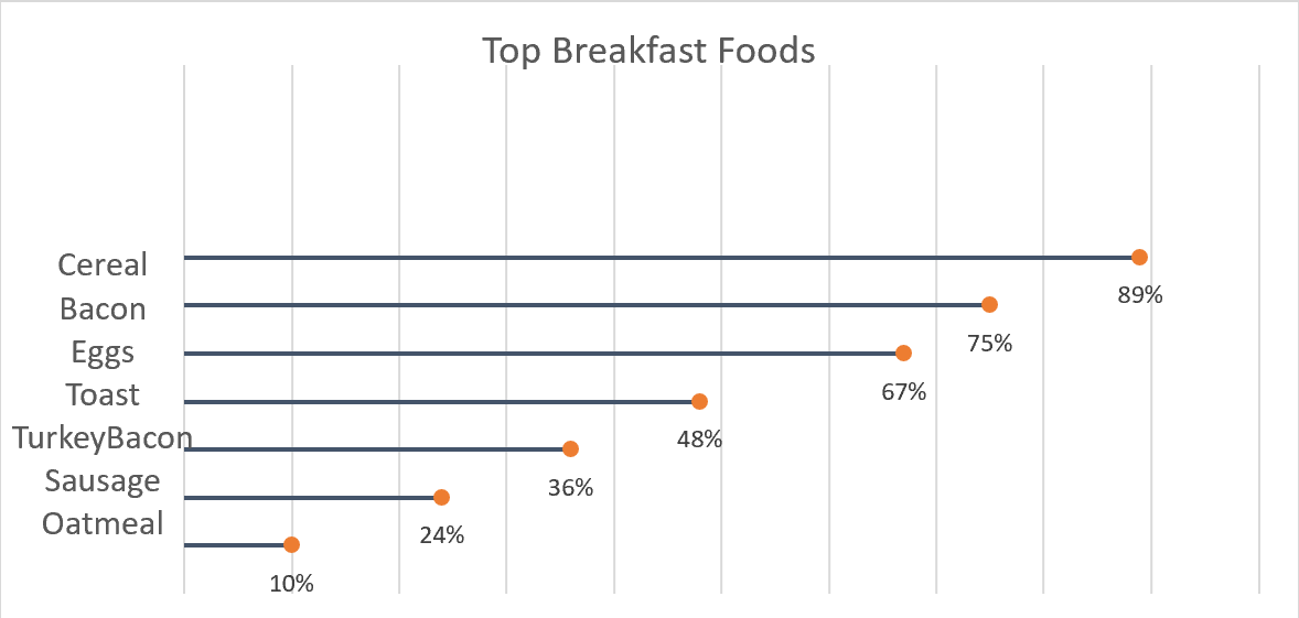
A good way to go about comparing large percentages is through a lollipop chart. Here we made one to show a percentage of the top breakfast foods that people eat. We could have used a bar chart or something similar to portray this same message but a lollipop was useful because we have some data points that are close in length and it also make it look less cluttered. Here we can use a very simplistic design, no need for different colors or legends. The chart I made was done in excel, by using a scatter plot of my data and then adding error bars. After modifying the bars a bit I got the look of bars with a round end point and the final product of the lollipop graph.
I appreciate the explanation how lollipop charts are useful when data points the are close in length. It’s key in deciding the right chart to use.
Have you tried other visualization techniques?
Have you thought of other areas where this type of chart could be effective as it was in your food example?