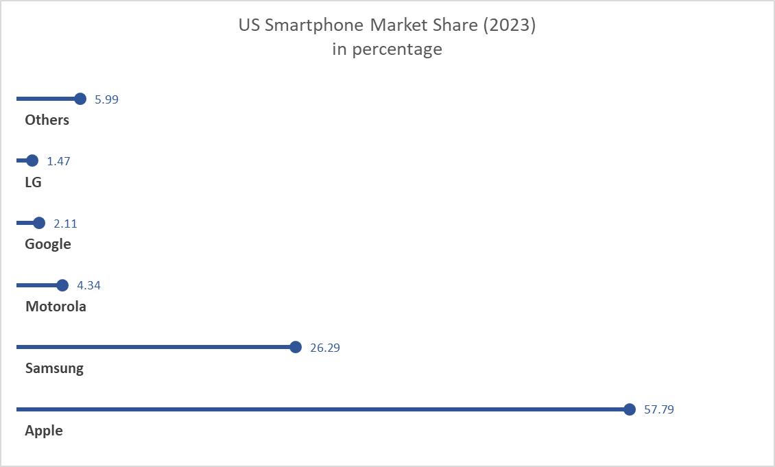
When it comes to the creating a chart in Excel to display the needed information, we tend to only think of a bar, line, or pie graph. However, it is possible to be more creative and workaround with those existing graph choices. This time we learned about the lollipop chart. From what I think, lollipop is much more appealing to the eyes than other standard horizontal bar chart. It can tell length which distinguish the proportion in which one is higher or longer in value. In other words, it works the same as a bar chart. There is a difference. Bar charts are most likely used when there are not too many data to display and then it would become clustered. Being clustered can basically fill out the entire chart with all different colors which can irritate the eyes. Lollipop chart achieved the minimalistic view even with higher number of data. It does require many additional steps comparing to just insert a graph with the traditional bar chart. It started with a scatterplot and with a number of formatting the data sets, labels, etc…. There is a down side to use this lollipop chart. The value needs to be clear and apart from another. It is difficult to tell the end point of each line if there is no label especially when data are close to each other. I can see this graph to be use in a more professional environment.