A lollipop chart is basically a combination of a bar chart and a dot plot or scatterplot. It can be used anywhere that a bar/column chart would be appropriate. Lollipop charts are great for reducing visual clutter and making use of white space, which can make important data stand out more and make the differences between data points more apparent. Numpy Ninja makes the point that one strength of lollipop charts are that they are highly customizable. One of the weaknesses is that the circular markers can create some ambiguity in where the actual datapoint lies, making it more difficult to discern scale. This type of chart actually works best when there is a large discrepancy between datapoints such as in the below. The second chart I made has much less deviation between data points so the chart overall is less impactful. This is one of those things that you have to see for yourself to understand that there really is a best chart for different types of datasets.
I was recently at Disney and got the sales pitch for DVC timeshares. I thought a fun lollipop chart would be to show how many one bedroom villas each different resort has. This can be important information for a family looking into which resort to purchase if they need a specific room type. This chart clearly shows that a family that requires a one bedroom villa to be comfortable should stay away from purchasing at certain resorts or they may not be able to book the room they desire due to low availability. This lollipop chart was created in Excel.
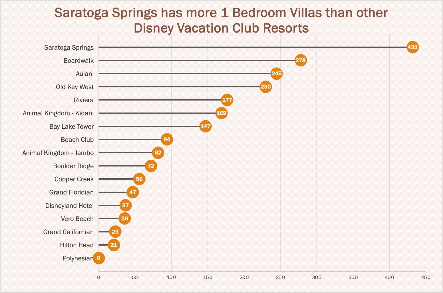
https://www.dvcfieldguide.com/blog/disney-vacation-club-1-bedrooms
I tried to create a lollipop chart in Tableau using data on consumer spending. I found some information on what categories of purchases consumers intend to splurge on in 2023. This application can be tricky to figure out, but I love that I can export my charts with tooltips for readers to interact with. 37 percent of consumers intend to splurge on something in 2023 and this chart breaks it down into categories. We can see that most people intend to splurge on restaurants and groceries and the fewest people intend to splurge on fitness and household essentials.
Great blog post about lollipop charts, the explanation on it being the combination bar charts and dots plots was appreciated.
What were some of the customization options that you used and did you find that creating this type of chart was easy?
It’s a good idea to consider how certain chart types might be better suited for specific distributions. Your post was informative.