As we continue to learn throughout the course of this class, there are dozens of ways to display data aside from the typical charts that we are used to seeing. One such example of this is a lollipop chart. A lollipop chart is a great alternative to displaying a significant amount of data that may be too overwhelming to look at and compare in a bar graph due to all of the shapes, shading, and numbers. It can also be helpful with a smaller set of data that may look odd or misplaced in other types of graphs. A lollipop graph – which gets its name due to the fact that it replicates what a lollipop looks like – takes this significant data and displays the same information in a much simpler way due to the design of it. Many people describe it as being a more “minimalistic” graph compared to the typical bar graph and prefer to use it when some data are similar.
A lollipop chart can be created a few different ways, however, the two ways I chose to use started with a scatter plot and a line graph. The scatter plot gives the horizontal lollipop look (due to the way it formats) whereas the line graph creates a vertical lollipop shape, once again due to the way it formats. Using Excel, I decided to create both types of graphs using the same data to compare how it looks.

The image above shows the lollipop graph in a horizontal display, while the image below shows the graph in a vertical format. The main difference between the two is accuracy. As we read about in the textbook, the vertical lollipop graph looks “prettier” but is not always as accurate due to the size that the lollipops are made in order to look more “put together”. For this reason, I prefer the horizontal look better as it is easier for me to comprehend, and yes also more challenging to make!
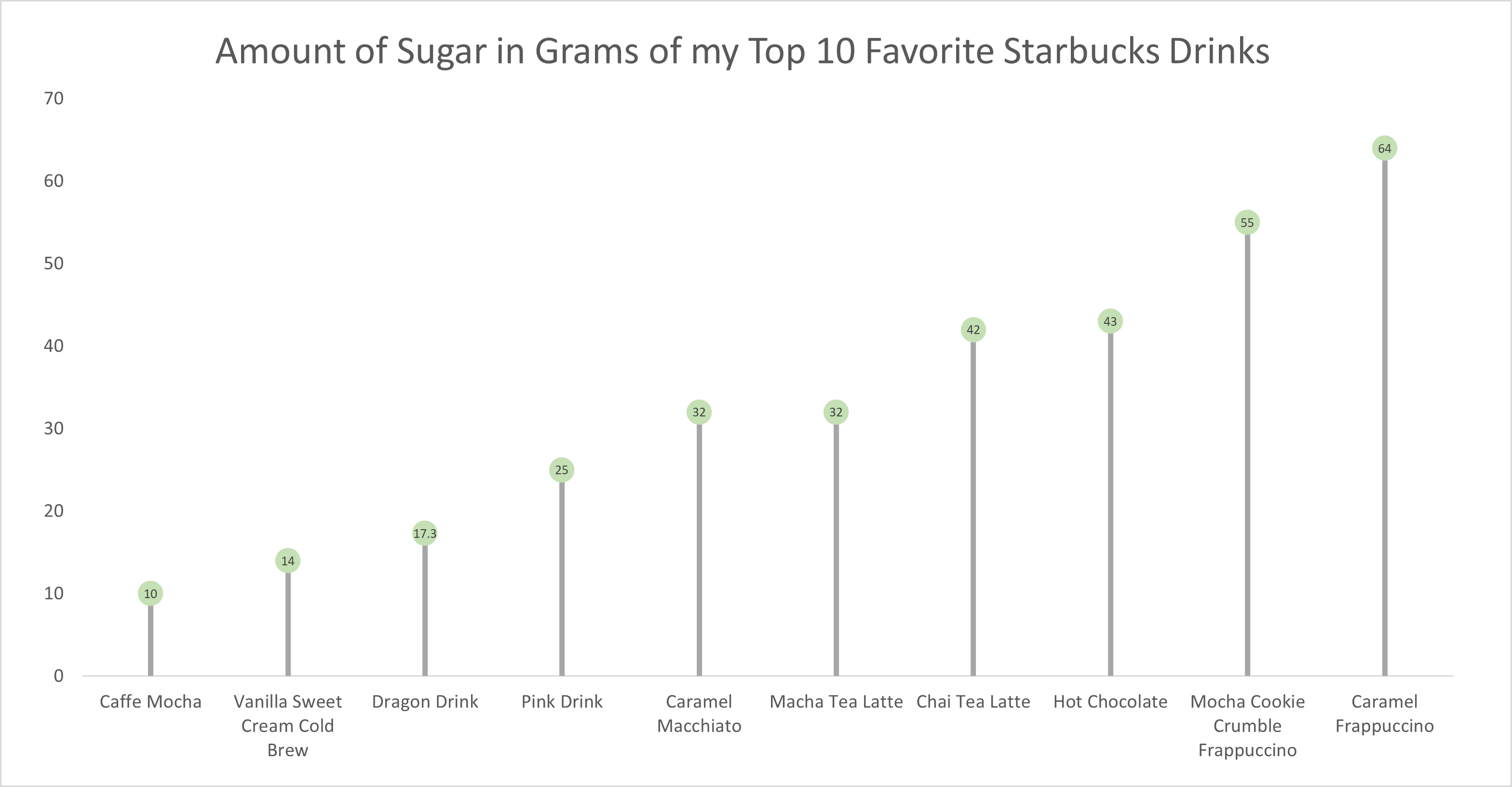
As for the actual data shown in each graph, I chose to create my own data based on research of the grams of sugar in my top ten favorite Starbucks drinks. The reason I chose to do this was because I am constantly getting Starbucks and attempting to “hop on the trends” of newer drinks, so I wanted to inform not only myself, but other people who like these popular drinks about how much sugar is in them. The grams of sugar are based on their “grande” size, although I typically end up getting a “venti”. As you can tell in the chart, which goes in order from least grams of sugar to most grams of sugar, nearly every drink with the exception of a few, has more than twenty grams of sugar in one of the smallest sizes available. Once again, this information presented is very eye-opening and something to be aware of. I ultimately think a lollipop chart was an easy and effective way to present this data because it is easy to get the important information and comparisons without getting overwhelmed.
Did you encountered any challenges or specific insights when creating both horizontal and vertical lollipop charts, and if you have a preference for one over the other based on the practical aspects of data presentation? One suggestion I have is to consider adding some labels or annotations to your lollipop chart to make it even more informative. Providing the names of the Starbucks drinks alongside the lollipops could enhance the clarity of your visualization and help the audience easily identify the drinks you’re referring to. This might make it even more effective in conveying the message about the sugar content of these popular drinks.
Hi Giana, I really like your Lollipop chart and the way use the data to create the chart. I have never heard about this chart before but after I learned and made one by myself I actually like it. Lollipop is used for data comparison, ranked-based lists of data, and many more things. I need to say one thing in the second chart you need to increase the size of the number in a circle so the reader can read it properly.
I actually prefer going horizontal for lollipop and I did it for my own blog. It feels like it save much more space and show more data within a small amount of area. The vertical one just too far away apart and at this point I would rather go with the traditional bar chart. Maybe it is because of the data labels on the x-axis that caused it to spaced out. However, kudos to you to create two variants to see the differences.
I really enjoyed reading this blog post. The way you explained how you constructed each graph and how they differ is very helpful. I learned a new way to form data thanks to you. I also find that this type pf data visualization is great fit for the dataset you chose.
I really enjoyed the ease of visualization you enabled with both graphs! I felt as if the first graph in particular was exceptionally strong in conveying the increasing order of favorite Starbucks drinks and their sugar content. The horizontal layout allowed for me to quickly read each drink in descending order of sugar content. Do you think that perhaps an improvement to the vertical graph style might be scaling the lollipop heads depending on the total amount of sugar? Or do you feel as if this may overcomplicate visualization efficiency? Maybe even color coding the lollipop heads with the corresponding drink would help with the speed of which someone can obtain information from the graph?
Hi Giana. I really love how you used data that is personal to you for your chart. For some reason I agree that the horizontal lollipop is more impactful for this information, especially if someone is trying to manage their sugar intake. It is almost as if you are moving toward the maximum amount of sugar you can have in the day so you may want to choose something further down on the list. It’s interesting how orientation changes how we interpret data. I’m a Soy Chai girl and I had no idea that it was so high in sugar. I also liked the colors and spacing you chose. The design is very clean and easy to read. Do you think you will make different beverage choices based on your research?
I found that after making the first lollipop chart it became easier and I’m glad that we learned this because it is definitely something I will use in the future.