As data is becoming both increasingly important and more widely used/applied, it only makes sense that simultaneously there would be a growing number of fields working around such factors. This can become an issue for visualization artists, as with an increasing complexity and density to existing bases and collection methods, too much data may often be readily available than immediately necessary for an infographic. Sometimes many words may be conveyed within the motion or placement of the simplest of figures. One clever chart that may assist with certain large data pools, is a lollipop chart.
A lollipop chart is an excellent way to effectively illustrate a pattern to an audience when this pattern is hidden within a lengthy or complex dataset. As a lollipop chart is a variant of a bar chart with less visual clutter, these graphs are best used to display a distribution of values.
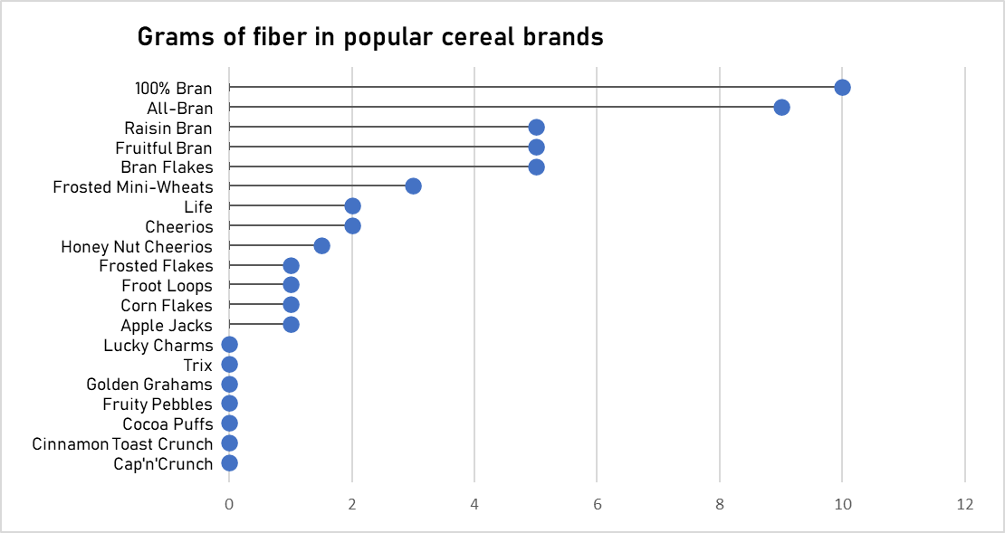
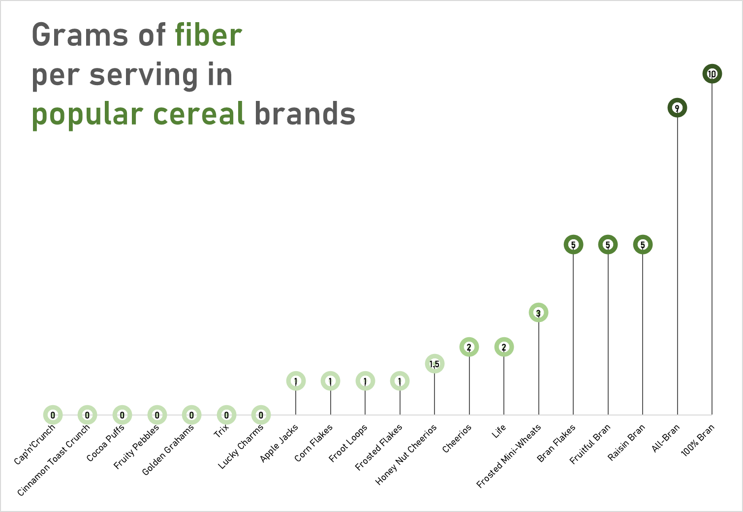
The data used to construct these charts was obtained from the “80 Cereals” dataset on kaggle.com
These charts would most likely visually fit a dataset with a more broadened distribution of values. However, with these two charts you can quickly see how a lollipop graph can demonstrate a concept with plenty of data to be easily deciphered. These graphs that I have created may be useful for someone who is looking to adjust their fiber intake, as I have separated the fiber content per serving in grams across popular cereal brands. However, the second graph is most effective, as with making use of the color spectrum of light to dark with increasing fiber content, the human eye may quickly identify significant regions of the graph.
This is a great post. I appreciate the way that you used different orientations of the data by switch in g the axes. Sometimes when I look at a graph like this, my brain automatically associates length with distance and height with amount. Even though both charts are showing the same information, one is easier to associate with what type of story it is trying to tell.
Using the contrast color green in the text and lollipops was also a great idea. It makes some information pop while still keeping an overall clean aesthetic.
When we look at nutrition information online, we often see pages and pages of values. Your chart shows that specific types of cereals (brand) tend to be higher in fiber than other types of breakfast cereal. Very easy to understand with a quick glance.
Hi Tameka, I really like how you did your post and separated them by color. I definitely agree with how a chart use of color can help the audience understand the data both quicker and easier. Though I am not sure if you are the one who created the “grams of fiber in popular cereal brands” but If you are, one thing I would recommend would be to exclude the cereal values that have 0 Grams of fiber. Considering that the purpose of the graph is to compare the amount of fiber within each cereal brand, it may not be necessary to include cereal brands that have no fiber to begin with. If this graph was in fact made by you, is there any particular reason the cereal brands with no fiber were included?
I prefer the horizontal lollipop chart based on the data you provided and the vertical one looks like a subway roadmap in my opinion, therefore I doubt it would be useful looking like that. Another point I want to add is maybe it is better to leave out the 0 data included in the graph. There are too many of them and it does not provide any valuable to the graph.
The lollipop chart very clearly constructs the data in an organized way, emphasizing the difference in values.I really liked how you showed two separate visualizations of the data set you chose. Was it difficult to construct that many values?
I agree with your point regarding the fact that a lollipop graph can be a useful tool to easily see trends in complex data series. My question is why not make the icons larger on the graph? By doing this you will make your graph a lot more eye catching. My suggestion is to make the icons larger.
Wow, great chart! Was your second chart made in excel? If not, what did you use to create it? I love the color saturation being used as a secondary scale for amount of fiber, and while maybe not that important, the green in the title on the important words really makes this a visually appealing and cohesive graph.