By Shaun Sneddon
Unveiling the Lollipop Chart: A Sweet Way to Visualize Data
In the world of data visualization, a lollipop chart stands out as a charming and efficient tool. It combines the best of bar charts and scatter plots to make your data pop. In this post, we’ll explore what a lollipop chart is, when you should use it, and we’ll create one together.
What’s a Lollipop Chart?
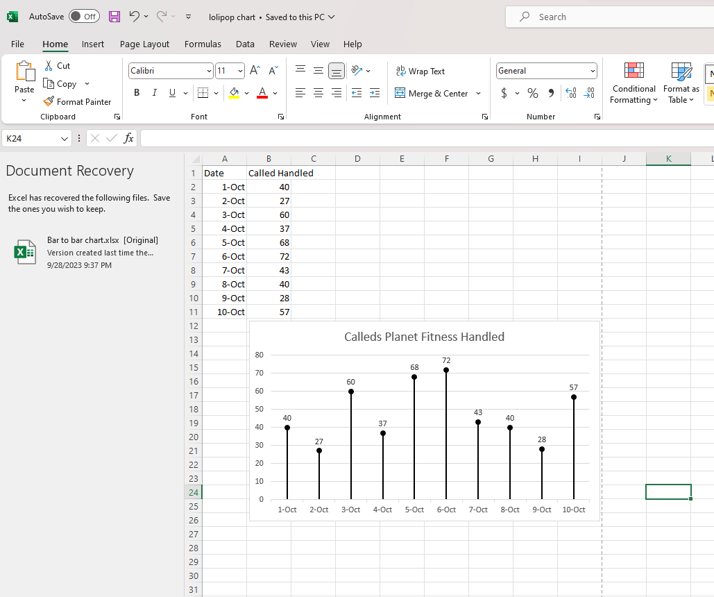
Imagine a vertical line (the “stick”) with data points as markers (the “candies”). This is a lollipop chart! It’s ideal for showcasing a handful of data points, ranking items, highlighting outliers, and tracking changes.
When to Use Lollipop Charts
Few Data Points: If you have a small set of data to compare, a lollipop chart simplifies it elegantly.
Outliers: It’s great at spotting unusual data points that stand out.
Rankings: Show rankings or positions in a dataset clearly.
Changes Over Time: Use it to track how data changes over time or across categories.
Data Distributions: Combine it with other charts to display data distributions.
Creating a Lollipop Chart
For our example, let’s track the quarterly sales of three products – A, B, and C.
Input Data: Use your preferred data tool, like Excel or Google Sheets. Create columns for “Product” and “Sales.”
Design the Chart: In your tool, use a bar chart or scatter plot. Make the data points circular (or use candies).
Customize: Personalize your chart by adding labels, changing colors, and adjusting the size.
Titles and Legends: Don’t forget to label your chart correctly.
Conclusion
Lollipop charts are a delightful way to make data more appealing and understandable. They shine when you want to highlight key points, compare a small dataset, or reveal outliers. So, spice up your data visualization and give lollipop charts a whirl!
Hi Shaun, Hope all is well. I like your introduction to lollipop charts and their potential applications. Do you think you can explain any specific scenarios where lollipop charts might be less suitable or where other chart types are more effective? Also, it would be it could be helpful to include a step-by-step guide for readers to create their own lollipop charts. A tutorial on making lollipop charts will help readers to use this type of data visualization efficiently in their own projects.
Shaun Sneddon, I like how you designed the data post with a yellow highlighter for your heading. I did not realize we could do this. Your chart is visually appealing and shows an excellent example of a Lollipop chart, which is excellent for presenting large amounts of data.
I liked the use of your Excel data on this post. It works with how you broke up your explanation of creating the chart. The subheadings in this post help make it clear what you’re trying to explain. One recommendation I have is to use fewer subheadings because some of them can probably be combined into one.
Hello Shaun, I think you did a great job on this blog post. I like your point regarding how lollipop charts can simplify smaller sets of data. My only question is what you would say the threshold is for how large or small the data set could be before a lollipop chart is deemed ineffective. My suggestion is adding more to your step by step because a lollipop chart can be very difficult to create for a novice.