This blog is all about how lollipop charts should be used and how they effectively visualize data. A lollipop chart is typically used to compare two or more categories or variables. It consists of a horizontal axis and vertical lines that represent the values of each category or variable. Lollipop charts show changes over time since charts can be used to visualize changes in data over time. Lollipop chart highlighting differences between categories or variables. It is also used for presenting ranking or ordering. For instance, I made a lollipop chart in Excel based on ranking.
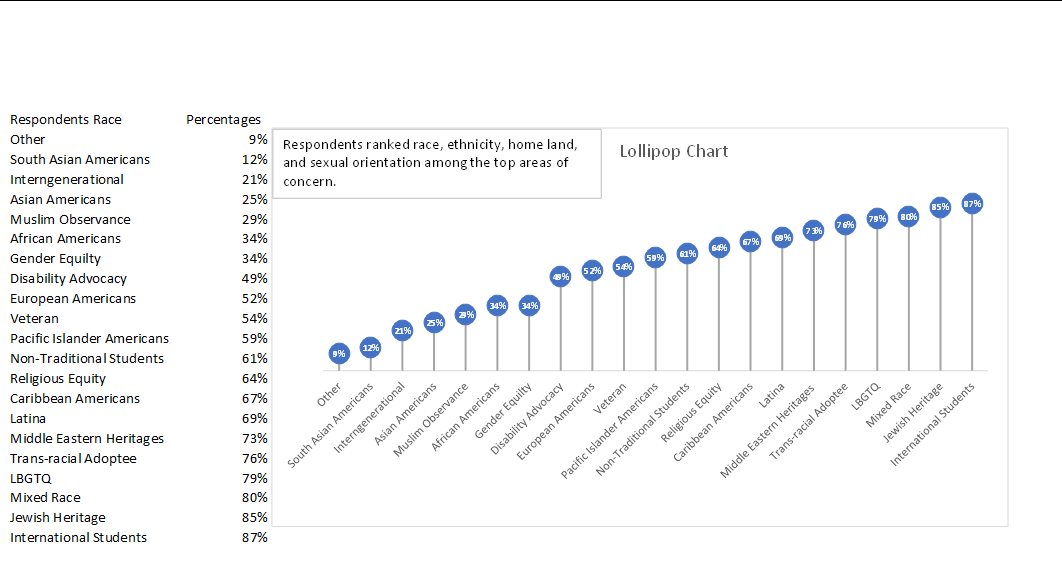
This lollipop chart is about respondents ranked race, ethnicity, homeland, and sexual orientation among the top areas of concern. You can see how each lollipop is labeled with data according to rank. Overall, lollipop charts are suitable for situations where you want to compare, rank, or highlight differences between categories or variables. Lollipop charts usually attract the reader because of the patterns within the data.
Reference
I chose this data from Evergreen Data.
I like your explanation of lollipop charts and how they effectively visualize data. Your example of ranking based on respondents’ concerns showcases the practicality of this chart type in presenting data clearly. lollipop charts are quite handy when you need to compare, rank, or emphasize differences between categories or variables, and their visual appeal can help readers quickly understand the patterns in your data. lollipop charts are excellent for showing not only rankings but also how data changes over time in a more fun way, making them a versatile choice for visualizing data.
Pat, your data post is excellent, and the Lolllipop chart is well displayed. A Lollipop chart can also be used to display something within a category, which is both visually appealing and unique at the same time. As I mentioned in my post, Evergreen’s data was quite challenging to construct, so I found another reliable website that provided me with an easier way of constructing my chart.