Data visualizations often are made through comparison of values and the best way to do that is to include a reference point to evaluate data. Based on where the benchmark is located the viewer can analyze if it is above or below that point. This can help provide context to the data or it can be used to mark goals in data. In data visualization, it is important to have these indicators so that the information being presented has meaning.
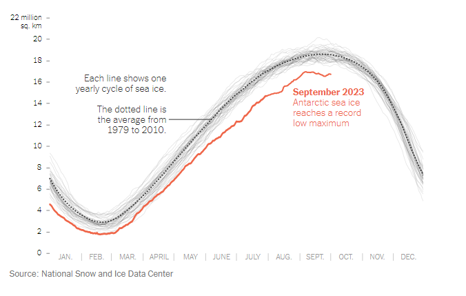
The data above was pulled from an article uploaded to The New York Times called, “Where’s All the Antarctic Sea Ice? Annual Peak Is the Lowest Ever Recorded” by Delger Erdenesanaa and Leanne Abraham. The authors report that the annual peak of Antarctic sea ice has reached its lowest recorded levels. This decline in sea ice extent raises concerns about the implications of climate change for the polar region. What they did to visualize this data was to add in a “benchmark” shown as the dotted line to represent the average from 1979-2010. You can clearly see that where we are in 2023 (shown in red) that the Antarctic sea ice drops below the benchmark by an extensive amount. Based on the data shown, they are able to assess where the level should be and can make the achievement goal to be above that targeted area. https://www.nytimes.com/2023/10/04/climate/antarctic-sea-ice-record-low.html
Hey Grace,
I really appreciate your thoughtful analysis of data visualization and the importance of incorporating benchmark or reference points. It’s a crucial aspect of making data understandable and meaningful to viewers. Your reference to the recent article from The New York Times, “Where’s All the Antarctic Sea Ice? Annual Peak Is the Lowest Ever Recorded,” is particularly relevant in today’s context.
I have a question for you: In your opinion, how might the use of benchmark lines or reference points in data visualization influence the general public’s perception and understanding of climate change-related issues, such as the decline in Antarctic sea ice?
I’d like to suggest exploring the potential psychological impact of data visualization with reference points. It might be interesting to delve into research or studies that examine how viewers’ emotional responses and engagement with data change when benchmarks are added, especially in the context of climate change communication. This could provide an additional layer to your insightful analysis.