Infographic as a whole usually display information such as sales on year by year comparison. However, these type of graphics can come in handy when looking at a benchmark. I am taking an example from National Oceanic and Atmospheric Administration’s website and few other regarding the global temperature
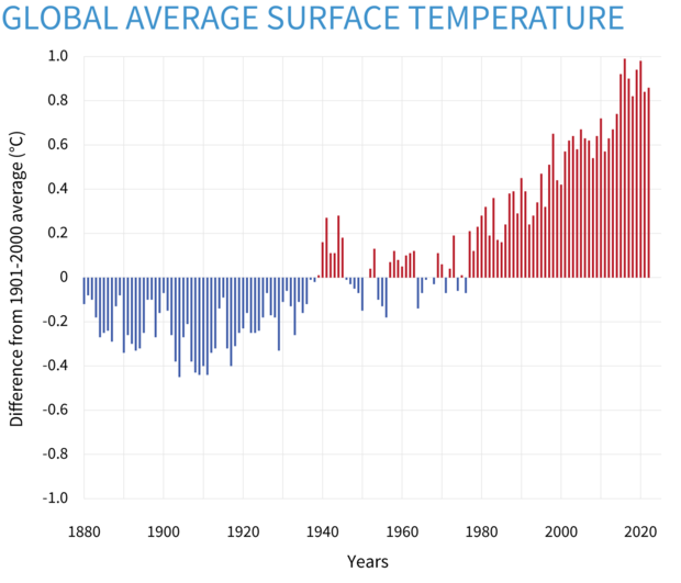
This first graph here is a “Yearly surface temperature compared to the 20th-century average from 1880–2022” and blue bars indicate cooler-than-average years; red bars show warmer-than-average years. One thing can be seen from this type of graph is how you can easily see how much of a difference between years. The graph only listed from -1.0 to 1.0 Celcius (30.8 to 33.8 Fahrenheit) but the short distance between the maximum and the minimum y-axis makes a small difference much more exaggerated. At first, I would have like to know the actual average temperature on a yearly basis but this would not fit in this type of graph due to the amount of spaces needed for additional data.
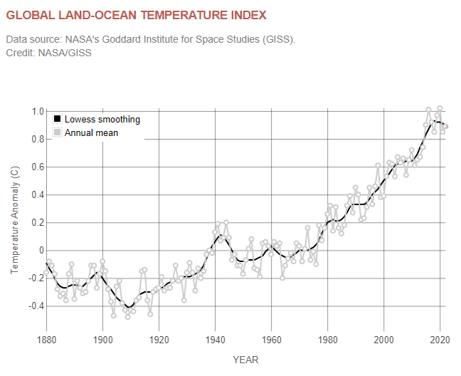
This graph is a similar graph comparing temperature from NASA’s website. This offer one more variable to look at is the LOWESS smoothing. By definition from NOAA’s website, LOWESS or LOESS is a nonparametric method for smoothing a series of data in which no assumptions are made about the underlying structure of the data and is effective when there are outliers in the data. However it is difficult to understand any of the scientific terms but overall just another example on how current temperature can be shown on a graph.
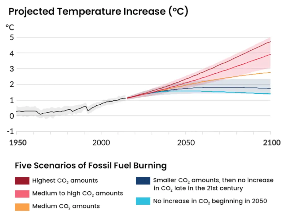
This graph here is “Projected Temperature Increase (°C)” from Center for Science Education. This graph is benchmarking the future temperature on a few different scenarios as listed within the graph itself. Black line and grey area perhaps are the accepted temperature change by many scientists. This graph is definitely great in comparison and it shows the temperature entirely depends on the decisions of humans. However what is missing here that makes me wonder is what is the different between CO2 amount from each scenarios such as would the highest CO2 be somewhat for an example 10 million and medium to high would be somewhere 3 million to 5 million and so on. Overall, it may seem that the actual number of CO2 because it is not the main focus of this graph.
Great post! When I was making my own blog post I had tunnel vision on the types of benchmarks I could find for examples. I really love your first and third examples of benchmarking. They’re slightly more subtle than printed literal benchmarks but are stellar examples nonetheless, great choices!