By Marc Joseph
Source https://humanbenchmark.com/users/6523996c62704b00084820c5/reactiontime
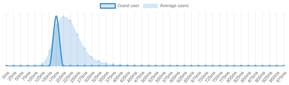
Reaction Time Charts
There are many different ways one can use benchmarks in order to determine whether a measurable value is over or under an expected value. As shown by the reaction time benchmark from Humanbenchmark.com where I scored an average of 191 m/s which put me in the top 74.46% percentile. The graph that is darker represents my value while the lighter colors represent the standard of comparison, or the average of all the other users. As shown, my values are slightly skewed to the left which means that my reaction time is above average when compared to the values of the lighter blue.
Investing Charts
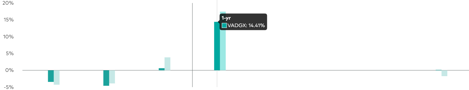
https://investor.vanguard.com/investment-products/mutual-funds/profile/vadgx#performance-fees
Another application of benchmark comparisons would be an investment or stock that generates a projected profit after a certain period of time. As portrayed by investorvanguard.com, they have a bar graph that shows the amount of returns and projected returns within a year. The darker green color represents the current value while the light green represents the expected goal. They used a darker color to bring attention to the value that they want the reader to see the most and a lighter color in order for the other value to be less distracting.
All in all, there are many different ways to shows benchmarks and simplify information. One can use bar graphs, line graphs, bell curve, and many more options in order to accurately portray data. Using the data, the audience can then make a more informed decision on their topic of interest (i.e. stocks, investing etc.). Hopefully this article gave you a good idea of the effectiveness of benchmarks and their many uses.