Benchmarks are a commonly used feature in many data visualization charts, as they help to compare data in a comprehensive and easy way for viewers of all sorts. More frequently, we see benchmarks used to show things such as a budgeted/projected amount or numbers compared to the actual numbers for a specific data set, whether it be for a school, company, test, or experiment.
The unique thing about benchmarks is that they can be shown on graphs in a multitude of ways, from dotted lines and solid lines to different bars and solid colors on charts. Another notable feature about benchmarks is that there is no specific category that they have to be used for, meaning they could be used in/represent important statistical data or even smaller, less important information.
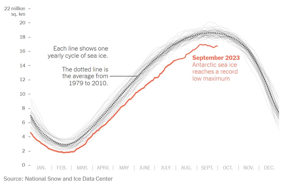
The example above is an instance where the benchmark line is used in a more serious setting and is represented by a dotted line on the line graph. The graph was taken from a New York Times article that discusses the current issue in the Antarctic Sea. As shown in the graph, this September marked the lowest ever recorded peak of sea ice, endangering wildlife. The red line represents the current levels recorded of the Antarctic Sea ice. In many scenarios, this would be considered the “actual” data in the graph/chart. In this specific graph, there are two types of benchmark (comparison) data. The first being the faded light gray lines that represent previous recordings of the sea ice level and the second is the dotted line with the average sea ice level, which is the main benchmark data and the comparison area. This chart was a great way to display this information, as it is clear to see the difference in sea ice throughout the years thanks to the comparison data/benchmark line.
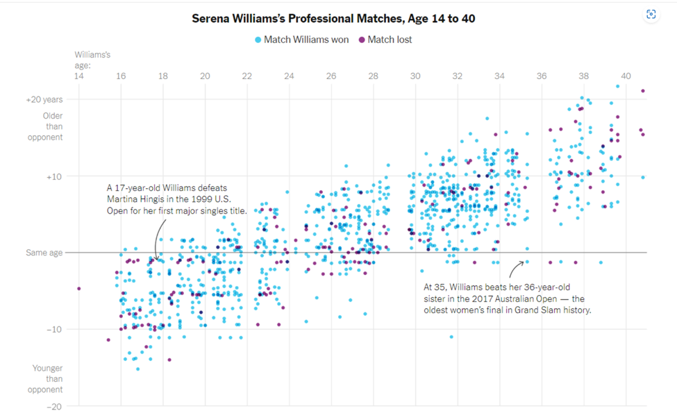
As previously mentioned, benchmark data sets can be used to represent and compare serious and important data, as well as data that is simply for fun. The chart above is a different presentation of a benchmark that takes on a less serious meaning. Serena Williams is a tennis player, and last year the New York Times put together an article and data visualization to compare Serena William’s age to all of the other people she has played and either won or lost to in each match. The gray solid line going across the entire scatter plot represents the benchmark (comparison) data, in which Serena Williams was the same age as her opponents. From here, it is easier to see how she performs with people younger than her, her age, and people older than her. While this type of chart looks chaotic, it is another perfectly acceptable use of a benchmark line within a data visualization.
In conclusion, benchmarks can be created and shown on almost any time of chart or graph that is trying to compare two or more things. It is an excellent tool that people can use to provide others with a better understanding of a situation. In different articles and publications that feature graphs, you will see them presented in a variety of ways depending on how the author chooses to do it. While none of the ways to show a benchmark are wrong, some are better suited for specific presentations of data. For instance, having a bar graph with overlapping bars to show the benchmark for all of Serena Williams’s matches and ages of opponents would have been acceptable, but a lot more confusing and chaotic than the scatter plot used with a simple solid benchmark line.