In today’s world, many data charts have been used in the market economy and small businesses. This blog is about benchmark graphs and how they allow you to identify improvement areas to get the company on par with growth and success. With the help of a benchmark graph, it allows businesses to compare their performance against competitors. In addition, it gives strategic decision-making ideas by analyzing the performance of competitors. The benchmark graph is innovative in comparison with a regular bar graph. This blog, it’s all about “The Employment Situation in January” The number of jobs added in January came in well above market expectations after unemployment from 2020. Based on the report from the U.S. Bureau of Labor Statistics the unemployment rate ticked up by 0.1 percentage point to 4.0 percent.
Average monthly job growth over the last three months was 541,000 a fast pace.
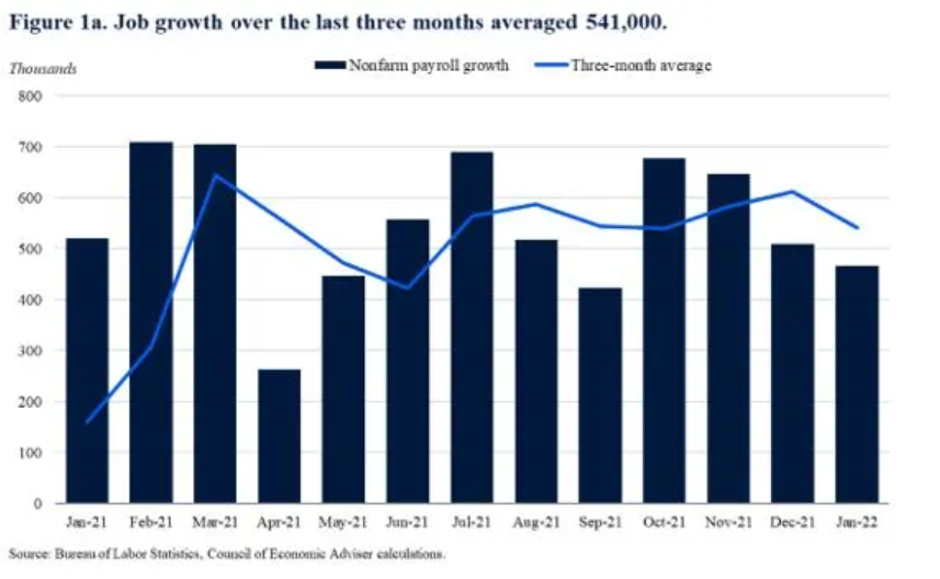
In this graph, the target line is a three-month average, and the bar graph represents nonfarm payroll growth. Since monthly numbers can be volatile and subject to revision, the Council of Economic Advisers prefers to focus on the three-month average rather than the data in a single month. This graph is the perfect example of good benchmark analysis since some bar column is above the target line which means there is growth in the number of jobs.
Labor force participation grew by 0.8% point year-over-year, a fast pace.
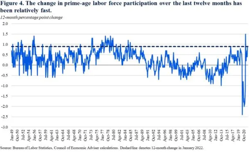
The above graph is an example of labor force participation. According to the Bureau of Labor Statistics, the labor force participation rate was 62.2% in January, up from 61.4% percent a year ago. The “prime age” (25 to 54) labor force participation rate was 82% up from 81.1% percent a year ago. The Council of Economic Advisers prefers the participation rate because it is less impacted by changes in educational enrollment and the natural slowdown in labor force participation caused by the aging of the population and retirements. As we can see in the graph back in the day the labor force was above the target line and it got below the line from the year 1990 till 2020.
Overall, a Benchmark graph is a powerful tool in data visualization for businesses and other organizations to gain better performance, tracking data, and identify areas for improvement and development. This activity cleared a concept of mine towards benchmarking and how it is used at a bigger stage. Getting the knowledge of this graph will help me in every sector of economic fields.
Reference
https://www.whitehouse.gov/cea/written-materials/2022/02/04/the-employment-situation-in-january-2/