Many different types of data have an underlying benchmark included. A benchmark put simply is just a target or a goal that the organizer wants to meet or exceed. I have worked for multiple organizations who set these goals on a monthly or quarterly level then looked back over them to make predictions for the future. There are multiple different ways we can use benchmarks to visualize our achievements. We will take a look at some of these different visuals and see which ones work the best to portray a message.
The Benchmark Bar Graph
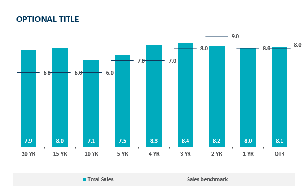
In a bar graph we can compare a value over time very easily but with the addition of a benchmark line we can see which time periods performed the best. Sometimes pure quantity doesn’t tell a whole story. Some months can see higher sales year after year. If we put a benchmark line in that month it is easier to see how it is really performing. This idea is highlighted in the above chart, the 20 year sales have exceeded goals by 2% which is great but as we get closer to the 2 year mark we see a miss of the goal yet a higher total sales. The 2 year mark obviously has a higher target to meet based on history and other factors. Growing benchmarks must mean the company is growing because they are achieving more and more goals.
Benchmark Line Graph
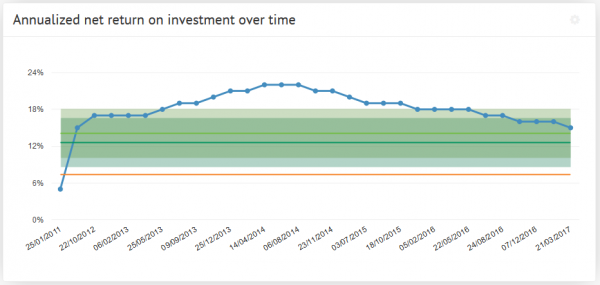
Here we see a different type of measuring a benchmark over time. The benchmark line here is the green portion and we can observe either exceeding expectations or shortcomings based on the blue line above. The benchmark is set steady at 18% and does not change. This means their goals do not change based on history or trends. Without changing goals how would this example grow. If we are trying to meet goals that always stay the same we’ll never see long term growth. Pushing goals up and up based on success will lead to meeting higher goals and higher growth.
Comparing Multiple Line Graphs
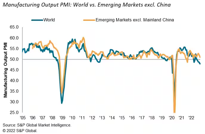
Here we have a graph of the emerging markets and how they stack up against the rest of the world. It measures total manufacturing output over the last 17 years. After a quick glance you don’t come away with much of an impression, this is due to a closely overlapping graph. I think this is a useful graph but it takes some time to really make a judgement on since the two lines are so closely related. I think it would be of more use if we saw it on a monthly level to really get some separation to see where the emerging markets are exceeding the world.
I think after all of these visuals we can understand what a benchmark really consists of. We also saw multiple different uses of them and can probably choose a favorite. I think the easiest one to read was the bar graph with clear benchmark lines that made it clear what points fell where in comparison with the benchmark.