Some different ways people can show comparisons to a benchmark is through competitive, strategic, & performance. Competitive benchmarking is emphasized as the most effective form of benchmarking for businesses, allowing them to assess their true success by comparing themselves to competitors. It provides insights into industry trends and competitor strategies. To perform competitive benchmarking effectively, companies should establish clear goals and parameters and leverage digital tools for in-depth analysis, going beyond basic benchmarks like revenue and growth to gain a granular view of competitors’ data for more informed decision-making. Strategic benchmarking focuses on learning from industry leaders and best-in-class companies to understand their success and identify areas for improvement in your own business. It involves analyzing their business models and strategies to optimize various aspects of your own organization, such as marketing, online presence, or finances. Mobile app intelligence tools like Similarweb are highlighted as essential for gaining insights into mobile app trends and competitors’ strategies. Performance benchmarking aims to compare profitability and establish ambitious but achievable goals based on quantitative data comparisons, focusing on performance indicators like price, quality, speed, and reliability, ultimately driving continuous improvement.
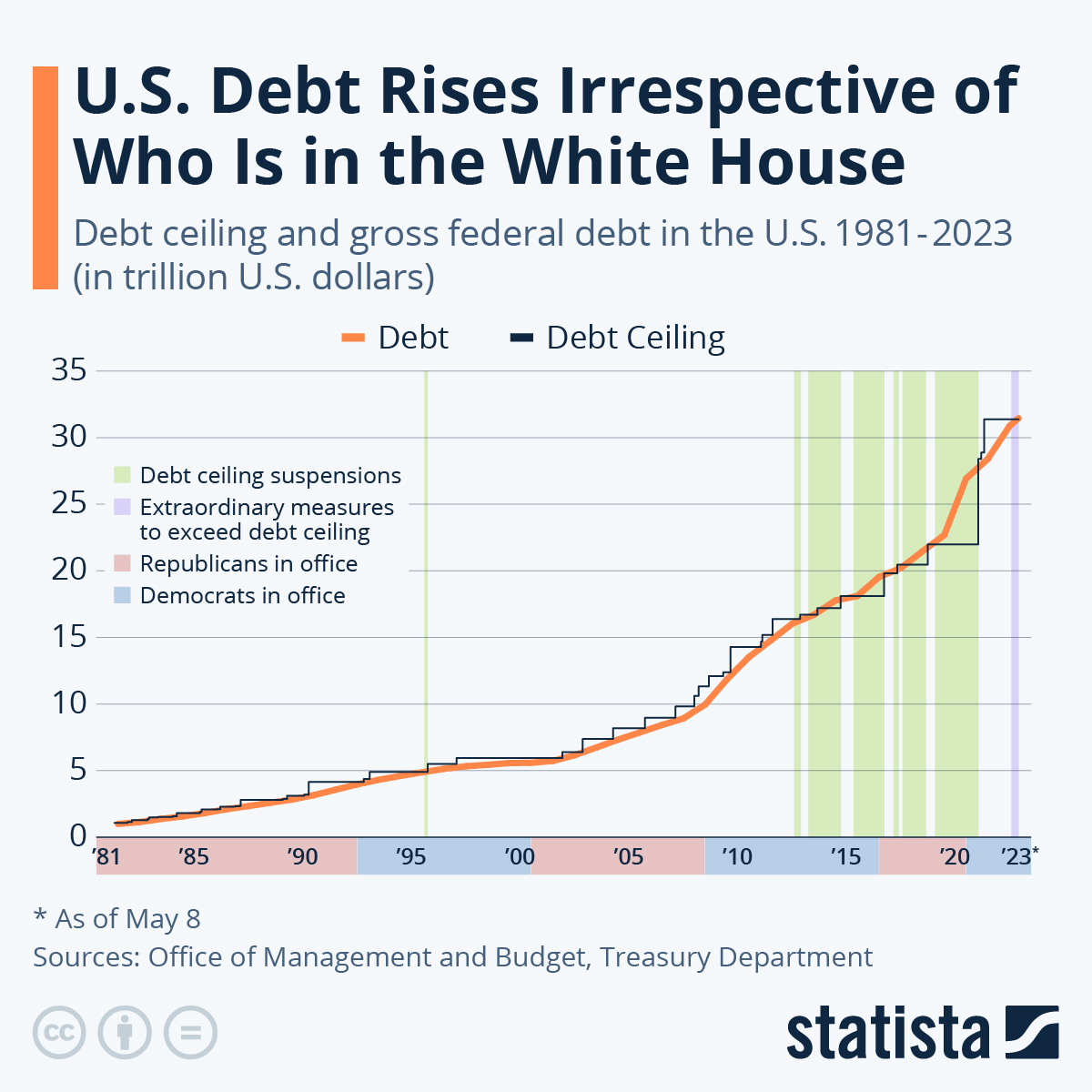
is this graph of the “U.S. Debt Rises Irrespective of Who Is in the White House” the benchmark is the debt. In this graph the numbers highlighted in blue at the bottom represent Democrats in office and red represents Republican. In this graph it shows typically it doesnt matter which group is in office because the debt rises no matter what.
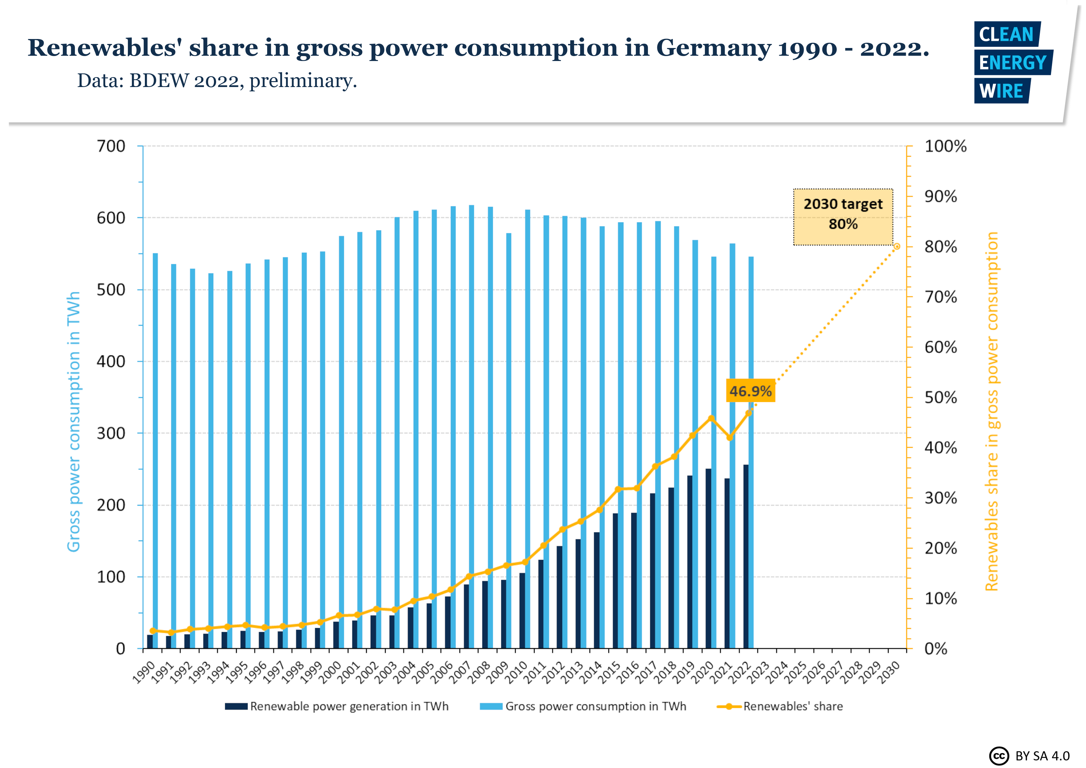
In this graph it shows Germanys power consumption throughout the years. The benchmark line is the yellow line indicating renewable shares. Germany is predicting that it will raise from 50% to 80% in the next 10 years.
sources
https://www.statista.com/chart/1505/americas-debt-ceiling-dilemma/
I really like the sample benchmark charts that were used to show different ways that a benchmark line could be made. While both look similar, they also have completely different features that make each unique and informative. I like the first one about the U.S. debt increasing with who is in office the most because it is something I never would have thought about prior. One thing I recommend, however, is possibly providing another example of how benchmarks can be shown due to the similarities in these. For instance, a scatter plot with a benchmark line would also be a good way to display certain data if there are a lot of different types and results as compared to the benchmark. Overall, however, I think this was a really well written and informative post.
I love how you not only clearly outlined what benchmarking is considered to be, but why it is so important to a business, and also how a business may make use of such procedures. I never considered there to be various methods of benchmarking, such as strategic and performance, which perform measurements and evaluations from different angles. I appreciate both of the graphs provided, as their benchmark values and significance are clearly represented and explained. Do you think that the debt ceiling line is entirely necessary in the first graph?
Hi Tyler, I really like your blog about US debt benchmark graph and the way you talked about how inflation is going above the target line. In addition, the second graph is also attractive since it clearly states how energy consumption in Germany throughout the year and how it will be raise in a future. Benchmark graph is most used in stock market and businesses to see the growth from past to future.