This blog is about ways we can use insightful data visualizations to compare numbers. Data visualizations can make complex information more comprehensive. At the point when you analyze numbers visually, examples, patterns, and connections become more obvious. Comparing data is an effective way to show similarities or differences between two known subjects. With that being said, it can be very difficult to digest information when it is not presented in a way that speaks to the language of the eye. In order to draw someones attention you have to know how to visualize data in an easy to understand way. However, there are different charts and graph that digest certain types of information and data. Choosing the most effective tool is extremely beneficial.
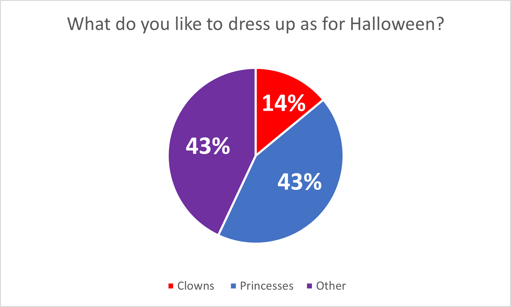
For example, the author gives different charts for the appropriate data sets in the article “7 Types of Comparison Charts for Effective Data Visualization” by Tanzil Ebad Chowdhury. When comparing numbers, pie charts are the most commonly used technique because they are easy to understand and interpret. This is best used when comparing a part to a whole, like percentages. https://ninjatables.com/types-of-comparison-charts/
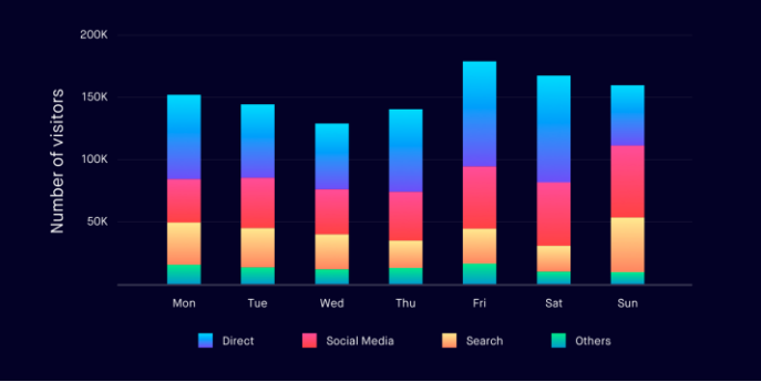
Bar charts a great way to incorporate numerical data in a straight forward way. It is commonly displayed with an x axis for categories and the y axis for numerical values. This is good for monitoring changes over time.
Histograms are best used for quantitative data because they are specifically designed to display the frequency distribution of quantitative data. This can visualize the shape of the distribution so that you can analyze whether it is normal, skewed, etc.
Overall, there is a different chart/graph for every form of information, choosing the right one is the most important part. The article linked displays about 7 different ways you can do this and explains the primary approach for each one. It is essential to choose the best type of chart based on the specific characteristics of the data and the information you want to present. Other types of charts, such as line charts and scatterplots can be more suitable for different scenarios, so choosing the most appropriate visualization method is critical for effective data visualizations.


Podcast: Play in new window | Download