There are many different factors that contribute to quality of life for people around the world. One of those factors tends to be leisure. How do we spend our “time off?” Many people work through their weeks and dream about weekend plans or where they are going for their holiday in the summer. The difference in that dream can be what country you live in. Some countries have statutory paid vacation, while some countries, including the United States, leaves paid time off rules up to employers. The graphic below shows guaranteed vacation time in several countries. It is shocking to see that most U.S. workers are guaranteed only 10 days off for public holidays, while Austrian citizens have 38 days between annual leave and holidays. Many U.S. workers are not even guaranteed the public holidays off because many services continue during those days.
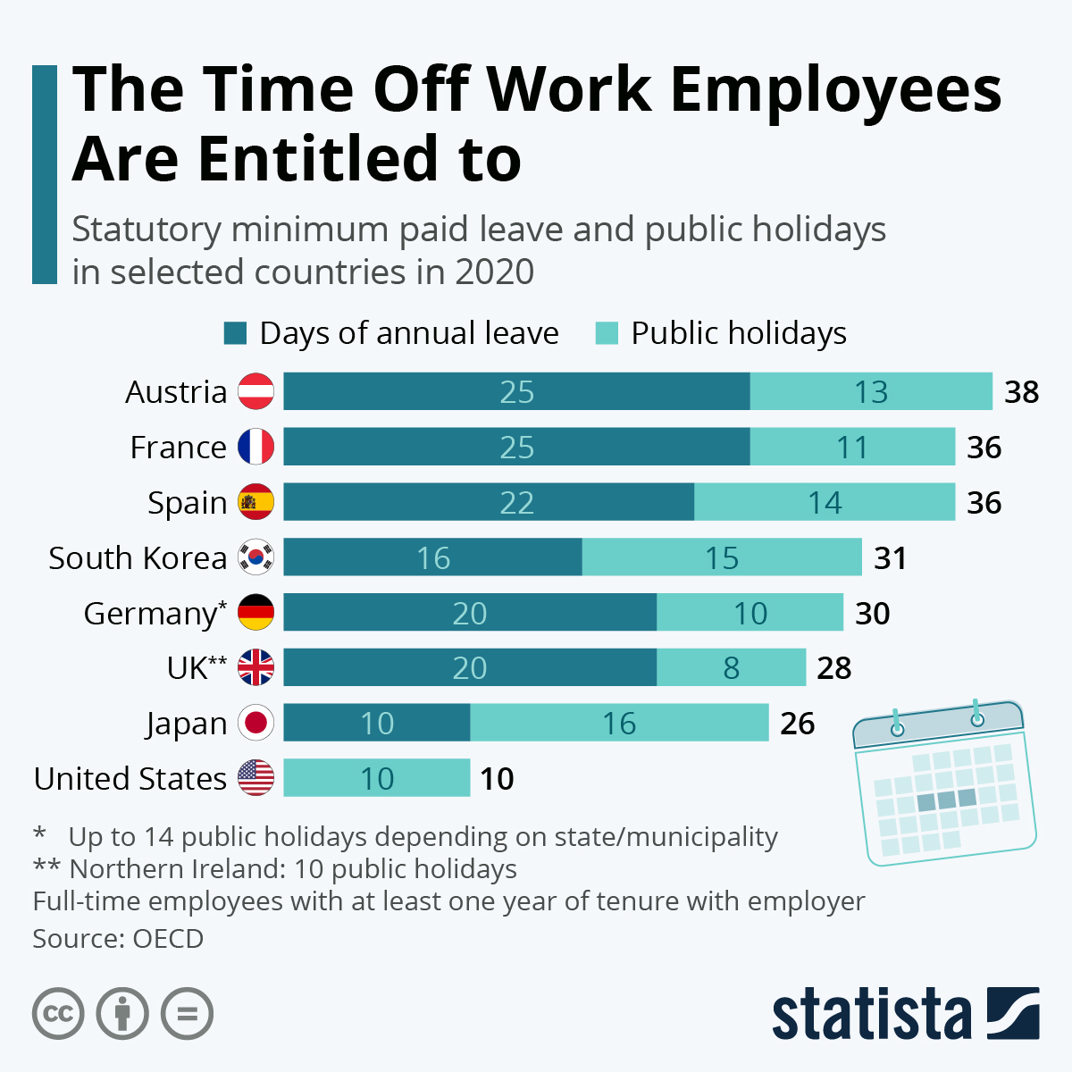
https://www.statista.com/chart/15005/statutory-minimum-paid-leave-and-public-holidays/
Paid leave can affect more parts of life than leisure. There are huge discrepancies in different countries on both paid sick leave and family or maternity leave. Again, some countries mandatory minimums for maternity leave. This graphic from Capital and Main shows the how much maternity leave is mandated by the United States versus other countries.
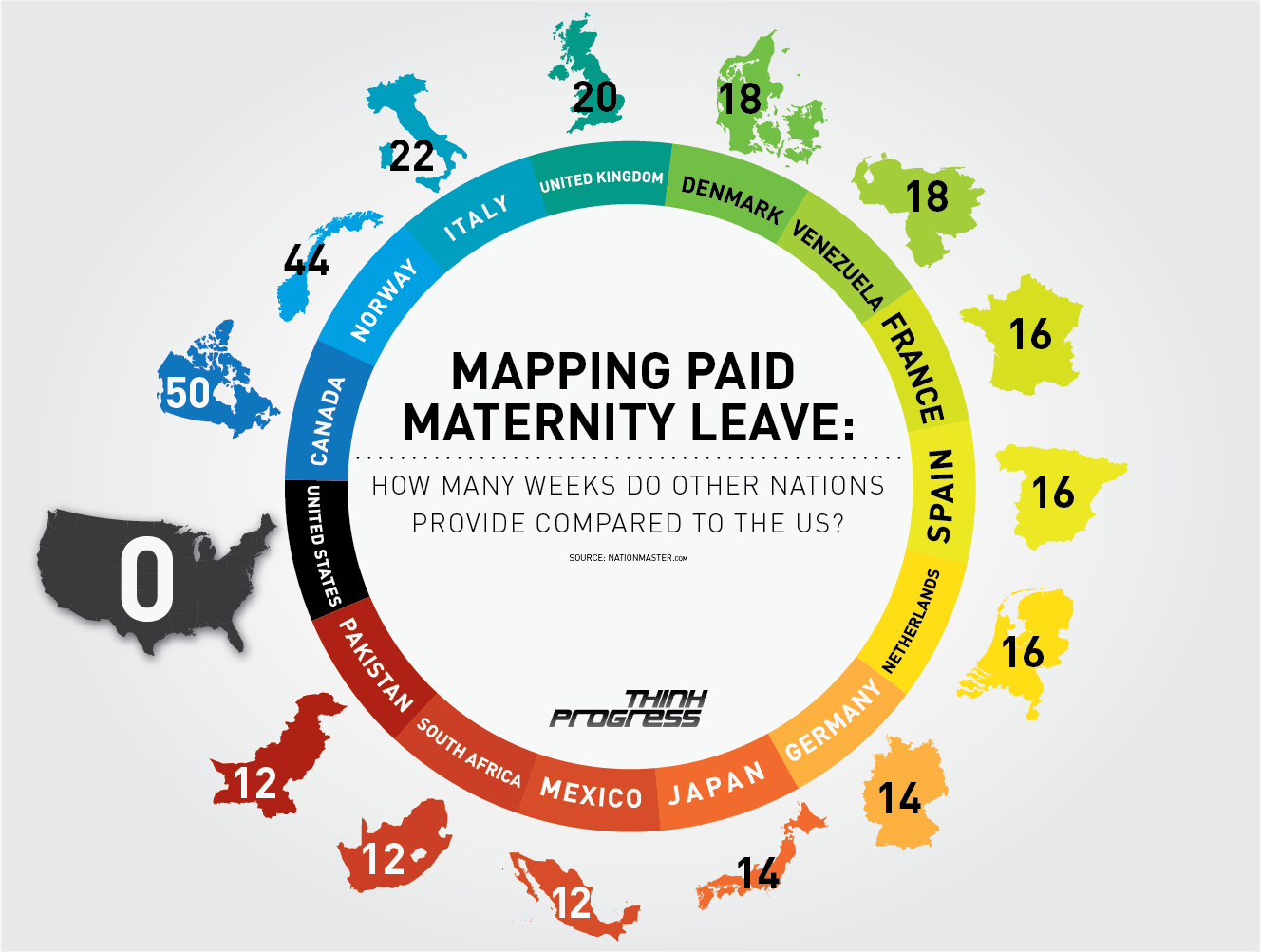
https://capitalandmain.com/the-right-to-care-states-paid-family-leave-turns-10
Graphics like these, that show how one country compares to other countries around the world can paint a picture the differences. Why those differences exist and how they affect populations are questions that we can research further to understand, but these graphics give us a great starting point.
I think this was a really well-written and eye-opening blog post. I appreciate how there was a central theme occurring throughout the entire post with the samples of data visualizations that compare numbers. It made the overall flow of the blog post 100 times better. I think deep down I always knew that the United States did things a lot differently (and possibly more unfairly) than other countries, but it is visualizations like this that continue to put it in my face. The fact that the United States provides the absolute lowest number of time off for employees for regular time off/holidays and maternity leave is crazy, especially considering the U.S. was not even close to tying with anybody for “last”. The paid maternity leave is also heartbreaking and shows that the United States is in a male-dominant workplace still. Overall, I do not have any suggestions for this post as it flowed nicely and provided great examples! I am curious as to how you thought to use data as powerful as this and make it flow so nicely because I never would have thought to look up days off/paid maternity leave the way you did!
These infographics were exceptionally effective and awakening. I love that you chose the topics of maternity and annual leave in employment, as I’m sure your average individual isn’t aware of such contrasts across the world. Another thing I love about your blog post, is how you included several eye-catching statements many people can relate to in the beginning. It’s quite shocking to realize just how much the U.S. differs from many other developed countries within their number of off days provided, especially for maternal leave. Upon first glance of the chart, I would have assumed the U.S. would have at least ranked closely along with the other countries low on the list, providing at least 12 weeks’ time. It’s quite appalling to consider this differing level of treatment amongst mothers around the world. Like Giana mentioned, your blog post was rich in content and flowed wonderfully, therefore I cannot come up with any suggestions! I wonder if any cultural and historical significance can be drawn from the initial chart showing the amount of paid leave compared to holidays per country?