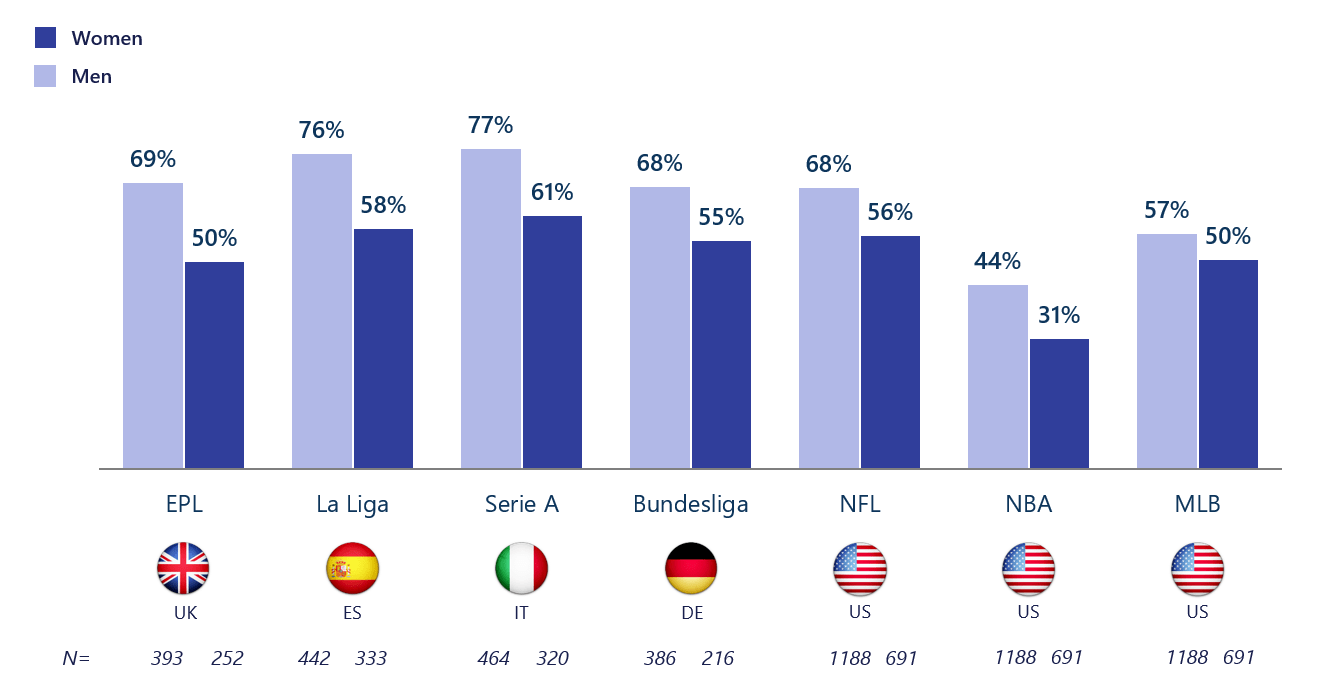
If there is one thing that should be known about data visualizations, it is that one can find a data visualization about almost any topic with the click of a button – and a quick google search. Due to the fact that baseball season is about to come to an end with the post-season approaching and the football season coming in full swing now, I thought it would be interesting to find a data visualization about sports and who exactly it is (by gender) that watches sports. As a female who watches baseball and even hopes to work for the MLB one day, I knew that the “MLB fan club” was mostly male dominated, but thanks to this data visualization, there is a better grasp about the true difference in the amount of males and females that watch and engage in sports such as baseball.
The unique thing about this visualization is that it not only focuses on U.S. statistics and sports, but also the UK, Spain, Italy, and Germany. This provides a perspective that might not have otherwise been known to people in the U.S. and other countries, and overall adds to the value of the data visualization.
Altman Solon, a telecommunications, media, and technology strategy consulting firm, created the data visualization pictured above and even went beyond by breaking it down even further. For instance, in the data visualization pictured below, viewers are able to just look at statistics for women in different countries and their interests in different sports leagues around the world.
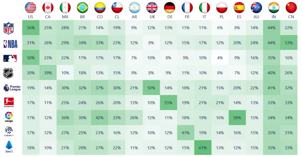
By breaking it down this far, viewers are able to get a better understanding of where females stand with sports interest compared to males, and hopefully make a difference so that the level of viewership becomes more balanced by gender in the future.