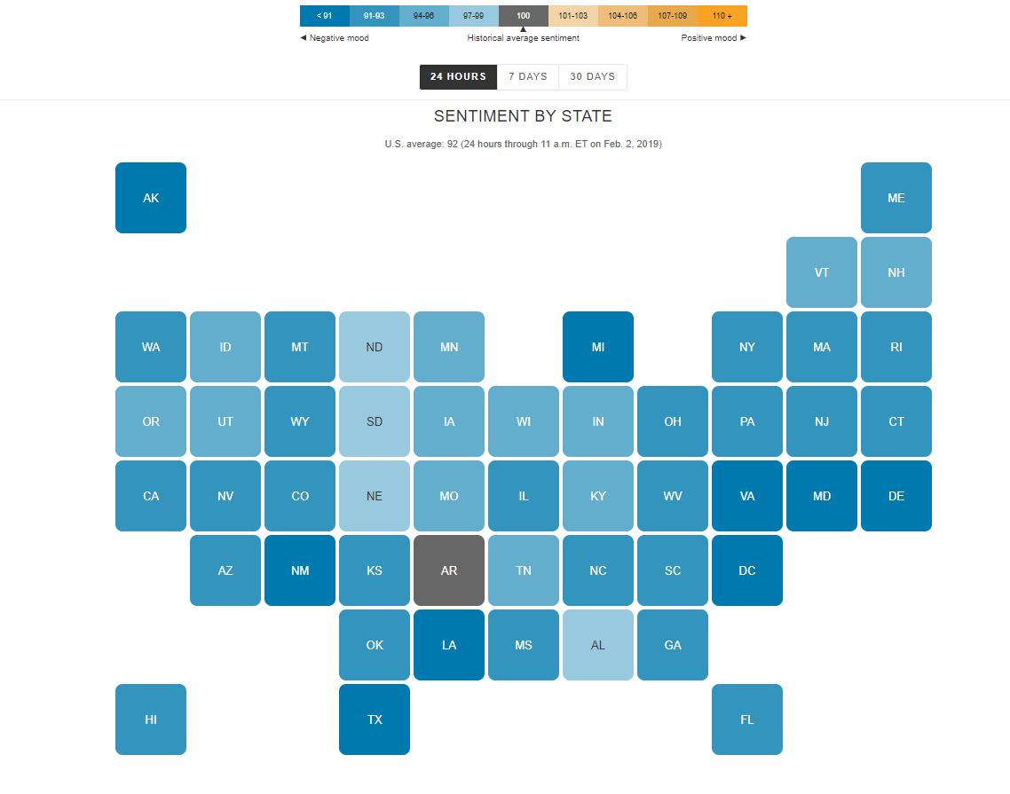
I find the “U.S. Social Sentiment Index” quite intriguing. It’s a creative way of harnessing the power of social media, specifically Twitter, to gauge our nation’s mood in near-real-time. What caught my attention, in particular, is how they use benchmarks to add context to the sentiment data.
In this case, they don’t just look at raw sentiment but also compare it to the current sentiment on Twitter. This means that they calculate a benchmark sentiment level based on the tweets they’re analyzing and then position the current sentiment relative to that benchmark. This approach is crucial because it provides a point of reference. It helps us understand whether the current sentiment is above or below the average sentiment of tweets from people across the country. For instance, if “most states are in the negative,” it suggests that the sentiment in those states is predominantly negative compared to the average sentiment in the analyzed tweets.
What’s even more fascinating is how this data is presented in near-real-time, updating hourly. It’s like having a live pulse on the nation’s emotions, and for data enthusiasts like us, that’s a treasure trove of insights. It’s a reminder of how data visualization can make complex information accessible and meaningful.
By Shaun Sneddon
http://graphics.wsj.com/twitter-sentiment/