A comparison chart is an effective way to show and compare multiple options between two or more items. In this blog, there is a comparison between two COVID-19 vaccines which are Pfizer/BioNTech and Moderna COVID-19 vaccines. When both these vaccines approved by the FDA many people had questions about which vaccines were more effective and what are the side effects after receiving them. This comparison chart contains details of the vaccine age eligibility requirements, the number of shots required, days between shots, as well as side effects.
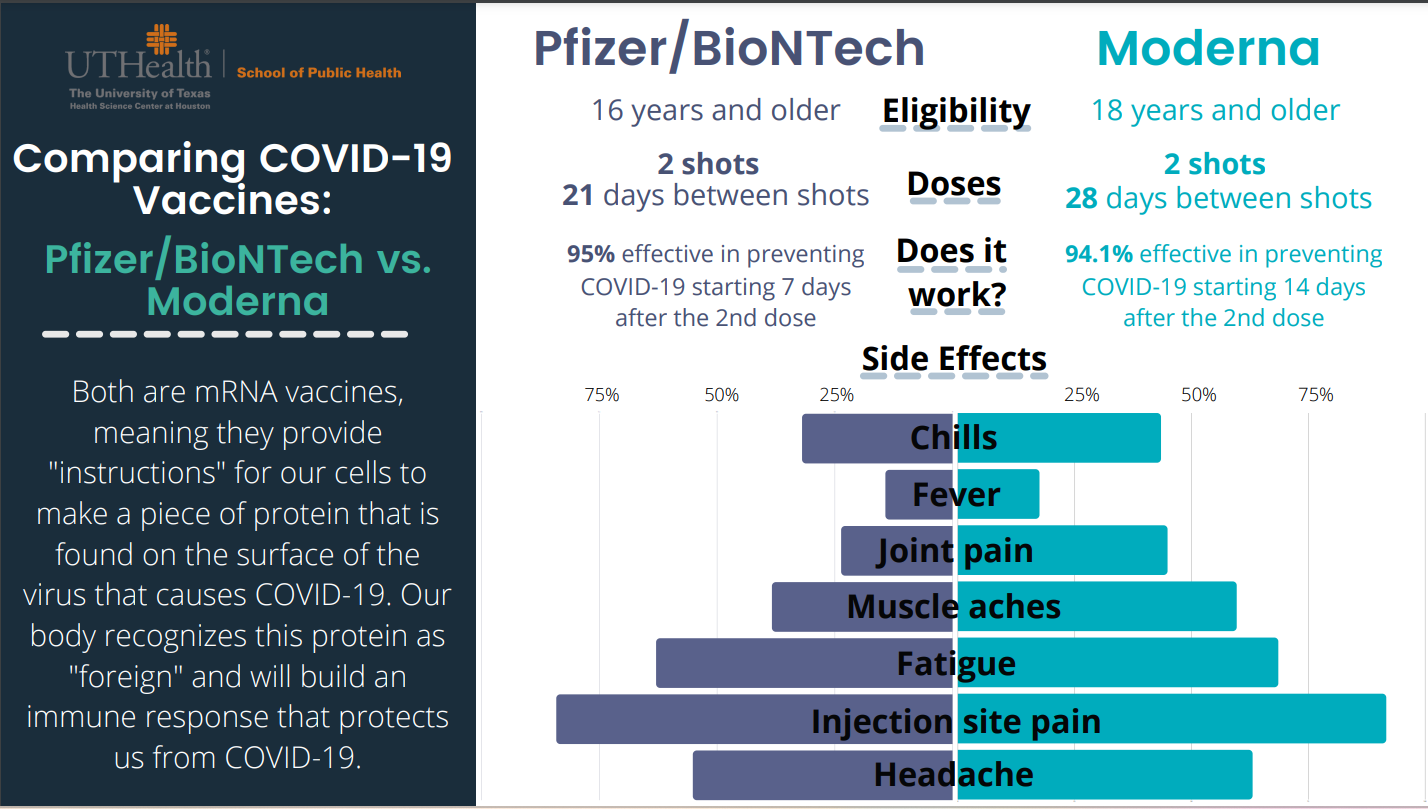
On the left-hand side, Pfizer/BioNTech provided data about the effectiveness of the vaccine and on the right-hand side, Moderna provided data about the effectiveness of the vaccine. Both vaccines are safe and effective based on their clinical trial results. The beauty of the comparison chart is it attracts reader at first sight and give important information right away about these two vaccines instead of reading whole in-text information. In addition, this chart mentions both vaccine’s side effects with percentage values so anyone can get an idea. The reason I choose this comparison chart since I am a certified immunizer and pharmacy technician at Walgreens and every time people have questions about vaccine’s effectiveness and their side effects. In conclusion, comparison charts enable us to make informed decisions and bring meaningful insights.
Reference
https://eagleanalytical.com/uthealth-covid-19-vaccine-comparison-chart/