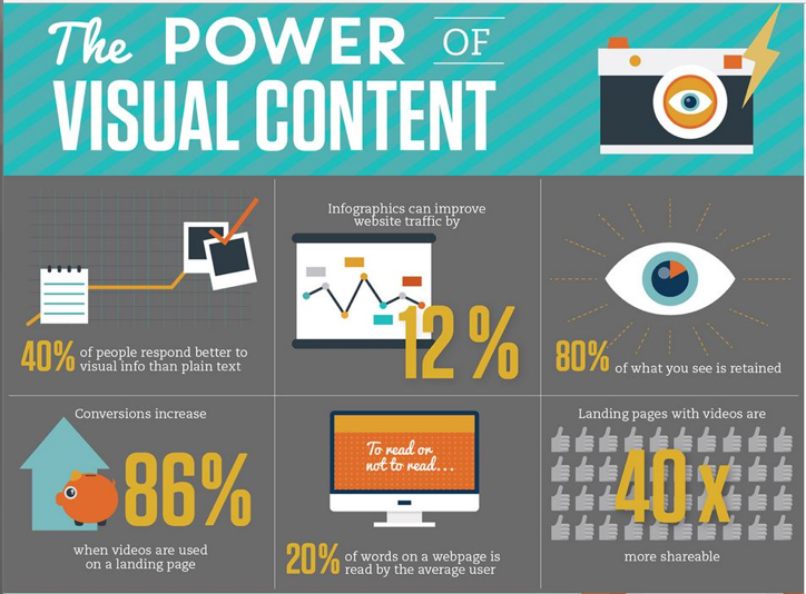
Insightful Data Visualization
Data graphics are an especially useful way to share information quickly and effectively. Somewhere data graphics can be useful is the classroom. To summarize from “8 Examples of How Middle Schools Can Incorporate Infographics in the Classroom” article from Venngage; within a classroom there is so much information for student to absorb. Having data graphics on the walls of the class would greatly help students in retaining information. Other ways data graphics could be used is for introducing new material to students, the visuals will be a nice aid for student who are learning topics for the first time. In conclusion information graphics can be a helpful tool for students.
Infographic Design Tools: Visme
The above link to the infographic image
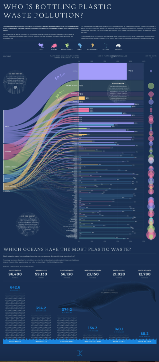
In our daily life how many plastic bottles of water, cold drinks or coffee cups are we using no one have any idea about how much plastic waste is thrown into the ocean worldwide. However, with the help of infographics, it is very easy to track that which country is doing more plastic waste pollution. This is the data based on the distribution of total plastic waste generation by continent. The purpose of this blog is to estimate the percentage of plastic waste that was inadequately disposed of. These types of graphics present complex information quickly and clearly. The infographic provides a great amount of complex information in a clear and precise picture of the current surface plastic mass by the ocean, measuring it in a creative way. In a bar graph, we can see plastic waste management for every country in a colored bar chart. The names of the countries that report 100% of all their plastic waste handled properly are highlighted in bold. In addition, the GDP of the country and efficient plastic waste management don’t always correspond as we can see by the irregular patterns shown in the infographic.
Reference
https://visme.co/blog/best-data-visualizations/
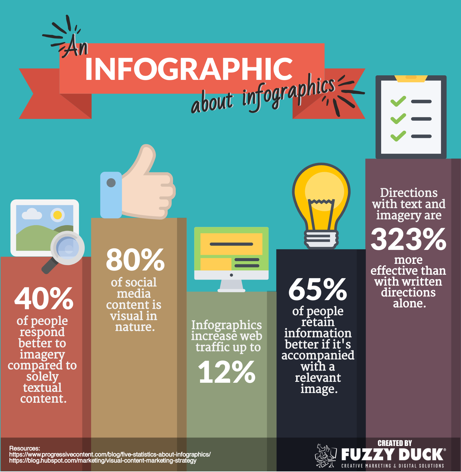
The Importance Of Infographics and Data Visualizations
https://visme.co/blog/best-data-visualizations/
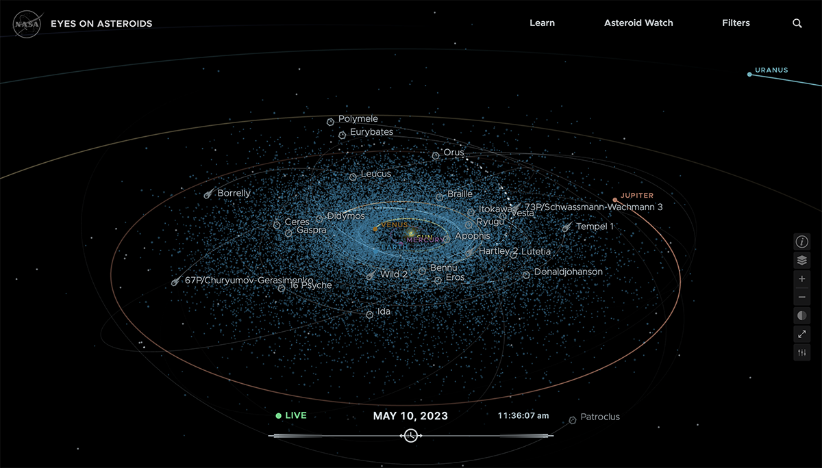
Infographics is an everyday part of our lives. There are many instances where it can be used to aid others in understanding certain complex concepts through the use of visual aids. It can be used anywhere from teachers trying to teach a class about a certain topic, or a marketing firm presenting a new product. One such method that uses infographics includes the use of data visualizations to not only observe but also predict the current course of asteroids in space. According to Visme, NASA’s eyes on asteroids visualizations ” provides up-to date information on the position and trajectory of asteroids”. This means that NASA is able to use the data visualization to possibly see any threats that could be approaching our planet and prepare ahead of time. Furthermore, as shown by the picture above, the data visualization contains a plethora of information about many asteroid paths with their names and projected paths. There are even some planets that are within our solar system such as Jupiter. The abundant amount of information being shown in such an easy to understand manner is only possible because of infographics. To add on to this, there is also a higher chance of the information being shown to be retained by the audience because of its simplicity. It has long been known that people are typically more likely to remember information that leave a strong impression on them, and portraying a 3D real time model of space is definitely one way to do that. However, predicting asteroids isn’t the only thing that infographics are used for. There are also many data visualizations that analyze the social or historical aspects of society such as the seven wonders. With that being said, Infographics is a major resource that can be utilized in many ways in order to learn, retain, and predict information.
Tools that may help us construct Infographics
There are many tools and websites that can help you construct an infographic with one easy search on Google. From my quick research, I found that the easiest websites to navigate (not the best) and create an infographic are Canva, Adobe Express, and Infogram. Canva is known for its user-friendly, intuitive interface that makes it usable by users with different degrees of design ability. To produce infographics with a professional appearance, you are not required to be a graphic designer. Infographic templates in a variety of designs, topics, and uses are available from Canva. These pre-designed, eye-catching templates can help you get going quickly. You can pick a template based on the type of content and presentation you prefer. Adobe Express makes it so have precise control over the design of your infographic, it enables you to generate scalable visuals and icons, utilize a variety of drawing tools, and work with layers. Infogram makes it easier to create infographics by providing a user-friendly interface, pre-designed templates, and data visualization tools, enabling users to quickly create informative and aesthetically pleasing infographics.
Sources : https://www.practicalecommerce.com/tools-for-creating-infographics
- https://www.unboxsocial.com/blog/tools-to-create-engaging-infographics/
- https://shrutideshpande.co.uk/why-infographics-are-important-to-your-content-marketing/
Infographics
Exceptional visualization examples: Kurzgesagt

Link to image: Kurzgesagt | Logopedia | Fandom
Link to channel: Kurzgesagt – In a Nutshell – YouTube
For this week’s blog post, I am sharing one of my favorite content creators from YouTube. Their channel is titled “Kurzgesagt – In a Nutshell,” and they specialize in short, scientific, informational videos. All of their content contains a great deal of creative, and effective infographics. Kurzgesagt excels at achieving the ideal blend of artistic expression and information display, often the main focus of information visualization. Combinations of encaptivating characters, objects, and places alongside smooth and crafty transitions help to educate the general public on some fascinating topics. All that is required is to find a topic or title that jumps out to you, and their videos will speak for themselves.
Infographic Design Tools: Canva

The following is an Informative Infographic that provides insight into how to build confidence in your children. The Infographic is well-designed and set up in an order that’s easy to follow. The design provides a perfect combination of images and color contrast, pleasing the eye.
Here is a link to the Infographic Image https://edmontonfetalalcoholnetwork.org/2015/05/28/confidence-building-in-children/
Sites For Creating Infographics
Sites such as Canva, Venngage, Infogram, Piktochart, Vise, and others provide tips and templates for creating the perfect Infographic for your audience.
Canva
I will discuss Canva in more detail since it is an excellent tool for guiding you through designing your Infographic and offers a variety of templates and designs to choose from. The possibilities with Canva are virtually endless. You can select themes such as medical, mental health, science, health, environmental, etc.
You can even watch a video that demonstrates how to create an infographic by clicking here
Canva Infographic Maker
The Canva website also provides a one-page guide to making an Infographic. In addition, this includes information regarding their photo library, which contains millions of photos that can be used in your Infographic. You also upload your own photos to the graphic if you have your own graphics that you wish to use.
Infographics
By Shaun Sneddon
- Examples of insightful data visualizations:
- First example I found that very interesting because I do love Star Wars was a graph of all the characters (over 20,000) are connected.

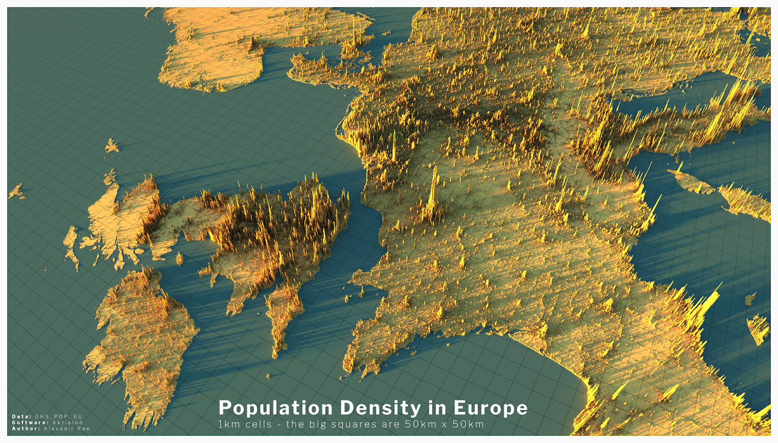
- The second example I found intriguing was a 3D data visual of where higher populations are located in Europe. When you look at a map of Europe you see the cities and can think that’s where a lot of people live but with this 3D visual you can see where people are vastly located.
- Example datasets for potential project use:
- Airline Safety
- Traffic accidents in a community
- Fatal Car accidents by country
- Stress at universities
- Tools that may help us construct Infographics:
- There is many websites that can help students construct Infographics such as Infogram, Adobe Express, and many more.
- Tools such as accessing data and images on the Internet.
- Website used for the images https://careerfoundry.com/en/blog/data-analytics/data-visualization-examples/
Welcome Fall 23 class
We will be posting our visualizations here each week. You can scroll through and see SOME of the past posts by students. Most of the previous class posts are password-protected, and I will release those at the end of the semester. I look forward to reading about your challenges and successes as you create your visualizations.