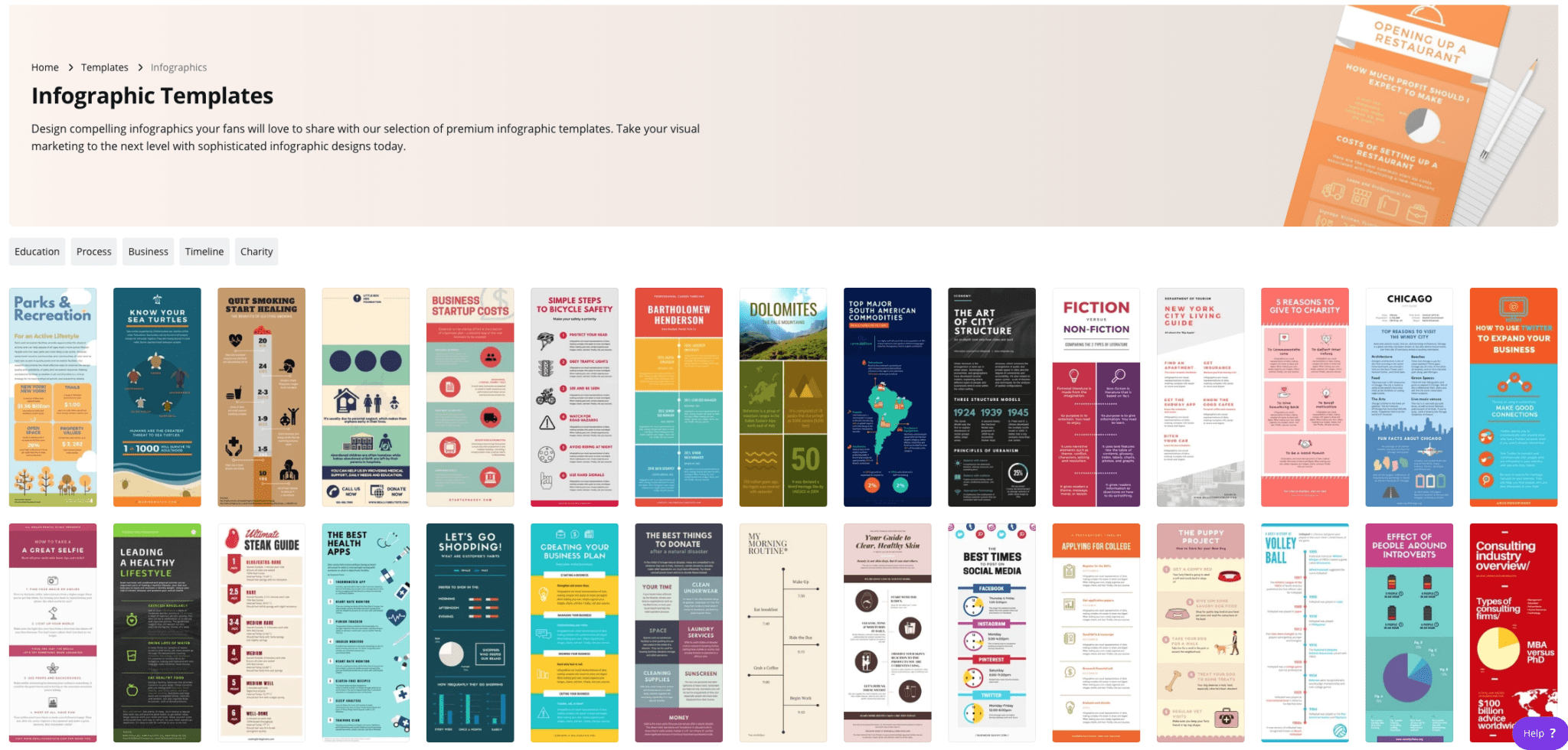
Helpful Tools for Creating Effective Infographics

Link to image: https://www.buzzfeednews.com/article/stefficao/friendship-pinterest-board-tiktok-trends
One of the most important tools for creating an infographic, is finding a solid platform to find useful photos and images pertaining to the topic of your graphic. One of the most useful platforms I have found for this job is Pinterest. Pinterest is an interactive social media platform that allows you to create a virtual “scrapbook” of images and links pertaining to your interests and needs. Once the user makes their own account, they are then able to browse through millions of photos, videos, links, and webpages curated to their specific interests. The user is then able to create virtual boards and folders that can be personalized with names to keep projects and ideas organized. All the user has to do is “pin” whatever image or link they may find interesting to one of their personal boards. Many times Pinterest is used for planning parties, costume ideas, organizational tips, style inspiration, and so much more. There is also a growing use of people sharing art, photos, and different images that can be used in digital design and the making of infographics. These images can help curate different aesthetics and appeal to different audiences’ moods and emotions.
Tools That May Helps Us Construct Infographics
Infographics are becoming increasingly popular over the years. With most information now being shared online there are some tools that can help you create the best infographic.
- Canva
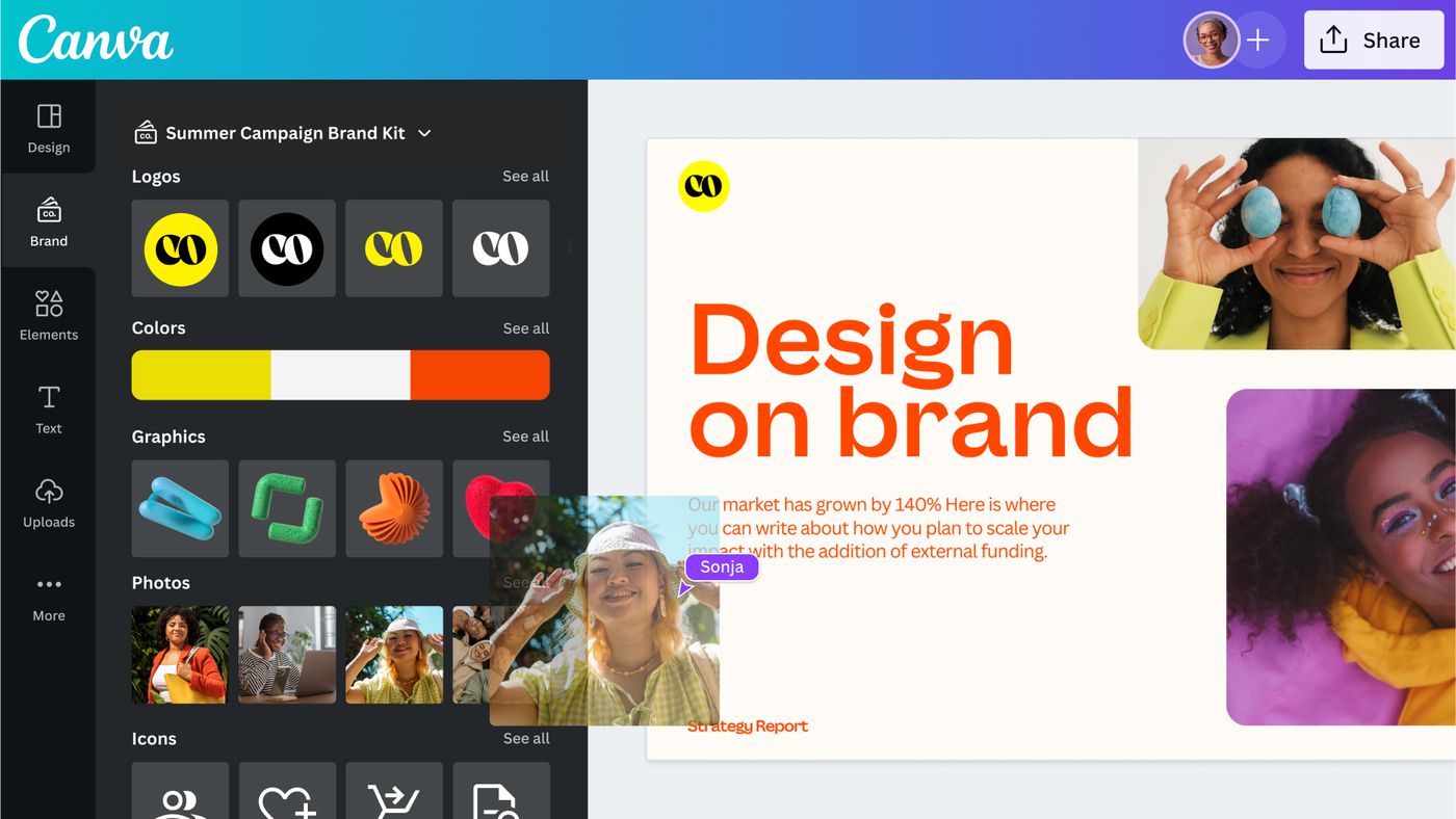
Canva is a free design webpage that provides hundreds of templates for flyers, posters, presentations, and more. If you do not want to use the templates you are still able to create your own work. They offer many options for graphics or you could upload your own. The website also allows you to share your design so multiple people on your team can work together. Students can sign up for CanvaEducation and get access to even more templates and graphics for free.
2. Procreate
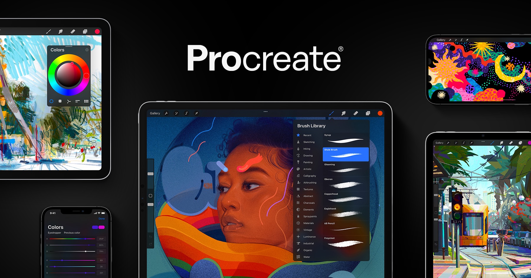
Procreate is an editing and art software that allows users to create artwork and edit images. It can be downloaded in the app store for Apple product users for $10. The app gives you options of multiple tools to draw, write, add images, and crop whatever you want.
3. Adobe Illustrator
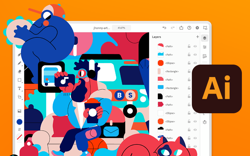
Similar to Procreate, Adobe Illustrator or Ai allows you to create just about anything you want. Ai can be downloaded on any desktop, PC, or tablet. It allows you to draw designs, add text, and upload graphics to your canvas. Adobe Illustrator does require you to have an adobe account and is free to download and use. However to unlock more features and tools it costs a monthly subscription $20.99.
Useful Dataset Repositories for Information Visualization.
With the overwhelming of data to sort through to begin working on your infographics, choosing where to start can be daunting. Here are a few websites to get you started:
UC Irvine Machine Learning Repository
Link: https://archive.ics.uci.edu
UCI Machine Learning Repository is a free repository of datasets purposed for machine learning, maintained by UCI. With over 600 datasets excellently catalogued this website has excellent datasets to work from and build ideas if you’re unsure where to start.
If you’re unsure where you want to start and you want a well curated dataset to start off with.
Kaggle
Link: https://www.kaggle.com
Kaggle is a similar resource to the UCI Machine Learning Repository, in that it is also a repository geared to machine learning and A.I. applications, but the breadth is much greater as it is not as well curated as the UCI collection.
Perfect if you have a good idea of the type of data you’re looking for.
Data.gov
Link: https://data.gov
Data.gov is the United States government’s free and open repository featuring data collected from census, state and lower governments, and other various agencies and bureaus from around the country.
Great for information directly related to statistics regarding state and national characteristics.
Insightful Data Visualizations
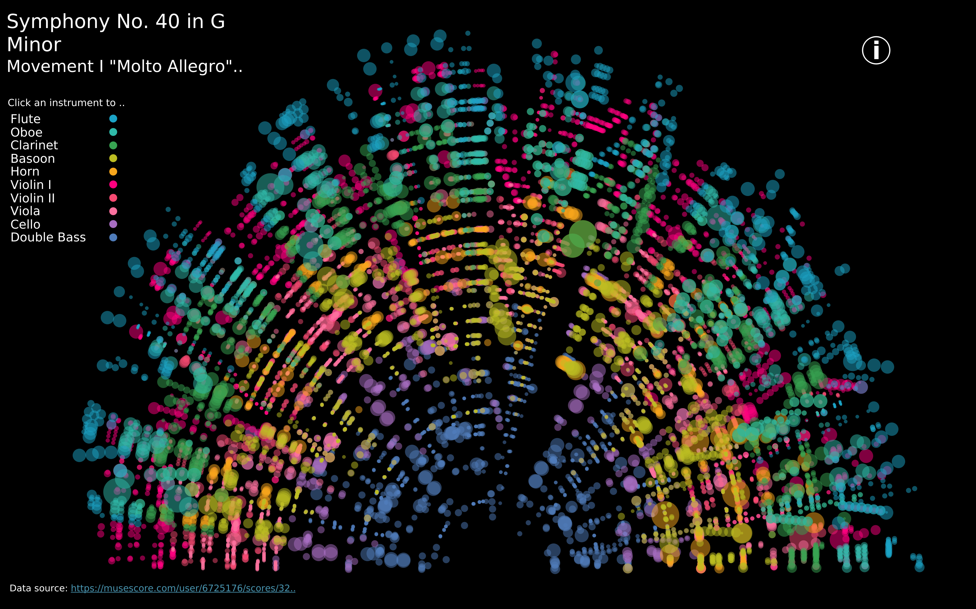
https://public.tableau.com/app/profile/louise.shorten/viz/BeautifulMusic/1_Mozart-SymphonyNo40
We live in such an information rich world that visualizations are everywhere. When we interact with our phones to get directions to our next location, we are met with a visualization that displays travel time, route, traffic, and other helpful data to help us choose how to navigate to our destination. This creates a data rich landscape that helps us understand more of what is going on in the world around us. Navigation and mapping visualizations have given us more efficient ways to commute, travel, and explore.
Other maps can be created using data that is not traditionally geographical. Pictured above is a visualization of Mozart’s Symphony 40 created by Louise Shorten using Tableau. This is basically a map of the sound. Different colors represent different instruments. The musical scale moves from the inside of the arc (lowest notes) to the outside of the arc (highest notes) with the size of each circle being the length of time each note is played. The song moves in time from left to right along the arc and each note has a position on that line. This type of visualization is very powerful because it allows us to interpret something we already interact with in a whole new way.
Click the link above to interact with this visualization.
Tools That Can Help Us Construct Infographics
Canva is interesting infographics that are also instructive is easy with Canva. It is so easy to use with its user-friendly interface and extensive library of templates and graphic elements.it is the perfect choice for individuals and organizations looking to visually engage audiences with complex data and statistics, and it can come at no cost to the user. If you are really ready to buy the program and want he full experience the full software is only $12.99 per month. Canva’s enables its users, regardless of prior experience in graphic design, to produce infographics that look polished and professional. Due to the wide range of pre-designed templates that are catered for various themes and applications, the final product will reflect the user’s message. To add, a variety of customizable components from Canva, like symbols, pictures, charts, and graphs, make it simple to modify infographics to meet specific needs. On the platform, groups of people may work together in real time to produce a more extensive and well created infographic visualization.
How to Make a Useful Infographic
Useful Steps:
A lot of work goes in to successfully presenting information. Infographics have become a more and more popular way to do so. Infographics portray data and information quickly and accurately to your audience. The first step to doing so is to truly understand what it is you are trying to explain. Once you do then you will begin data collection. This step is crucial because your data is your story, if your data is incorrect or doesn’t support your story then your visual will not be useful. After you have data that accurately reflects your idea you must be able to visualize it in a way that is not only clear but appealing to look at. The audience will not take much away from a visual that is confusing or dry. Avoid throwing too much information out in the infographic itself, let the visual do the storytelling.
Infographic Examples:
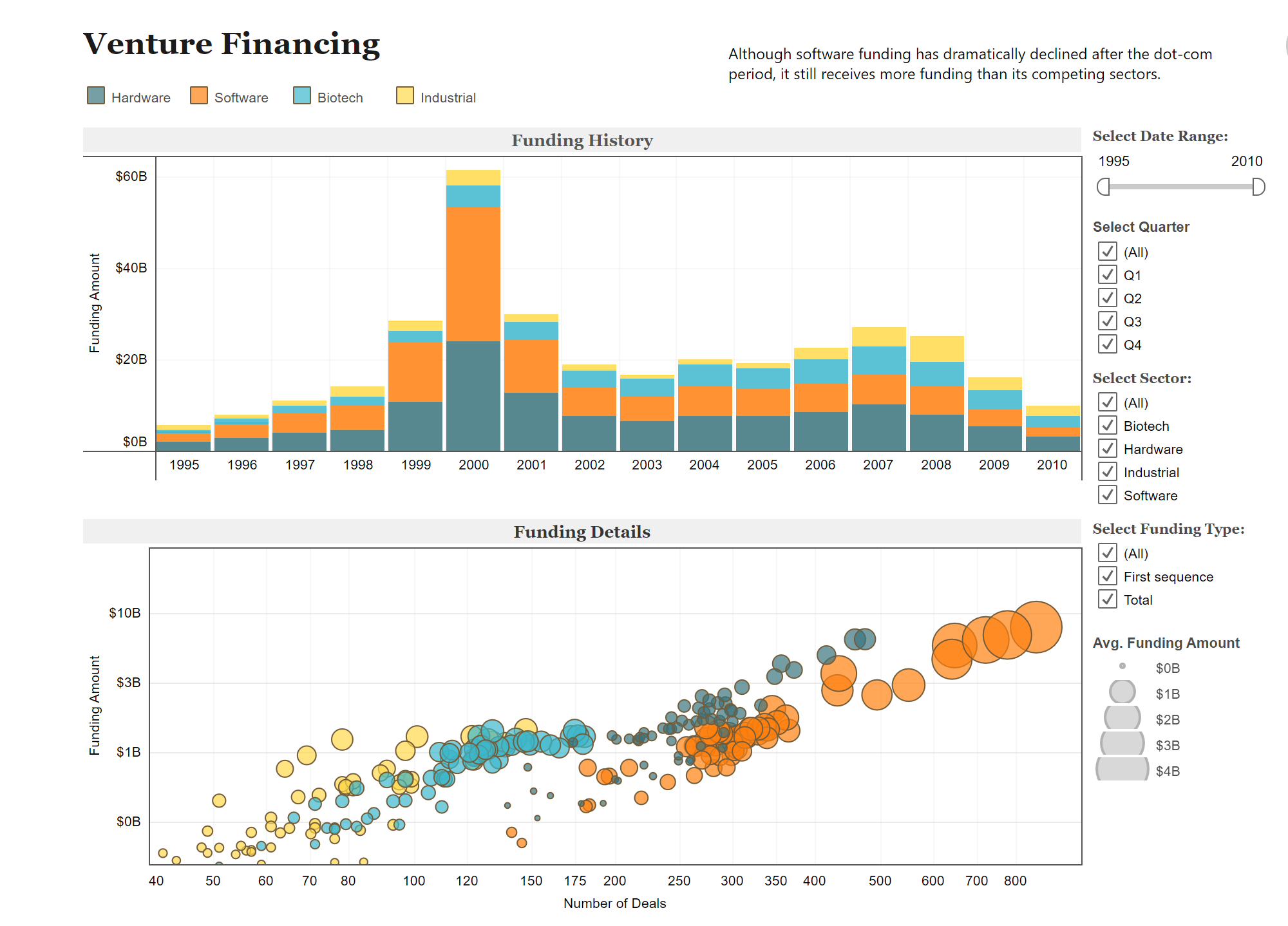
Below are two different charts using the same data to portray different messages. The use of colors are uniform between both graphs allowing you to flow back and forth between the two. Also helping that idea is how they stacked them on top of each other. Overall these two visuals provide a clear set of information that you could understand without really having any prior knowledge on the subject.
Data Set Examples
Attached is a link to a site with examples of many different, useful, data sets. Click the link to explore the different ways data can be manipulated.


Podcast: Play in new window | Download
Insightful Data Visualizations
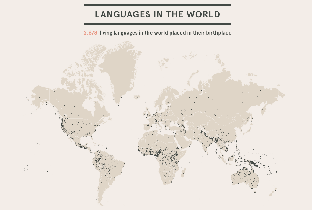
Link to Image: https://cdns.tblsft.com/sites/default/files/pages/6_after_babylon.png
Infographics are an inventive and creative way to share information with others and hold their attention. The beauty of infographics is that there is no specific way that one should look, leaving creators with hundreds of different layouts to choose from. One such way to share information is through a data visualization, as shown above. Data visualizations are a form of infographics that allow a person to share a set of data through one big image rather than multiple facts and smaller images. In the case of the data visualization above, viewers are able to see just how many languages are spoken in the world. The creator of this visual decided that the best way to do this was to use a map of the world, with each small black dot representing the general area/region of the language. A data visualization like the language one puts into perspective how many different languages are spoken not only around the world, but also in a general area or community, which is something that a lot of people may not have been fully aware of before. If the number of languages were just listed in a chart with the region that it is spoken, it may not have been as fully effective as the one above.
The creators of this data visualization are a part of a project known as After Babylon. Their goal, as stated on their website, was to analyze the “current linguistic situation of the world”. The map above was only one of many different maps and graphs shown on their website to help people fully grasp the language situation in the world. One of the brilliant features on their website was to make some of the maps and graphs interactive, making it easier to pinpoint languages and their origins for a full understanding. Overall, After Babylon’s work of the languages in the world using data visualizations and infographics proved just how important these tools are when it comes to sharing information with your audience and keeping them interested in the topic.
Insightful Data Visualization
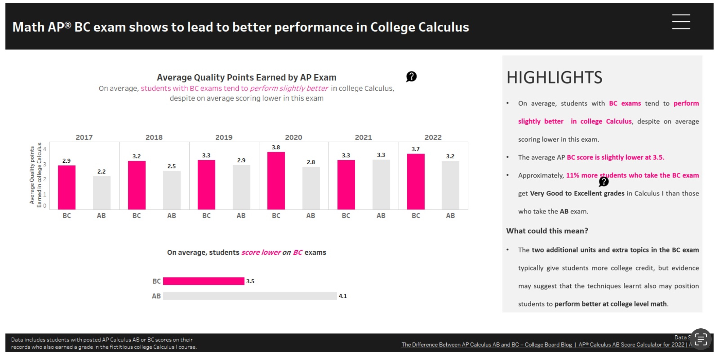
Data graphs are an essential way to display information effectively and efficiently. Graphs are essential to everyday and something seen all the time. Visual data has been around since 1786 when William Playfair used charts to showcase British trade and debts. One of the most important aspects of data visualization is clarity. In the image above, it depicts the relationship between student grades in AP Calculus and how well students perform on the test. What makes this infographic successful is the clarity shown throughout it. The infographic is clearly defined by the title given. They also included an interactive aspect to allow individuals to hover each column presented to view more details. By creating an interactive infographic, it causes more engagement due to the information scattered throughout. On the right hand side, they included important key details relating to the study. It allows for individuals to make their own discoveries and dissecting the information. According to UX Planet, “Insights are patterns in the observations we make in the world. They give us an understanding of a specific cause and effect within a specific context. They help us explain our observations.” Insights provide us with a different perspective in order to reframe the problem and provide a different way of thinking. The infographic above represents insightful data due to the offer of understanding of the topic.

Podcast: Play in new window | Download
Creating an Infographic
Here are some of the tools I found incredible to create an infographic in each pricing categories.
CANVA (Free)
Canva is a tool that perhaps well known among many especially younger people. Canva is hugely popular due to its simple way of creating an infographic, poster, presentation, etc… with a few touch of a button. As a free tool and with a wide selection template, Canva is no doubt a perfect place for creating high-quality visuals with no design experience required.
Adobe Illustrator (Monthly Subscription)
Adobe Illustrator is practically the industry standard and often the program of choice for professional graphic designers and digital artists. Its available tools and features allow to efficiently create and edit high-quality designs for a wide variety of uses. Comparing to other free choices, Adobe Illustrator is much more difficult to use due to professional settings. Adobe Illustrator is costly to use as its monthly subscription does not come in one application rather than a package with multiple applications.
Affinity Designer (One-time Purchase)

Designed as a cheaper alternative to Adobe Illustrator but a strong rising competitor. Affinity Designer can be use in a similar way to Adobe Illustrator but it has a much more gentler slope of learning comparing to its predecessor. Designer is also available to many platform with its iPad app became one of the best and best selling design apps on the market. One down side of Affinity Designer using on multiple platform is the need to purchase separately for tablet version and PC/Mac version.
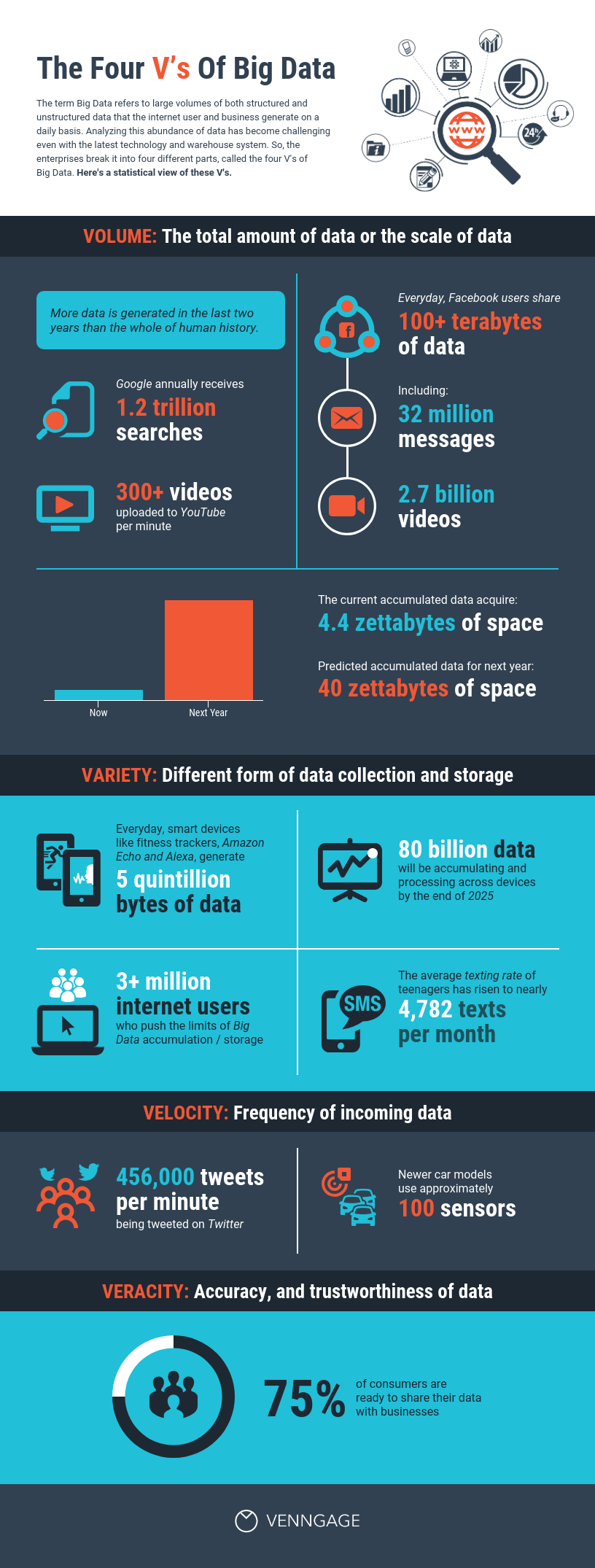
Effective Data Visualization
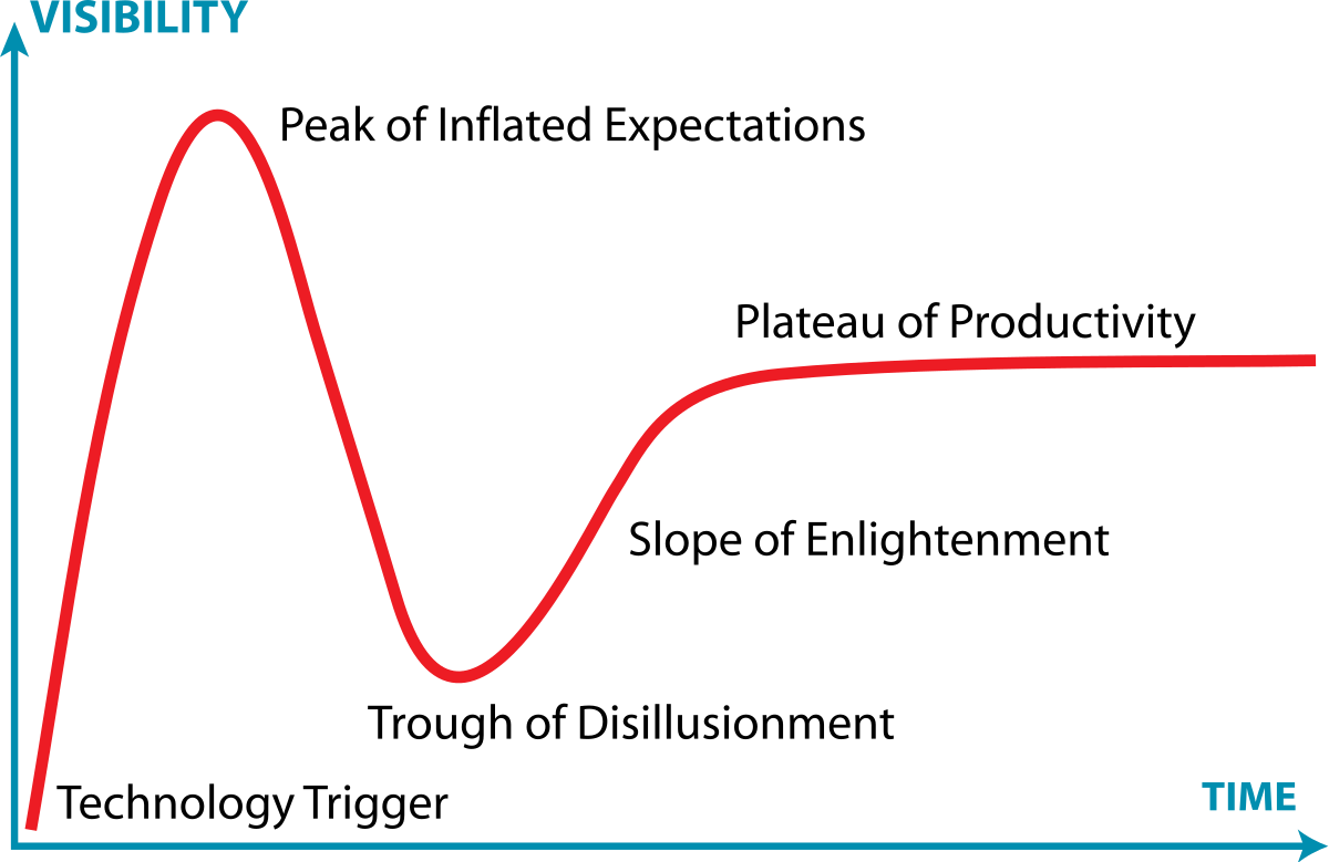
Infographics are visual representations of any information or data that can be displayed through images, charts, or icons. The goal of using these is to summarize or break down concepts more concisely. I researched examples of insightful data visualizations where I found Harvard’s Business review article that covers this topic. The article highlights the importance of storytelling through infographics to engage with observers efficiently. Examples about creating visualizations that are informative is included in the text. One of the topics spoke on the Gartner Hype Cycle, it is “traditionally data-driven form—a line chart—but no actual data” which is a graphical representation used in research to track data. It is done using complete visuals to analyze progression of technology (Harvard Business Review). The circumstances are very business based and are used in real life situations which I found very interesting.
Podcast: Play in new window | Download