Art of Information: Free Infographic Tools
There are many websites that offer free, easy to use, infographics. I found one called Piktochart. Very easy to sign up at (piktochart.com).
With infographics, we know there is visual engagement, storytelling, clarity and simplification if done correctly. With the right visual, it becomes more memorable and sharable. People tend to remember information that is presented with an infographic.
Below is an example of an infographic and its editing tools.
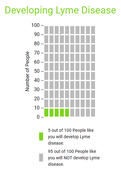
Developing Lyme Disease
I found Icon Array very useful and easy to use. I liked how it allowed me to change font size, color, etc. I would use it for simple data and no-frills visualizations to display for an audience. I played around with the colors for my example.


Podcast: Play in new window | Download
Using Visualization in Health
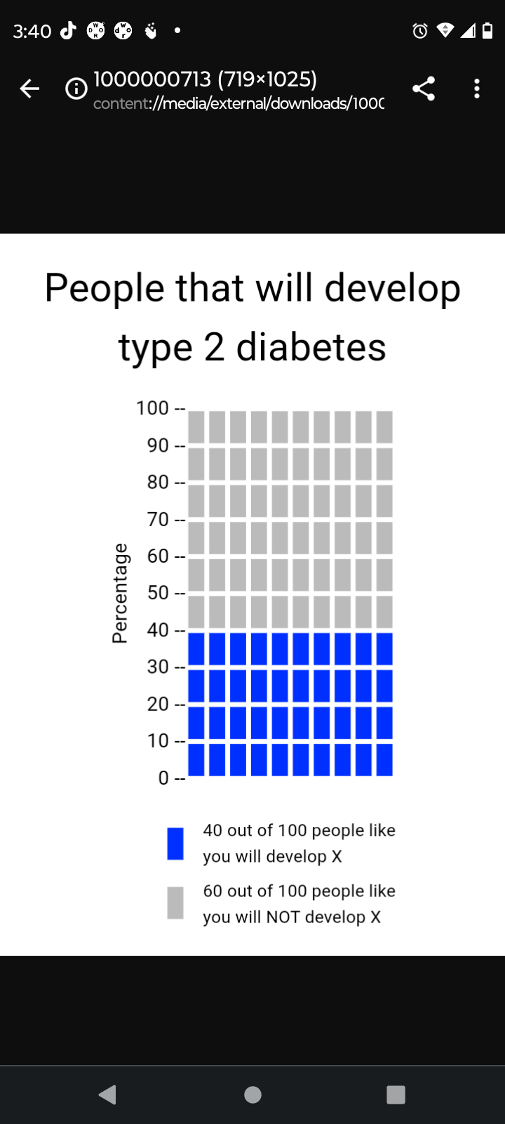
The implementation of visualization in health is a very crucial part in simplifying health literacy for the average individual/patient. This is especially true when one considers that patients come from many different cultures and backgrounds, all of which have an abundance of different languages. If done properly, a visualization transcends language barriers and cultural differences between a patient and a healthcare provider. With that being said, the Visualization in health website offers a variety of resources in order to create a proper visualization. To begin with, the website offers many different options for the types of graphs someone can use in order to measure a certain topic. There are disparities graphs and individual risk graphs which measure the likelihood of someone having a certain type of diseases/condition. There are also very simple risk graphs which can tell one their likelihood of contracting a certain type of disease based on the individuals health. As seen above, a simple graph was created in order to show the likelihood of someone contracting type 2 diabetes within their lifetime. The data being shown is very easy to understand and the graph properly conveys the values with proper labels. All of this was done in the span of 2 to 3 minutes and the features were very user friendly. People all around the world can use these features not only to see their likelihood of contracting a certain medical condition but also to find out what their current level of fitness is. All in all, this website can be used by both health professionals and regular patients in order to find out information and is a major part of data visualization.
Using Arrays for Data Visualization
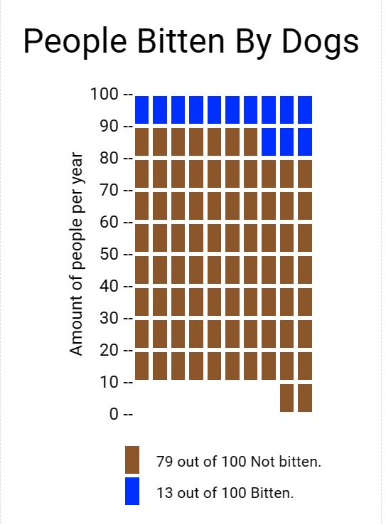
My experience using icon array was good. I enjoyed how easy the cite was to use and navigate. The array tool was very easy to use. I think this tool can be very beneficial for data analysis and visualization. I developed this array on the percentage of people who were bitten by dogs per year. As you can see the data is very easy to visualize and understand, which is why I like this method of data presentation. I believe others should use array icon too in any type of presentation they may have.
vizhealth.org – An excellent data visualization source
“Vizhealth” is an excellent website that provides information pertaining to data visualization in the health and science field. Specifically, their goal is to aid individuals with the creation process of infographics. A focus for these infographics is usually conditions affecting one’s health, incorporating risk as the primary concern. Resources like this one are extremely important, as the statistics surrounding severe illnesses and conditions are often quite complex and difficult to interpret for the affected general public.
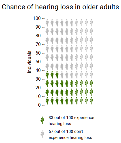
Using vizhealth.org and their “Icon Array Generator” tool, I was able to create this quick and effective chart at illustrating one’s chances at experiencing hearing loss past the age of 65. This chart could be useful in the sense that some people may not be aware of such odds. This image is based on original research and designs from Visualizing Health, a collaborative project between the University of Michigan and the Robert Wood Johnson Foundation made publicly available via Creative Commons license. Our use of this image should not be considered an endorsement from Visualizing Health. For more information, visit www.vizhealth.org.
Sources:
Zikmund-Fisher, B. J., & Witteman, H. O. (n.d.). Icon Array. Iconarray.com. Retrieved September 23, 2023, from https://iconarray.com/
National Institute on Aging. (2018, November 20). Hearing loss: A common problem for older adults. National Institute on Aging. https://www.nia.nih.gov/health/hearing-loss-common-problem-older-adults
Cardiovascular Health
Through the visualizing health website I gained useful knowledge of a beneficial new tool. This website allows you to view different scenarios and how they may affect your health. For example in the risk calculator you could fill in statistics that resemble yourself and see how you fair against developing certain health risks. I tried multiple different outcomes to see the differences in outcomes. Things like smoking and body weight were key factors for risk of cardiovascular disease risk. A website such as this one can be a valuable tool for people concerned for their health and want to evaluate risk.
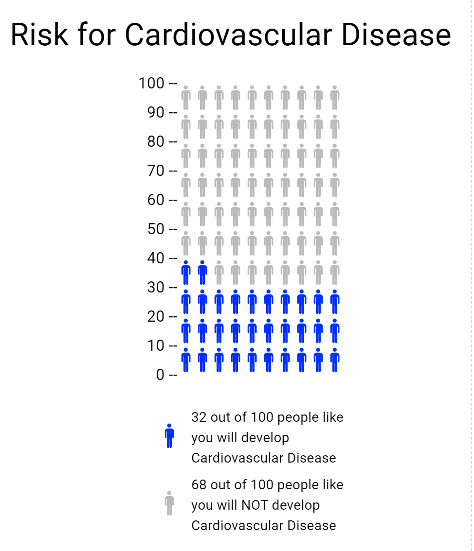
The icon array was another tool on the website used for creating a visual representation of risk. I used it to build on to the cardiovascular health from the risk calculator. I took a percentage from that and then made it into an array, pictured below.
Vizhealth
Visualization plays a crucial role in health science fields in terms of health education, analysis of numerical values, diagnosis treatment, and research. In this blog two important items: first of all risk calculator and second of all icon array. In the risk calculator going to calculate how much risk of cardiovascular risk in the next 10 years. The exciting thing about a risk calculator calculate the data and gives information in a color graph which basically, makes complex data into simplified information. The Icon Array Generator uses small icons to represent data.
Example of Risk Calculator
This is the chart used based on my father’s blood report in which I enter the data of cholesterol and blood measure at risk calculator. Finally, data visualization is the best tool to crack the numerical data into graphs.
Example of Icon Array
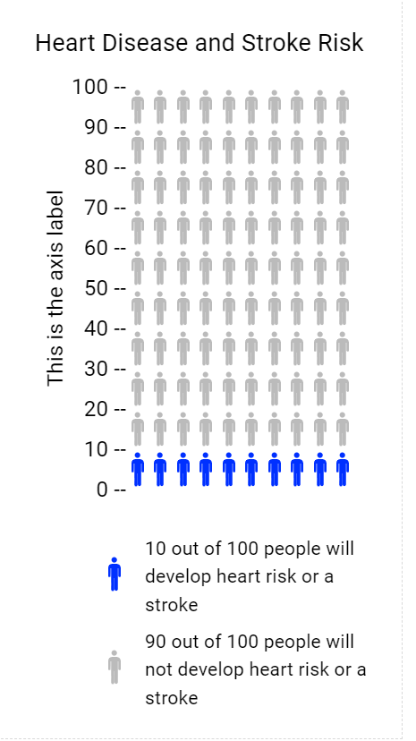
The Icon Array Generator I chose the topic of Heart Disease and Stroke Risk. Colored icons show the frequency of those at risk of Heart Disease and Stroke Risk and uncolored icons show the frequency of those not at risk. Both these tools of visualization are helpful techniques in the health science field. In addition, the Icon Arrays method is usually used in surveys, gathering data from worldwide, and many more.
Reference
www.cdc.gov
VizHealth
Risk Calculator
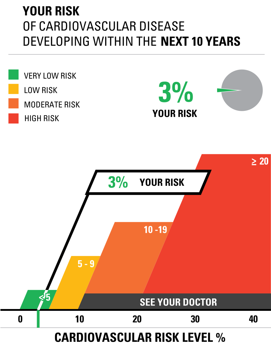
I entered demographic data into the risk calculator and say how it displayed different images based on the data I provided. Based on the information that I entered into the Risk Calculator, it was interesting to see how the graph and percentage changed. As a I played with the generator, I discovered that if I input higher numbers and the risk factor changed percentage rate, my risk of developing Cardiovascular Disease within the next 10 years increased to 7%.
Icon Array Generator: ASD Prevalence
By utilizing the IconArray, I was able to display the prevalence of children with ASD in comparison to children without ASD. Using the data statistics found here, I was able to create an IconArray. As I was creating my icon array, I discovered that I was not able to use percentage statistics, so I was unable to use the data that I had previously wanted to use. Using this tool, I was guided through the steps of how to construct an icon array and provided with options for how to customize your own, which was a new experience for me since I had never created one before. For learning about Data Visualizations, the Icon Array generator step-by-step instructions on how to create an icon array that visualizes the data. In my field of Health Science, I am always interested in applying different data visuals that I learn to my related field. In general, I felt the site offered some valuable aspects when it comes to learning about data visualizations. It offered gender-specific icons as well as an option to chose a shape to depict a graphical representation of the data. As a result, I was able to change the title and subheadings in order to indicate to audience viewers what data I was discussing rather than just displaying icon arrays with no intended meaning.
Insightful Data Visualizations
Crash Course YouTube and Website
Infographics are a creative and fun way to better explain information in a way that sticks with the reader more effectively.
They are used in both professional and academic settings to aid in learning for all ages across all subjects.
One of the best aids in not only data visualization, but in general learning is the YouTube channel and website “Crash Course“.
These two brothers create informative videos and lessons that give you a ‘crash course’ in a particular subject or topic. By browsing their YouTube channel you can see over one thousand videos categorized in different playlists by subject. These videos can aid anyone in continued learning at any age.
While these videos are not in depth each contains immense amounts of information , cited by reputable sources, as well as each links resources for you to delve deeper into each topic.
These videos are filled with different infographics, they even have a video about data visualization, that help the watcher better understand the information better. As a partner of PBS Studios these brothers are aiding in bringing free education to everyone.
They have a diverse and inclusive creation space that can be appreciated by any learner.
In their two video course on data visualization another member of the team explains the different ways and forms of infographics.
Watch both videos here:
Watching any of their content will help you become just a little more fluent in any topic. If more interested be sure to check out their links as well!
Sources:
https://thecrashcourse.tumblr.com/downloads/stats
Vizhealth
I truly believe that including visualizations in an event improves its relatability by enabling people to see it take place in front of their very eyes. Take the blood pressure visualization as an example, where viewing the actual numerical values expressed as percentages makes them more relatable and understandable. Having a concrete object of focus makes it easier for people to understand and integrate difficult topics by giving them a visual depiction.
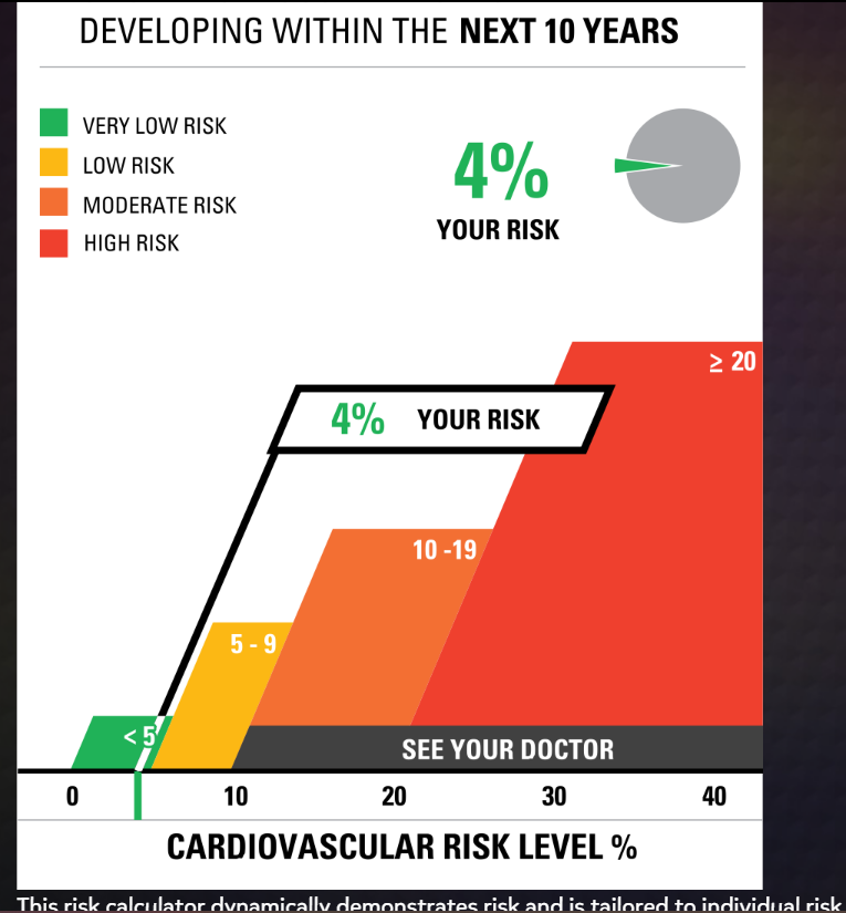
For the first chart, I used my mother’s real doctor cholesterol data. She agreed with the correctness of the final data visualization, demonstrating the validity of the visualization tool.
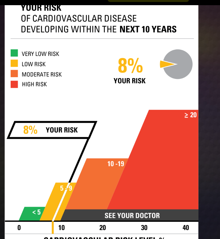
For the second one, I raised the numbers in every bar a little bit higher and checked yes for smoking and dietbites. I was shocked to find that it only went up 4 points. I was expecting a lot more.
The Icon Array Generator was an instrestiing graph. I played aroudn with this for a little bit and made my own on hair data
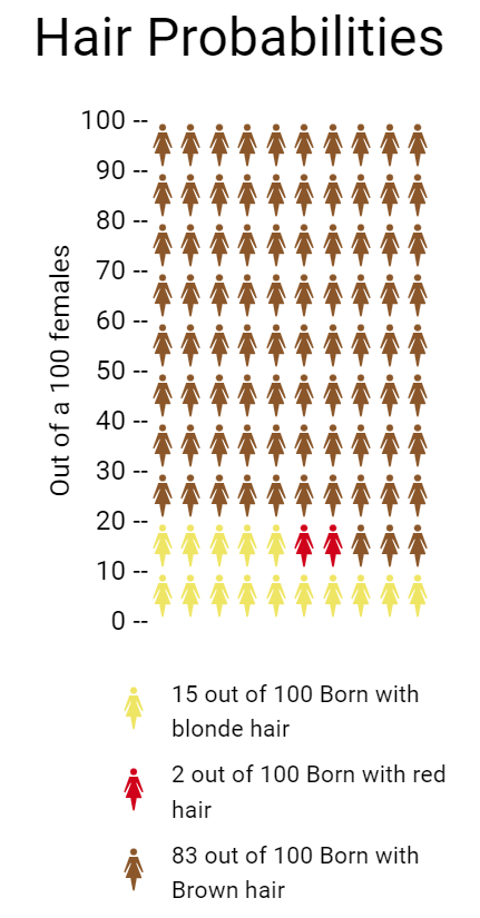
- Blonde Hair: Approximately 10–15 people out of 100 may have blonde hair. This is a very general estimate.
- Brown Hair: The majority of the global population has brown hair, so a significant proportion, around 70–80 people out of 100, may have brown hair
- Red Hair: Red hair is relatively rare, and only around 1–2% of the world’s population has red hair. So, roughly 1-2 people out of 100 may have red hair
per https://www.eupedia.com/genetics/origins_of_red_hair.shtml