When presenting a variety of information, such as comparing numbers, graphs and tables are the most effective means of presenting. The use of visualizations is an excellent method of creating visual representations that are complex to explain verbally. Chart interpretation and design can be challenging, especially when you have to construct imperative information, such as in health-related topics where reliability and validity are of utmost importance.
How to Ensure Self-explanatory Graphics
During my research, I found a resourceful website that provides guidance and further explanations about how we can improve our ability to create visuals. This is especially true when numbers are involved. This is in a manner that our audience can understand. During my research, I found a resourceful website that provides guidance and further explanations about how we can improve our ability to create visuals. This is especially true when numbers are involved. This is in a manner that our audience can understand. Using the website AHRQ, we can create our numbers comparison infographics with in-depth detail and pictures that along with their information.
AHRQ: How To Interpret Bar Charts Effectively
Below are a few tips provided by the Agency for Healthcare Research and Quality AHRQ to assist you in this process.
- Bar charts are examples of visuals easily understood by your audience. This is if you use a tool to make this type of visual more intuitive. Rather than displaying multiple responses in a single barm you can be display the response most meaningful to your audience.
- It is important to provide additional resources. Providing additional labels that correspond with the numbers you are presenting allows the audience to remain focused on the topic you are presenting and the numbers that align with the data being displayed.
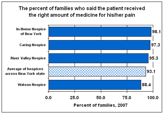
- Design plays an important role when color visuals and different shades are involved since you want your audience to be able to identify which numbers correspond to which color. The following image illustrates the use of the patterned bar when comparing more than one type of data.
- As well, it is imperative to ensure that the title or label of the bar chart accurately describers what the bars represent.
There are also several helpful tips provided on the AHRQ website on how to use things like symbols when comparing multiple numbers. The use of graphics as visuals means of displaying information to your audience or reader is highly prevalent in healthcare, therefore I shared tips that have grown most useful to me and can be applied to other professions when designing data visualizations.
I like your explanation of the important steps to properly interpret a bar chart. That section was well-organized and informative. Also, numbered lists break up the reading slightly to make it easier to understand. One addition I would make to your information is where you reference a source you used you could link it beneath so the audience also has access to it.