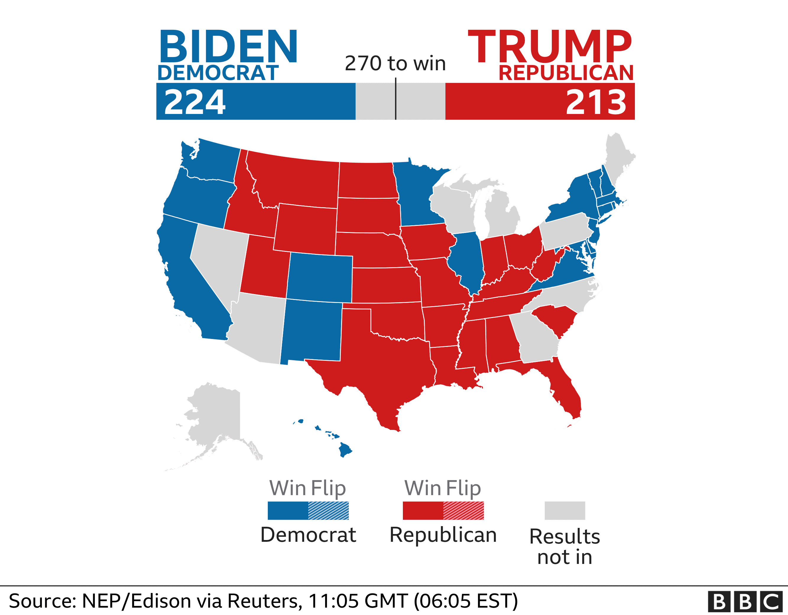
When analyzing multiple sets of data we must remember what the message is that we want to convey. While comparing two numbers to each other it is imperative that we portray them in a way that is easily readable for our audience. The first comparison visual that came to my mind is an election map. The reason this stood out to me is that they compare multiple things at once. They share with the audience the overall electoral votes for each candidate using raw numbers and then share where they came from using color on the states. These are a perfect example of how we want to compare our data, show the data and then the evidence for why it is this way. Pictured below is an example from 2020, notice how easy it is to comprehend at a glance.
Comparison Tools
There is countless ways to do analysis of data to create a comparison visual. The most user friendly is Microsoft Excel to record data and to evaluate it. There are many others however, companies are finding quicker and easier ways to take your data and do this work for you. Coding is something a little less user friendly and understood so companies are taking advantage of this knowledge and creating programs to do analysis and data comparison for their customers. One of these companies is Segment, collecting data “The right way”. These companies are extremely marketable to other organizations who want to do some research and development and don’t have the means to do it themselves.
Attached below is a link to the segment website which includes a product overview and tutorial.
Hi Joe, I really like your comparison chart. It attracted me at first sight because of the way you designed it. Mapping visualization we used to identify regions with connectivity, trends. In addition, Mapping data visualization is a good visualization tactic. In this blog, the way you mention about election ballot is quite impressive. Also, the color represents the winner of particular parties in each state so it is helpful for the reader to understand. I have one site for you to recommend where you can build your own data and apply into mapping visualization.
http://www.piktochart.com
Hey joe, I completely agree with an election map being one of the most simple to understand data comparisons out there. Each candidate is assigned a color and the state that votes for them is assigned the same color. It is a visualization that makes it very simple to understand which political candidate currently has the upper hand and from where most of there votes are coming from (i.e. southern, northern states etc…). With that being said, one thing that I would suggest would be to include more detail and examples within the comparison tools sections. Otherwise, this was a very informative and good blog post to read.