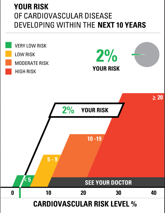
This week I tested out a website called Visualizing Health. I first checked out their risk calculator. While I enjoyed seeing what my risk factors were for cardiovascular disease and using the tools to see what my family members risks are I found it odd that I could not adjust the age any younger than thirty years old. While I believe this is risk calculator is a nice way for people to get a grasp of what their health is I am unsure of how accurate it can be if I am unable to put the correct information in some slots.
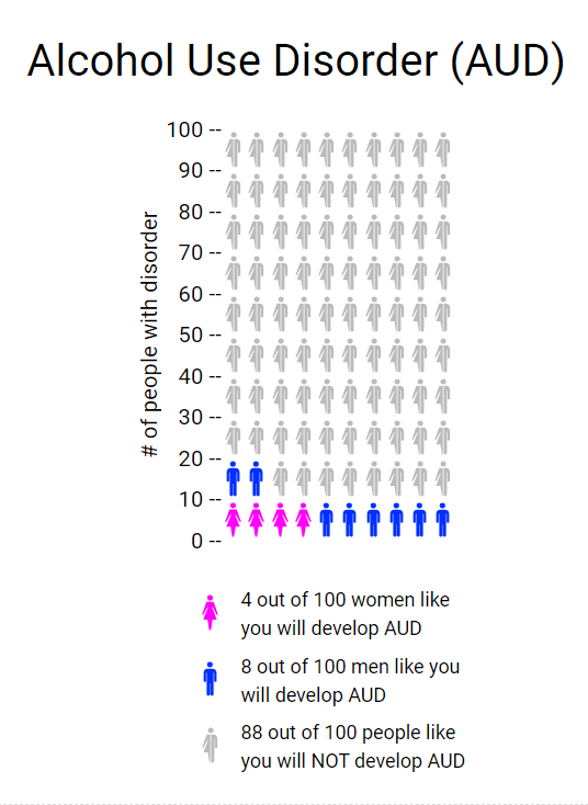
The second thing I tried on the website was the Icon Array feature. This tool allows the user to create an infographic to show the percentages of people (male, female, or both) and their likelihood for developing a disorder or illness. I really liked this tool as it was relatively easy to navigate and is a good visual aid for those who do not learn topics well simply from reading text. My only wish is that they provided other sorts of charts and ways to display data as putting things into a ratio can sometimes make numbers look very small. Twelve out of a hundred seems like a small percentage, but when talking about population that is a large portion of Americans. Overall I think I would use this tool again or something similar.