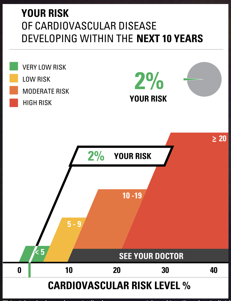
This weeks chapter in Effective Data Visualization was about the importance of a single number. Sometimes the impact of an important data point is obscured by too much other information. The icon array seemed to be difficult to create in excel but the VizHealth website has a great tool that health care professionals can use to convey complicated data in a simple and concise way to patients and other interested parties.
The risk calculator tool on the site was extremely easy to use and I can see the application for health care professionals to input a few data points while speaking with a patient and being able to give the visualization with the patient summary at the end of the visit. This cardiovascular risk data can be especially useful with people who are tracking lifestyle changes recommended by their provider. Visualizations of progress can be very motivating. This infographic is very well designed and highlights the important facts in a way that is easy to read for most people.
Smoking is a large contributor to negative cardiovascular health outcomes so I checked the CDC website for some statistics on how many adults in the United States currently smoke. The number was quite higher than I imagined at approximately 12 percent.
While I chose to show two different types of information in the graphics, I think both types of visualization are great for multiple applications. The visualization has a great deal of potential and is much more sophisticated in design. Tracking metrics and benchmarking would be great with the first type of visualization.
The icon array is great because it is a simple way to convey a percentage. You can imagine each one of the icons as a person in a room. It can be used for so many different applications and is more universal and probably easier to understand for most viewers. I also appreciated that the icon generator had options for gender neutral because it allowed for me to use data that was aggregated to adults vs. mens’ data vs. womens’ data.
https://www.cdc.gov/nchs/data/nhis/earlyrelease/earlyrelease202304.pdf
These images are based on original research and designs from Visualizing Health, a collaborative project between the University of Michigan and the Robert Wood Johnson Foundation made publicly available via Creative Commons license. Our use of this image should not be considered an endorsement from Visualizing Health. For more information, visit www.vizhealth.org.