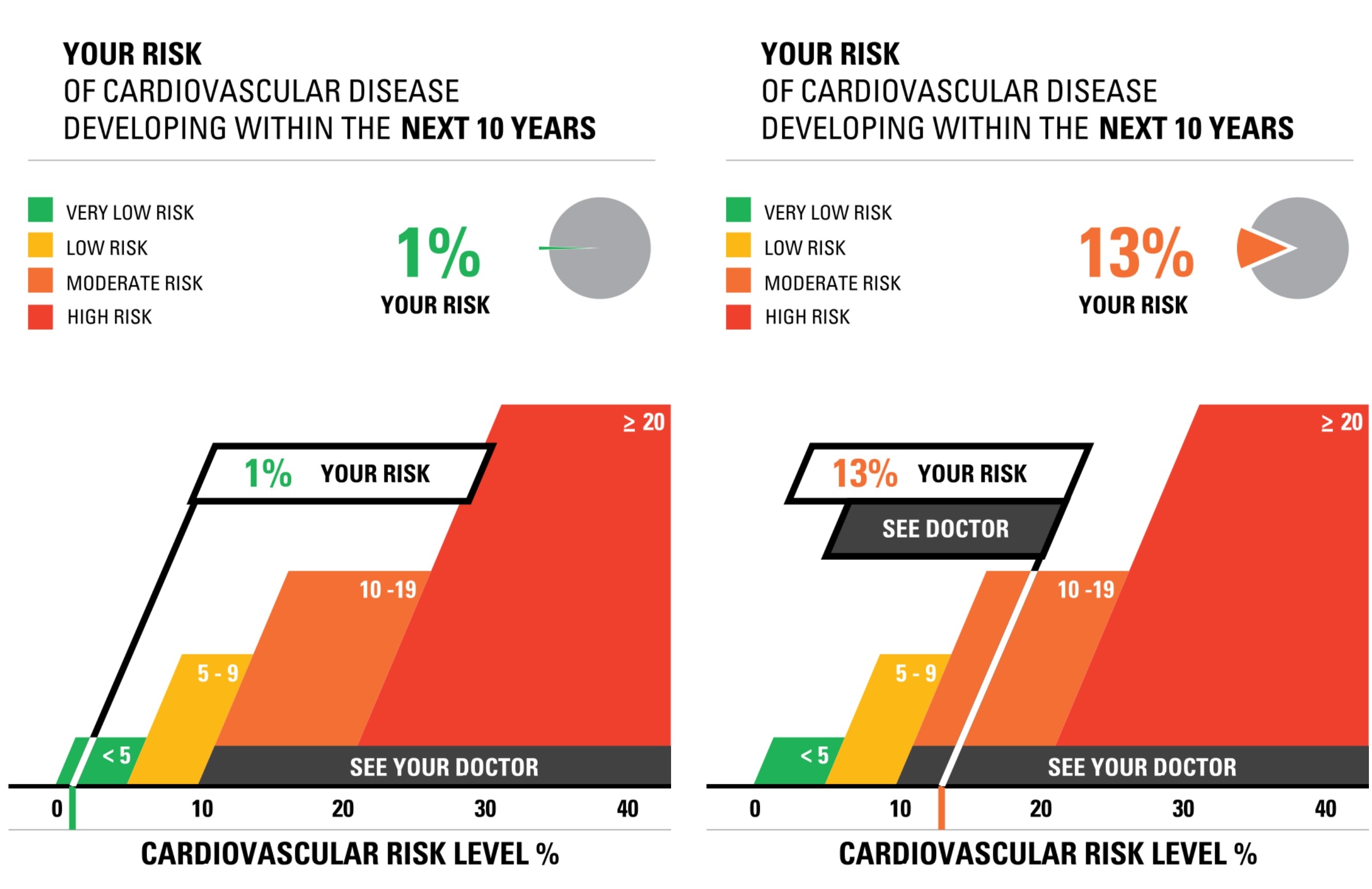
The site for Visualizing Health was very informative and neat to use. There were two data sets/numbers that I messed around with while using the risk calculator. The first was a young female (average height and weight) with normal levels for cholesterol, blood pressure, and overall good health. When I ran this calculator, I found that the risk for developing a cardiovascular disease was around 1%. I then ran the test again with a middle aged man (average height and weight) who had slightly elevated cholesterol and blood pressure, and was a smoker. The results for this test showed a 13% chance of developing a cardiovascular disease. While the website states that someone should not go directly based on this information and should still consult a doctor or another professional, I do believe that this provides a good starting point for someone who is concerned about their health and odds of developing a cardiovascular disease.
When I tested out the Icon Array generator, I felt as though I had a pleasant experience with it. Everything was very easy to navigate and understand, and it is a quick and easy tool to go to whenever someone has to create data visualizations such as this. I think it is beneficial that there are only four options for shapes and anywhere between 2 and three colors used. It makes it easier to look at and still very impactful in the end. The Icon Array I decided to create was based on the odds of women developing breast cancer. Upon research from the American Cancer Society, I found that 1 in 8 women develop breast cancer at least once in their lifetime, which translates to about 13 women out of 100. This data visualization is more impactful than simply hearing the statistic because it gives a better visual representation of just how many people are affected. I also like that I was able to change the color of the icons to light pink to represent and match the color for breast cancer. This simple feature once again makes it very impactful.
Overall, the sight is definitely valuable for learning about data visualizations because it teaches two simple ways to make data visualizations and is interactive, so learners are able to practice and have fun with it, which is key in learning these days.