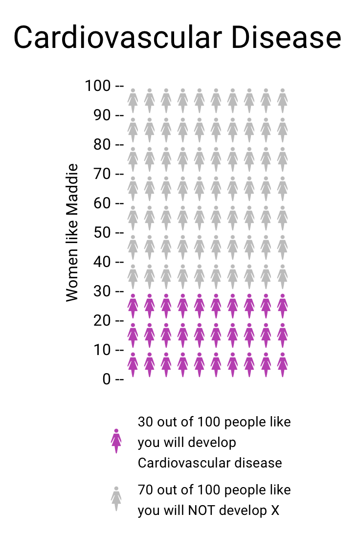
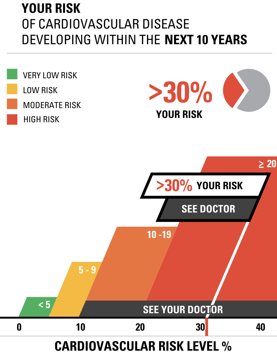
Vizhealth was a very interesting website to navigate and learn from. Two of the tools I used that helped create the data visualizations above was the risk calculator and the icon array generator. The first tool I used was the Risk generator. It prompted me with some questions to answer regarding my health, age, and other personal information. I decided to have fun with the calculator and input information that reflected an older woman with high cholesterol levels. The calculator then generated the visualizations to the right above to help me understand the results better. I think this is very helpful for visual learners in all fields, but especially the healthcare industry. This industry could not exist with performing studies and experiments, and these visualizations help make understanding results, ten times easier. After using this calculator, I then used the icon array generator. This tool was useful in visualizing the comparison between the true likelihood of a person with a similar health history to this woman developing cardiovascular disease.