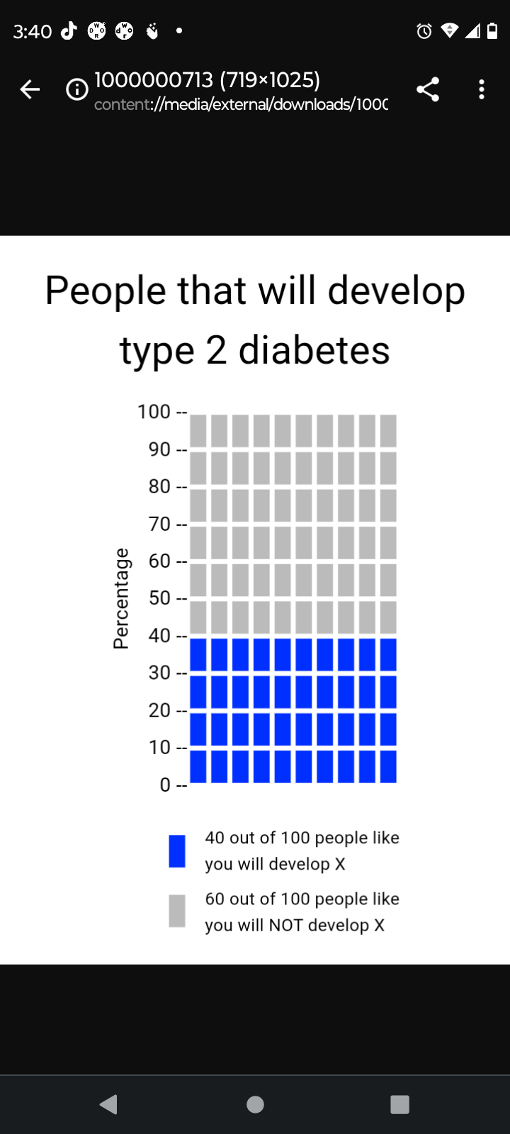
The implementation of visualization in health is a very crucial part in simplifying health literacy for the average individual/patient. This is especially true when one considers that patients come from many different cultures and backgrounds, all of which have an abundance of different languages. If done properly, a visualization transcends language barriers and cultural differences between a patient and a healthcare provider. With that being said, the Visualization in health website offers a variety of resources in order to create a proper visualization. To begin with, the website offers many different options for the types of graphs someone can use in order to measure a certain topic. There are disparities graphs and individual risk graphs which measure the likelihood of someone having a certain type of diseases/condition. There are also very simple risk graphs which can tell one their likelihood of contracting a certain type of disease based on the individuals health. As seen above, a simple graph was created in order to show the likelihood of someone contracting type 2 diabetes within their lifetime. The data being shown is very easy to understand and the graph properly conveys the values with proper labels. All of this was done in the span of 2 to 3 minutes and the features were very user friendly. People all around the world can use these features not only to see their likelihood of contracting a certain medical condition but also to find out what their current level of fitness is. All in all, this website can be used by both health professionals and regular patients in order to find out information and is a major part of data visualization.