Visualization plays a crucial role in health science fields in terms of health education, analysis of numerical values, diagnosis treatment, and research. In this blog two important items: first of all risk calculator and second of all icon array. In the risk calculator going to calculate how much risk of cardiovascular risk in the next 10 years. The exciting thing about a risk calculator calculate the data and gives information in a color graph which basically, makes complex data into simplified information. The Icon Array Generator uses small icons to represent data.
Example of Risk Calculator
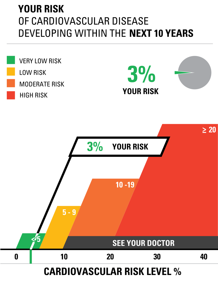
This is the chart used based on my father’s blood report in which I enter the data of cholesterol and blood measure at risk calculator. Finally, data visualization is the best tool to crack the numerical data into graphs.
Example of Icon Array
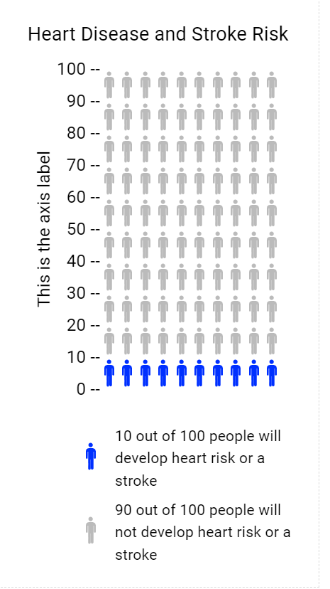
The Icon Array Generator I chose the topic of Heart Disease and Stroke Risk. Colored icons show the frequency of those at risk of Heart Disease and Stroke Risk and uncolored icons show the frequency of those not at risk. Both these tools of visualization are helpful techniques in the health science field. In addition, the Icon Arrays method is usually used in surveys, gathering data from worldwide, and many more.
Reference
www.cdc.gov