I truly believe that including visualizations in an event improves its relatability by enabling people to see it take place in front of their very eyes. Take the blood pressure visualization as an example, where viewing the actual numerical values expressed as percentages makes them more relatable and understandable. Having a concrete object of focus makes it easier for people to understand and integrate difficult topics by giving them a visual depiction.
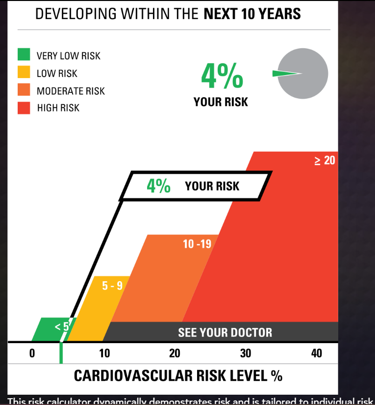
For the first chart, I used my mother’s real doctor cholesterol data. She agreed with the correctness of the final data visualization, demonstrating the validity of the visualization tool.
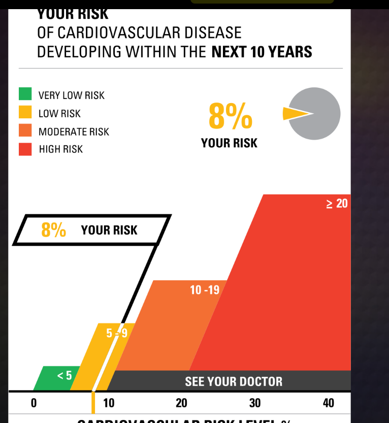
For the second one, I raised the numbers in every bar a little bit higher and checked yes for smoking and dietbites. I was shocked to find that it only went up 4 points. I was expecting a lot more.
The Icon Array Generator was an instrestiing graph. I played aroudn with this for a little bit and made my own on hair data
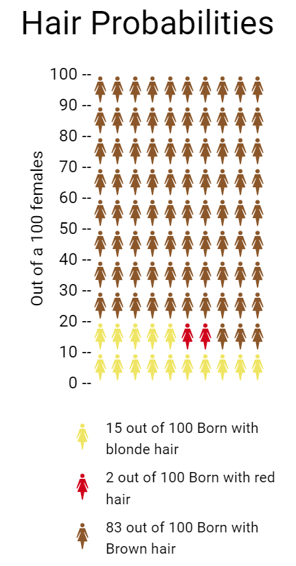
- Blonde Hair: Approximately 10–15 people out of 100 may have blonde hair. This is a very general estimate.
- Brown Hair: The majority of the global population has brown hair, so a significant proportion, around 70–80 people out of 100, may have brown hair
- Red Hair: Red hair is relatively rare, and only around 1–2% of the world’s population has red hair. So, roughly 1-2 people out of 100 may have red hair
per https://www.eupedia.com/genetics/origins_of_red_hair.shtml