https://public.tableau.com/app/profile/louise.shorten/viz/BeautifulMusic/1_Mozart-SymphonyNo40
We live in such an information rich world that visualizations are everywhere. When we interact with our phones to get directions to our next location, we are met with a visualization that displays travel time, route, traffic, and other helpful data to help us choose how to navigate to our destination. This creates a data rich landscape that helps us understand more of what is going on in the world around us. Navigation and mapping visualizations have given us more efficient ways to commute, travel, and explore.
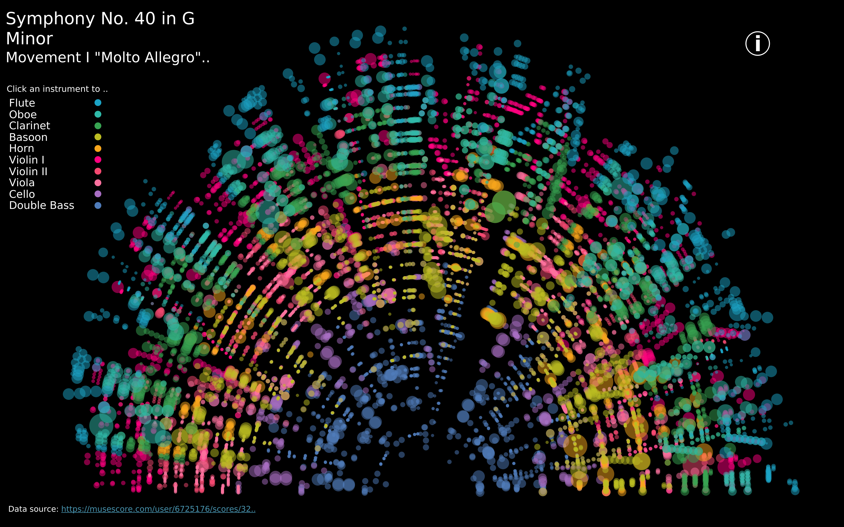
Other maps can be created using data that is not traditionally geographical. Pictured above is a visualization of Mozart’s Symphony 40 created by Louise Shorten using Tableau. This is basically a map of the sound. Different colors represent different instruments. The musical scale moves from the inside of the arc (lowest notes) to the outside of the arc (highest notes) with the size of each circle being the length of time each note is played. The song moves in time from left to right along the arc and each note has a position on that line. This type of visualization is very powerful because it allows us to interpret something we already interact with in a whole new way.
Click the link above to interact with this visualization.