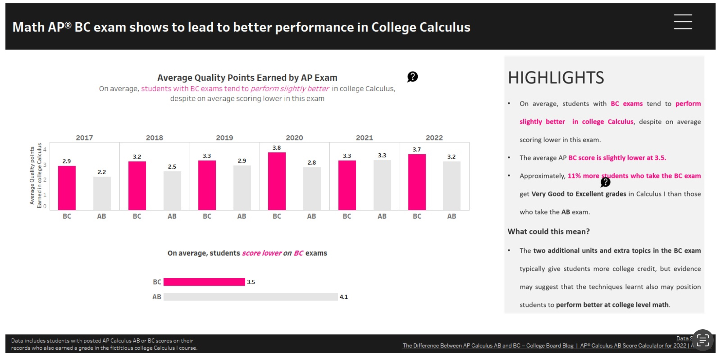
Data graphs are an essential way to display information effectively and efficiently. Graphs are essential to everyday and something seen all the time. Visual data has been around since 1786 when William Playfair used charts to showcase British trade and debts. One of the most important aspects of data visualization is clarity. In the image above, it depicts the relationship between student grades in AP Calculus and how well students perform on the test. What makes this infographic successful is the clarity shown throughout it. The infographic is clearly defined by the title given. They also included an interactive aspect to allow individuals to hover each column presented to view more details. By creating an interactive infographic, it causes more engagement due to the information scattered throughout. On the right hand side, they included important key details relating to the study. It allows for individuals to make their own discoveries and dissecting the information. According to UX Planet, “Insights are patterns in the observations we make in the world. They give us an understanding of a specific cause and effect within a specific context. They help us explain our observations.” Insights provide us with a different perspective in order to reframe the problem and provide a different way of thinking. The infographic above represents insightful data due to the offer of understanding of the topic.

Podcast: Play in new window | Download