Useful Steps:
A lot of work goes in to successfully presenting information. Infographics have become a more and more popular way to do so. Infographics portray data and information quickly and accurately to your audience. The first step to doing so is to truly understand what it is you are trying to explain. Once you do then you will begin data collection. This step is crucial because your data is your story, if your data is incorrect or doesn’t support your story then your visual will not be useful. After you have data that accurately reflects your idea you must be able to visualize it in a way that is not only clear but appealing to look at. The audience will not take much away from a visual that is confusing or dry. Avoid throwing too much information out in the infographic itself, let the visual do the storytelling.
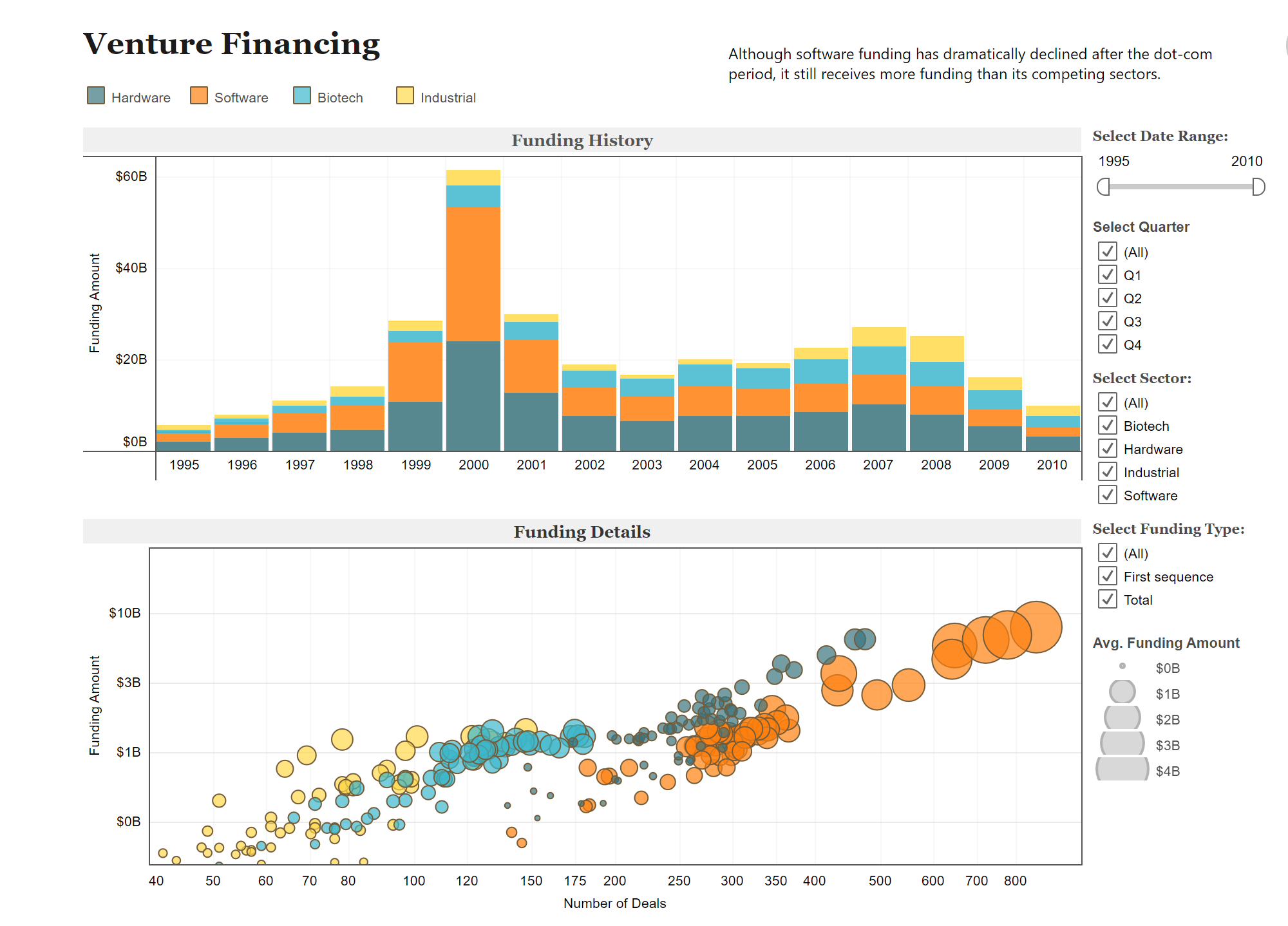
Infographic Examples:
Below are two different charts using the same data to portray different messages. The use of colors are uniform between both graphs allowing you to flow back and forth between the two. Also helping that idea is how they stacked them on top of each other. Overall these two visuals provide a clear set of information that you could understand without really having any prior knowledge on the subject.
Data Set Examples
Attached is a link to a site with examples of many different, useful, data sets. Click the link to explore the different ways data can be manipulated.


Podcast: Play in new window | Download