Insightful Data Visuals: Health Science
When presenting a variety of information, such as comparing numbers, graphs and tables are the most effective means of presenting. The use of visualizations is an excellent method of creating visual representations that are complex to explain verbally. Chart interpretation and design can be challenging, especially when you have to construct imperative information, such as in health-related topics where reliability and validity are of utmost importance.
How to Ensure Self-explanatory Graphics
During my research, I found a resourceful website that provides guidance and further explanations about how we can improve our ability to create visuals. This is especially true when numbers are involved. This is in a manner that our audience can understand. During my research, I found a resourceful website that provides guidance and further explanations about how we can improve our ability to create visuals. This is especially true when numbers are involved. This is in a manner that our audience can understand. Using the website AHRQ, we can create our numbers comparison infographics with in-depth detail and pictures that along with their information.
AHRQ: How To Interpret Bar Charts Effectively
Below are a few tips provided by the Agency for Healthcare Research and Quality AHRQ to assist you in this process.
- Bar charts are examples of visuals easily understood by your audience. This is if you use a tool to make this type of visual more intuitive. Rather than displaying multiple responses in a single barm you can be display the response most meaningful to your audience.
- It is important to provide additional resources. Providing additional labels that correspond with the numbers you are presenting allows the audience to remain focused on the topic you are presenting and the numbers that align with the data being displayed.
- Design plays an important role when color visuals and different shades are involved since you want your audience to be able to identify which numbers correspond to which color. The following image illustrates the use of the patterned bar when comparing more than one type of data.
- As well, it is imperative to ensure that the title or label of the bar chart accurately describers what the bars represent.
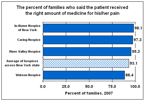
There are also several helpful tips provided on the AHRQ website on how to use things like symbols when comparing multiple numbers. The use of graphics as visuals means of displaying information to your audience or reader is highly prevalent in healthcare, therefore I shared tips that have grown most useful to me and can be applied to other professions when designing data visualizations.
How to Compare Numbers
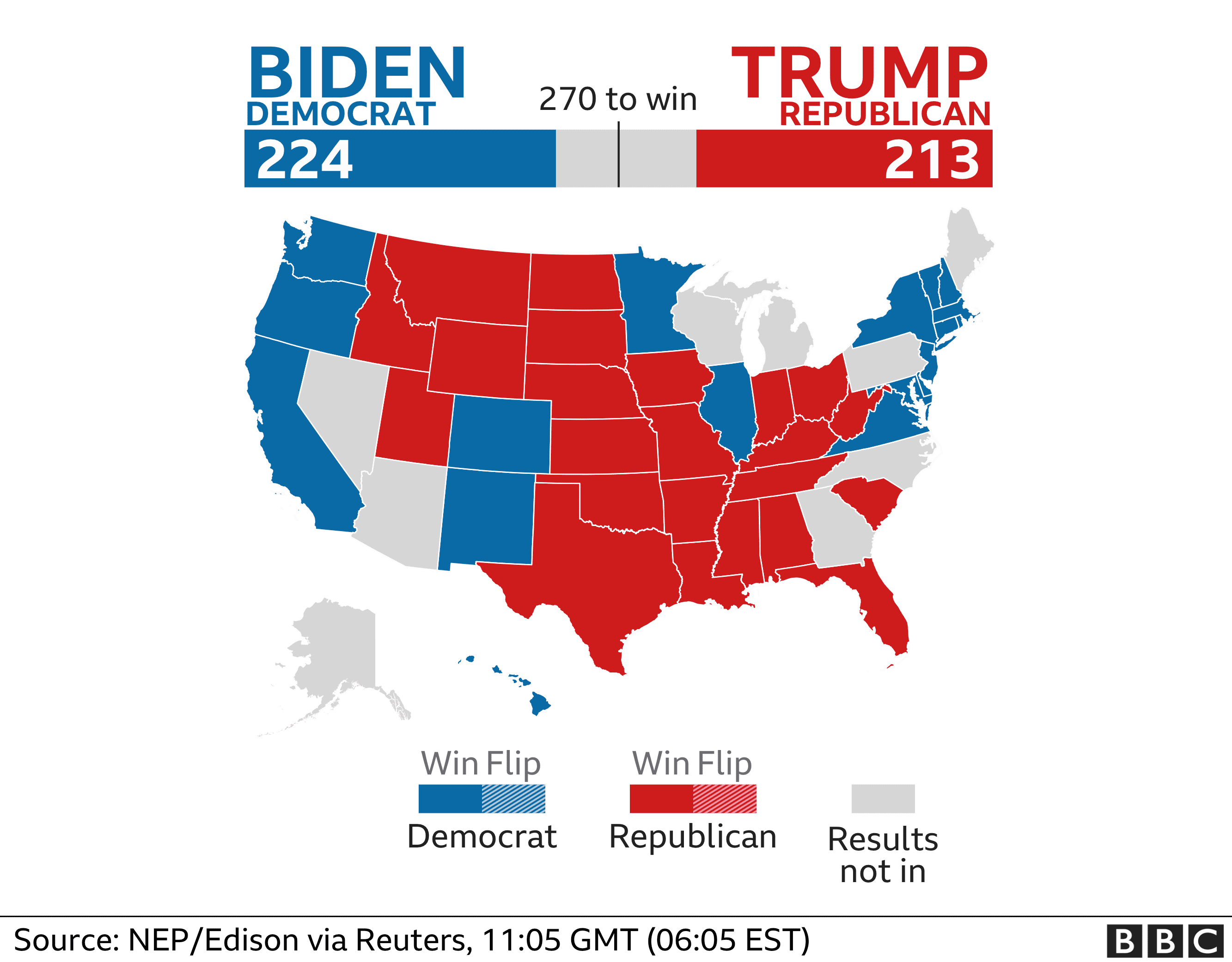
When analyzing multiple sets of data we must remember what the message is that we want to convey. While comparing two numbers to each other it is imperative that we portray them in a way that is easily readable for our audience. The first comparison visual that came to my mind is an election map. The reason this stood out to me is that they compare multiple things at once. They share with the audience the overall electoral votes for each candidate using raw numbers and then share where they came from using color on the states. These are a perfect example of how we want to compare our data, show the data and then the evidence for why it is this way. Pictured below is an example from 2020, notice how easy it is to comprehend at a glance.
Comparison Tools
There is countless ways to do analysis of data to create a comparison visual. The most user friendly is Microsoft Excel to record data and to evaluate it. There are many others however, companies are finding quicker and easier ways to take your data and do this work for you. Coding is something a little less user friendly and understood so companies are taking advantage of this knowledge and creating programs to do analysis and data comparison for their customers. One of these companies is Segment, collecting data “The right way”. These companies are extremely marketable to other organizations who want to do some research and development and don’t have the means to do it themselves.
Attached below is a link to the segment website which includes a product overview and tutorial.
Visualizing Health
http://www.vizhealth.org is a informational website developed by the University of Michigan, dedicated to providing resources for creating better data visualizations in healthcare and medicine.
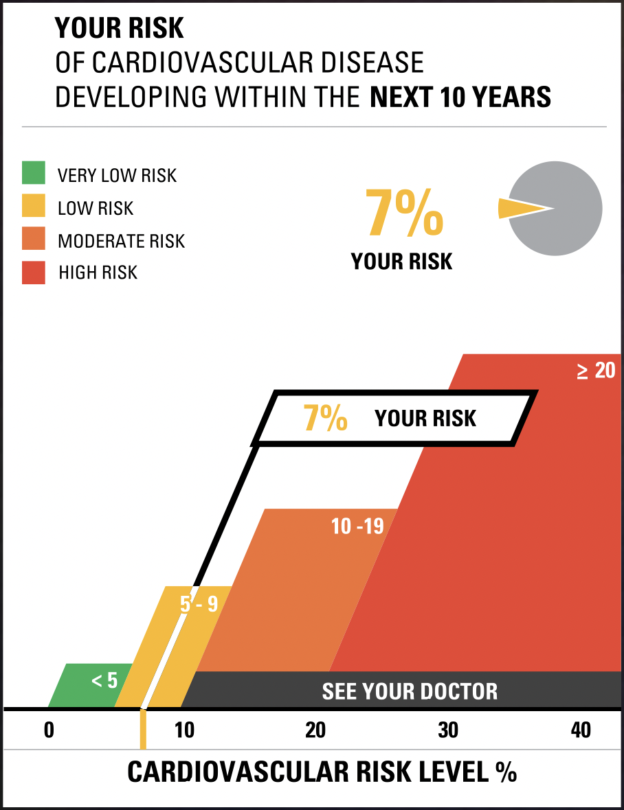
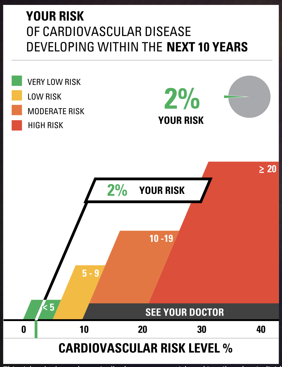
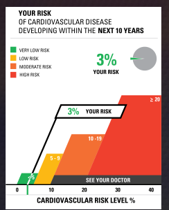
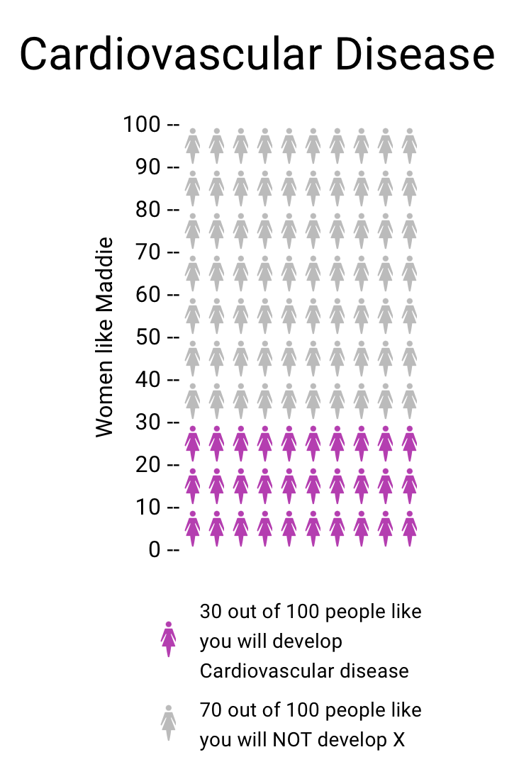
Although many pages of the website are currently defunct, a few useful resources are still functional. vizhealth.org has a built-in cardiovascular disease assessment which after a very brief questionnaire displays your risk for developing cardiovascular disease within the next 10 years. The formula used by the risk calculator was supplied by the Farmington Heart Study, an ongoing research effort which began in the 1940’s. This risk calculator is an exemplary display of interactive data visualization, my results below shows how a professional graph can be produced through engagement from an audience
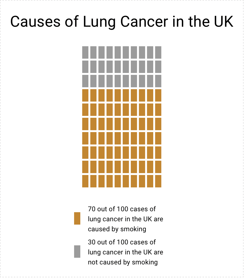
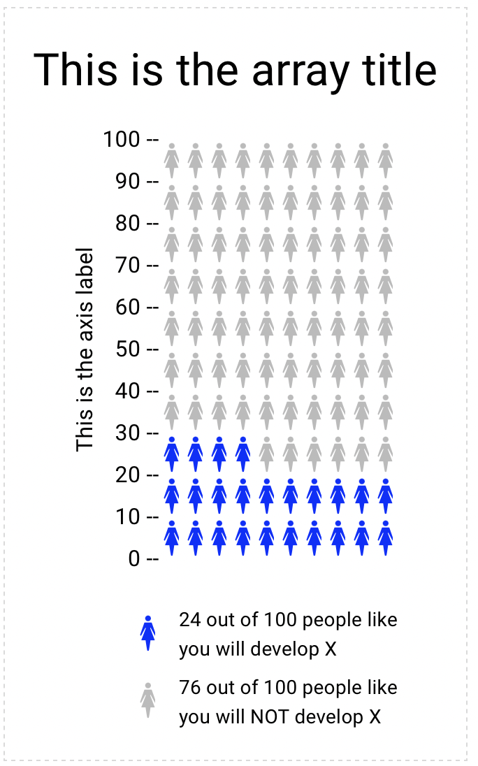
Another useful tool on vizhealth.org is a link to https://iconarray.com, another University of Michigan platform which hosts an interactive icon array visitors are able to experiment with and produce. Below are some examples:
Overall, vizhealth.org provides some useful resources for those interested in data visualization, and is indicative of all the useful tools available on the web.
Visualizing Health Data With VizHealth
This weeks chapter in Effective Data Visualization was about the importance of a single number. Sometimes the impact of an important data point is obscured by too much other information. The icon array seemed to be difficult to create in excel but the VizHealth website has a great tool that health care professionals can use to convey complicated data in a simple and concise way to patients and other interested parties.
The risk calculator tool on the site was extremely easy to use and I can see the application for health care professionals to input a few data points while speaking with a patient and being able to give the visualization with the patient summary at the end of the visit. This cardiovascular risk data can be especially useful with people who are tracking lifestyle changes recommended by their provider. Visualizations of progress can be very motivating. This infographic is very well designed and highlights the important facts in a way that is easy to read for most people.
Smoking is a large contributor to negative cardiovascular health outcomes so I checked the CDC website for some statistics on how many adults in the United States currently smoke. The number was quite higher than I imagined at approximately 12 percent.
While I chose to show two different types of information in the graphics, I think both types of visualization are great for multiple applications. The visualization has a great deal of potential and is much more sophisticated in design. Tracking metrics and benchmarking would be great with the first type of visualization.
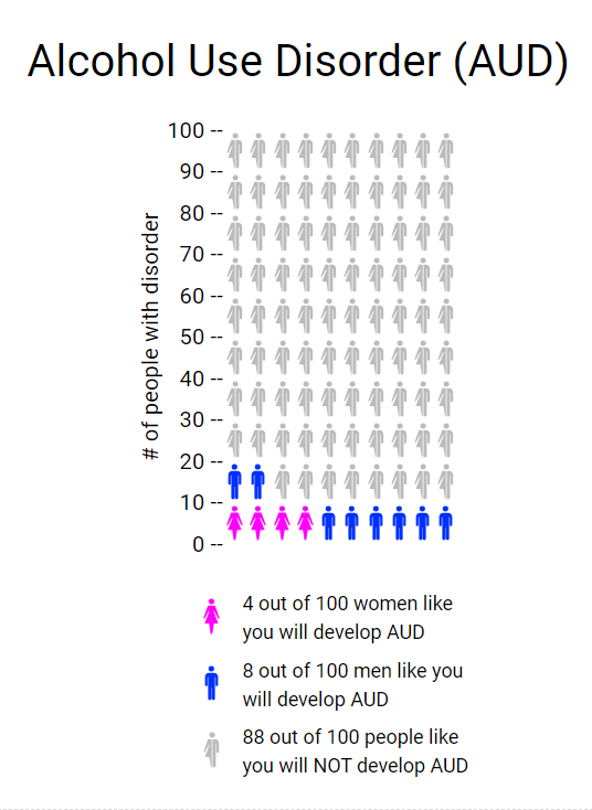
The icon array is great because it is a simple way to convey a percentage. You can imagine each one of the icons as a person in a room. It can be used for so many different applications and is more universal and probably easier to understand for most viewers. I also appreciated that the icon generator had options for gender neutral because it allowed for me to use data that was aggregated to adults vs. mens’ data vs. womens’ data.
https://www.cdc.gov/nchs/data/nhis/earlyrelease/earlyrelease202304.pdf
These images are based on original research and designs from Visualizing Health, a collaborative project between the University of Michigan and the Robert Wood Johnson Foundation made publicly available via Creative Commons license. Our use of this image should not be considered an endorsement from Visualizing Health. For more information, visit www.vizhealth.org.
Visualizing Health
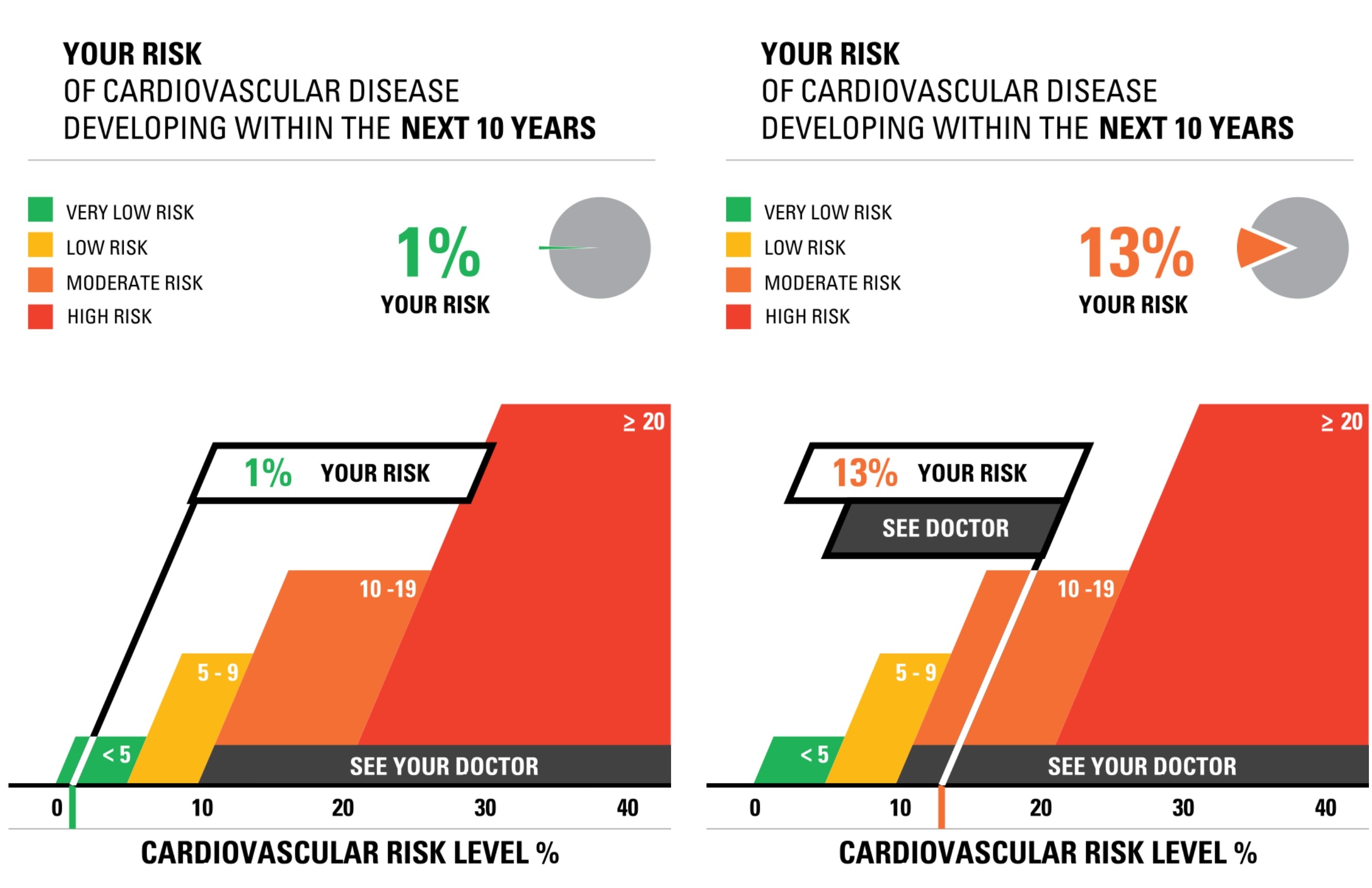
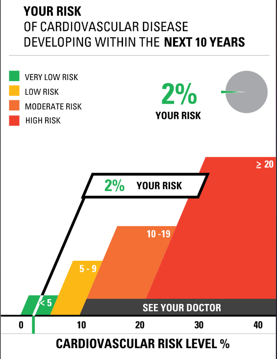
The site for Visualizing Health was very informative and neat to use. There were two data sets/numbers that I messed around with while using the risk calculator. The first was a young female (average height and weight) with normal levels for cholesterol, blood pressure, and overall good health. When I ran this calculator, I found that the risk for developing a cardiovascular disease was around 1%. I then ran the test again with a middle aged man (average height and weight) who had slightly elevated cholesterol and blood pressure, and was a smoker. The results for this test showed a 13% chance of developing a cardiovascular disease. While the website states that someone should not go directly based on this information and should still consult a doctor or another professional, I do believe that this provides a good starting point for someone who is concerned about their health and odds of developing a cardiovascular disease.
When I tested out the Icon Array generator, I felt as though I had a pleasant experience with it. Everything was very easy to navigate and understand, and it is a quick and easy tool to go to whenever someone has to create data visualizations such as this. I think it is beneficial that there are only four options for shapes and anywhere between 2 and three colors used. It makes it easier to look at and still very impactful in the end. The Icon Array I decided to create was based on the odds of women developing breast cancer. Upon research from the American Cancer Society, I found that 1 in 8 women develop breast cancer at least once in their lifetime, which translates to about 13 women out of 100. This data visualization is more impactful than simply hearing the statistic because it gives a better visual representation of just how many people are affected. I also like that I was able to change the color of the icons to light pink to represent and match the color for breast cancer. This simple feature once again makes it very impactful.
Overall, the sight is definitely valuable for learning about data visualizations because it teaches two simple ways to make data visualizations and is interactive, so learners are able to practice and have fun with it, which is key in learning these days.
Visualizing Health-Diabetes in America
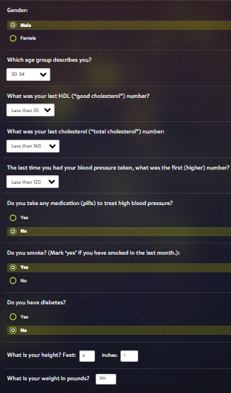
The site Visualizing Health has many resources to better interpret and explain health information. There is a risk calculator that can aid in the determination of whether medical intervention is necessary in cardiovascular health. Simple questionnaires like this can make health easier to understand. By entering different values into the quiz before you can see how different sexes, age and other characteristics can manipulate the chart.
For example, I chose these options and this visualization was my result. When choosing different options the picture will change to adapt your answers to what research has shown is a trend in cardiovascular health.
When using the risk calculator easily manipulating the chart by choosing different options can give you a better idea of cardiovascular health.
The site also has another tool the icon array. This is a very useful graph which can be changed to display information in a way that makes it much easier for a person to see the impact of something. For example, the CDC studies diabetes across America and the trends in the disease. According to their website 1 in 10 Americans have diabetes. While this statement alone can bring some awareness to the disease, a pictogram such as the one shown below may prove more helpful in visualizing the information.
You can change the color and shape of the icons, the titles of the graph and axes, as well as include a legend if necessary by utilizing the dialog box on the right.
This is such a handy tool to better explain information that could be written out and misinterpreted.
Utilizing Visualizing Health in data visualization across the medical field will prove to be a more effective way to interpret data.
Sources:
Visualizing Health
Visualizing Health: Helping People See the Bigger Picture
This week I tested out a website called Visualizing Health. I first checked out their risk calculator. While I enjoyed seeing what my risk factors were for cardiovascular disease and using the tools to see what my family members risks are I found it odd that I could not adjust the age any younger than thirty years old. While I believe this is risk calculator is a nice way for people to get a grasp of what their health is I am unsure of how accurate it can be if I am unable to put the correct information in some slots.
The second thing I tried on the website was the Icon Array feature. This tool allows the user to create an infographic to show the percentages of people (male, female, or both) and their likelihood for developing a disorder or illness. I really liked this tool as it was relatively easy to navigate and is a good visual aid for those who do not learn topics well simply from reading text. My only wish is that they provided other sorts of charts and ways to display data as putting things into a ratio can sometimes make numbers look very small. Twelve out of a hundred seems like a small percentage, but when talking about population that is a large portion of Americans. Overall I think I would use this tool again or something similar.
VizHealth
Using the Vizhealth website has been quite interesting. The interactive website allows for you to calculate how at risk you are to cardiovascular disease. It uses interactive aspects with the ‘risk calculator’ to showcase how likely you are to develop this disease. Based on inputs, it showcases a visualization to showcase how at risk you are. This visual is very successful in all cases. It uses large numbers to showcase important data points within your results. I feel like it’s a really cool way to display really important medical information!
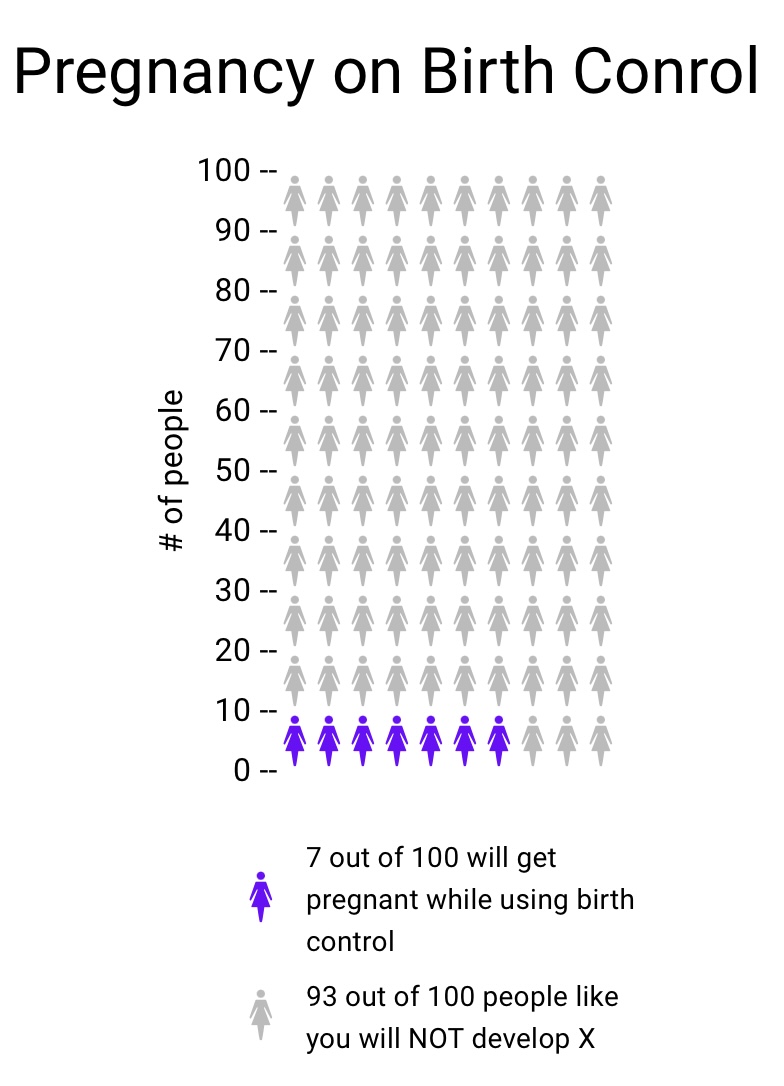
I found using the ‘Icon Array’ feature to be very simple to use. I found it as a quick and effective way to display data. I enjoyed how easy it was to use and edit. I used he example of pregnancy while using birth control. Although it is something that is unlikely, it still highlights the chance of possibility.
Data Visualizations in Health
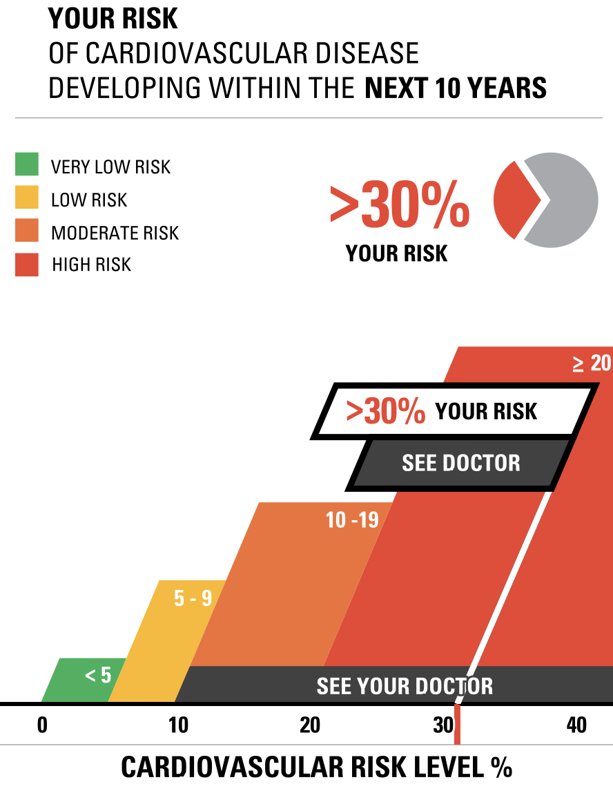
Vizhealth was a very interesting website to navigate and learn from. Two of the tools I used that helped create the data visualizations above was the risk calculator and the icon array generator. The first tool I used was the Risk generator. It prompted me with some questions to answer regarding my health, age, and other personal information. I decided to have fun with the calculator and input information that reflected an older woman with high cholesterol levels. The calculator then generated the visualizations to the right above to help me understand the results better. I think this is very helpful for visual learners in all fields, but especially the healthcare industry. This industry could not exist with performing studies and experiments, and these visualizations help make understanding results, ten times easier. After using this calculator, I then used the icon array generator. This tool was useful in visualizing the comparison between the true likelihood of a person with a similar health history to this woman developing cardiovascular disease.
Using Icon Array – Vizhealth
Vizhealth’s website for me is a great website that provide information about creating image or visualization in medical field, hence the name Vizhealth. Overall, this site helps newcomers with a few examples of how appealing infographics can be while providing crucial information such as the ‘Risk Calculator’ also provided on the website. While it is helpful as to display medical data on an image, the use of infographic does not limit to one field. Vizhealth is a great first step to learn and then develop your own image for your own topic.
While Vizhealth is about display medical data on an image. I found that their ‘Icon Array Generator’ can be use for unrelated field. This icon array I created is about the market share of worldwide operating system. While ‘market share’ perhaps does not equal to ‘phone usage’ but I thought this could be a fun demonstration. The image sure helps to generalize the idea around the market share topic despite the data provided is so large.
I also include the news article for this topic here.