Home » 2022 (Page 2)
Yearly Archives: 2022
Pivot Tables
I have found that pivot tables are good ways to summarize a lot of data. I think they work particularly well with data that involves a large quantity of numbers. They are very useful because they are great visual and interactive ways for readers to conceptualize numbers within the data set and clearly see what is being portrayed in the overall data story.
Here are some great examples of pivot charts and why they are so helpful:
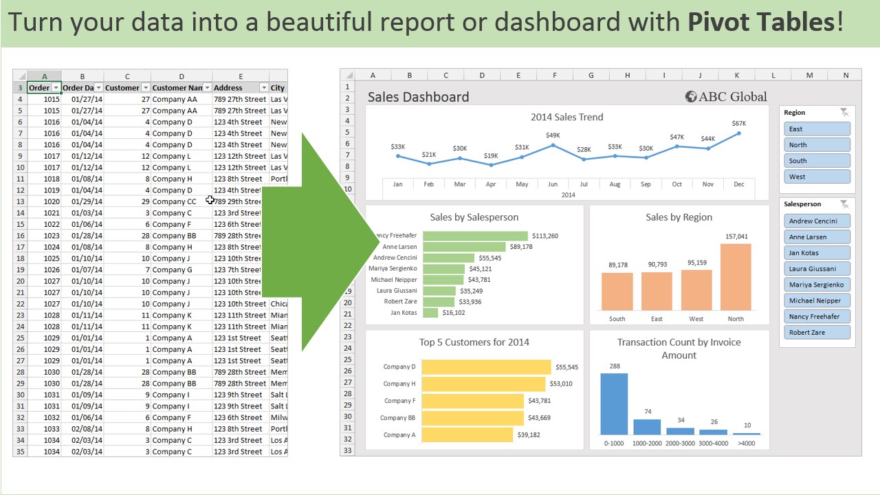
Example #1
This is an example of a pivot table I got from a very helpful website that shows how to create great tables! On the left is their source data and on the right is their pivot table. It is much easier to see the data within the pivot table because it is much more condensed and only has the information that is important to the reader. Instead of being overwhelmed with numbers and data, it is way more digestible in this form.
Example #2
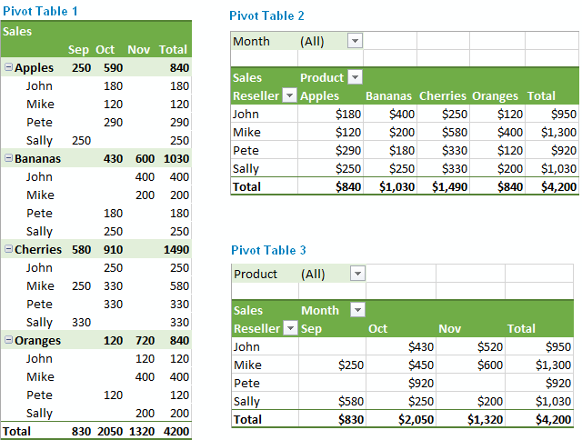
This next example also comes from a really helpful website to aid in creating pivot tables. What I really like about this particular example is that it highlights all the different ways the same information can be laid out. Excel does a really good job at offering the creator choices in layouts to make the creation of an effective pivot chart much easier. As seen here in this example, the layout of a pivot chart can really change the goals of what you want the chart to do.
All in all, I think pivot charts are great ways to display numerical information. There are plenty of websites to help in the aid of creating them and using tools like Excel also makes it very easy!
Pivot Table
By: Nicholas Mesa
What is a pivot table?
Pivot tables are normally sheets that categorize data to make it easier for a reader to understand the meaning. They automatically sort and display data in columns and tables.
Why are they helpful?
Pivot tables are helpful because they allow data to be quickly sorted and summarized so the reader can easily see what corresponds to what, and what the data means to them.
Here is an example of an effective table and some reasons why:
This pivot table allows each category to be displayed to make navigation easy. Breaking the data up into date, color, region, units, and sales, can allow someone to go in and be guided to exactly what numbers they need.
Pivot tables
By Robert Fox
What is a pivot table?
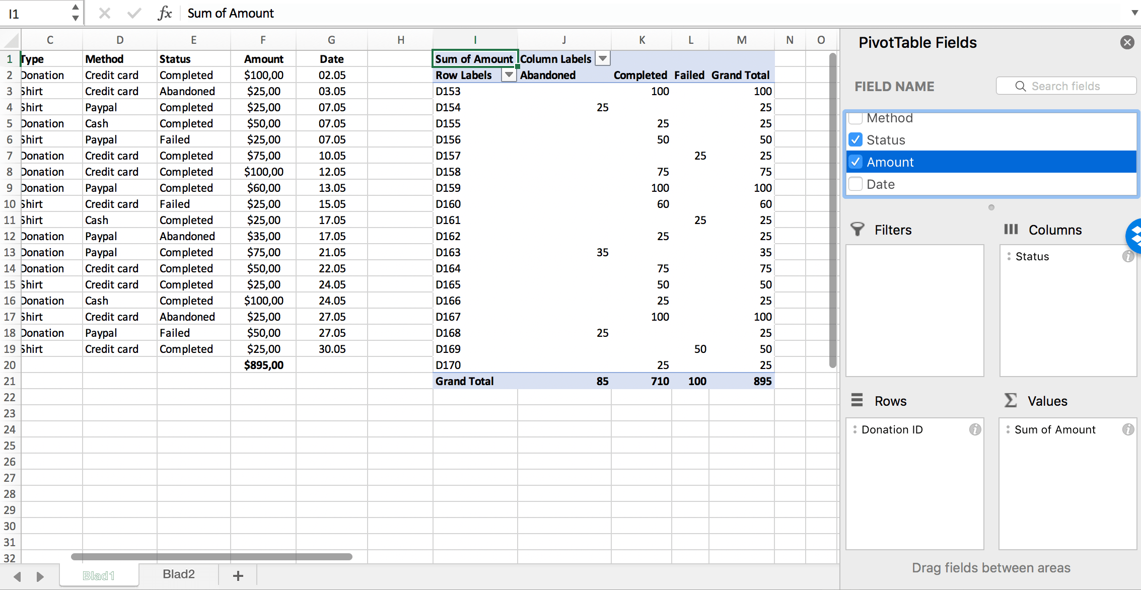
A pivot table is a type of visualization that allows the user lay out samples of data into one sheet to easily analyze and a examine. Here is an example of one.

A user can take data and organize or like the name implies, “pivot”, the information to reconstruct and look at the information differently.
That is one reason pivot tables are so handy when dealing with large data sets; being able to organize large complex sets of data and organize them into more digestible forms of data makes it much easier for everyone to examine. Attached I have added a video describing how to create a pivot table of your own.
Pivot Table
Carlita Holloway
What is a pivot table?
A pivot table is a type of visualization that let the user lay out huge samples of data in one sheet for the user to analyze and examine. They are typically used for all kinds of business practices or financial consultations. Here is an example of one.
With a pivot table like this, a user can take data and organize or “pivot” the information to reconstruct and look at the information differently. That is where the word “pivot” in pivot table comes from.
That is one reason pivot tables are so handy with working with large groups of numbers; being able to organize large complex sets of data and organize them into more comprehensible forms of data makes it much easier for both the reader and presenter to digest. Attached is a video describing how to create a pivot table of your own.
Pivot Tables
Created by: Victoria Valenzuela
What Is a Pivot Table?
Pivot Tables are used to calculate and analyze data. It allows you to see a change in your data with trends, patterns, and comparisons. They are super helpful especially when you have a large data set. You can categorize your set to differentiate one data from the other.
How can you use a Pivot Table?
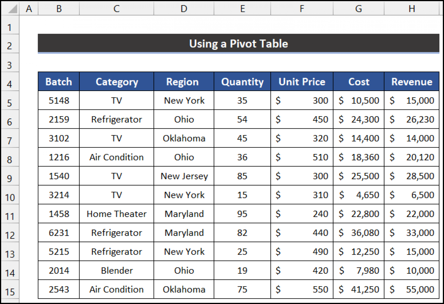
This particular pivot table includes a data set describing batches of home items. The data shows separation between the price, quantity, region, etc. The link posted shows exactly how to create a pivot table on Excel.
Why Is It Helpful?
Pivot Tables are helpful because they allow users to understand their data, have it organized into one block, and manage all of the numbers. You can clearly see all of your data split into rows and columns correlating to which it relates to. This will answer many questions any professor or outsider will have while analyzing your data set.
Pivot Tables
By: Veronica Perkins
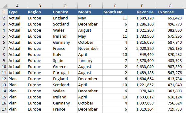
Like any other visualization, the intention is to help visualize the data being presented to an audience. The purpose of a pivot table, is to help visualize and a large amount of data at one time. A typical pivot table looks like this:
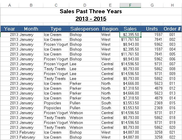
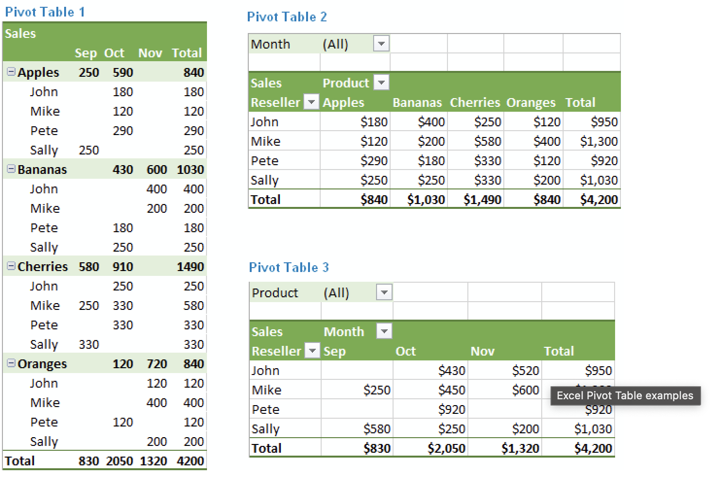
As you can see, a lot of information is presented in the format of a pivot table. This pivot table is an example of how a lot of information is summarized. In this example, the maker wanted to present the sales from the past three years. They decided to break it down between the following: year, month, type (meaning what was sold), the salesperson that sold it, the region of the sale, the sale amount, how many units were ordered and the order number that correlates to the sale. Pivot tables can be so helpful to use because they can help break down a large amount of data at a glance. This information, can also be used to make visualizations to help represent the data.
Pivot Tables
Pivot tables are very user friendly. You do not need to be an expert in Microsoft Excel in order to create one. Pivot tables summarize large amounts of data and automatically sort and count the data and display it in a table. It allows you to convert rows into columns and columns into rows. They make it very easy to find patterns within your data. You can analyze your data in numerous ways with just a few clicks of a button. Pivot tables sort your information in different ways which allows you to get insight about your data that might not have been so obvious in a different type of table.
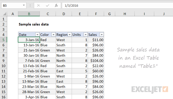
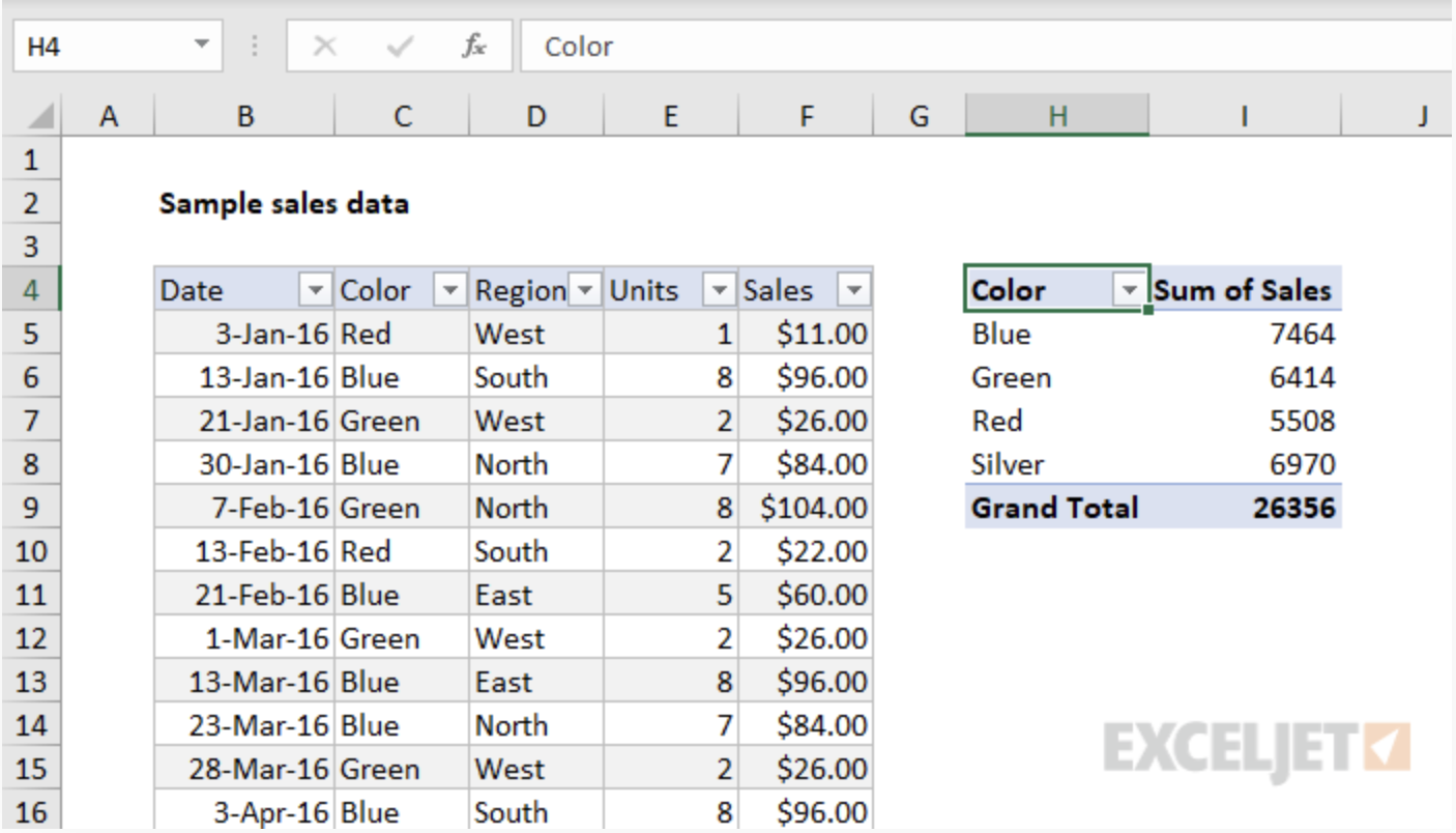
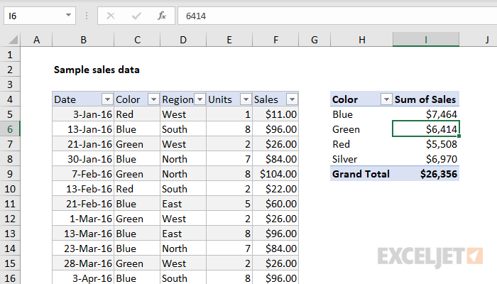
Here is an example data set that we will look at as a pivot table. We have lots of data that is being displayed here: dates, color, region, units and sales. This is a lot to look at and comprehend in just one table, so we are going to look at it in a pivot table and it’ll be more understandable and appealing.
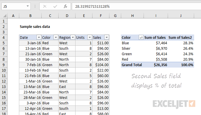
Here, we see a pivot table on the right summarizing the sum of sales by color. It looks better then the chart on the right because we are just looking at colors rather than dates and regions, but we are able to look at this data as well.
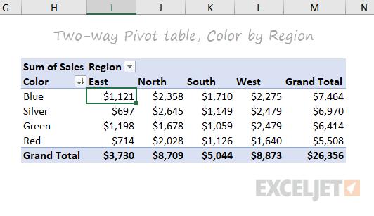
Now, this is a good pivot table. We can look at the sum of sales per region and by color. This one table shows us lots of information here that we can interpret. And if you click on the drop down bar next to “Region”, it will change our table to be “Sum of Sales per Date”. This is why pivot tables are great. You can display certain information at a time, or all of your information at once.
Pivot tables allow you to focus in on specific information, or look at the whole picture. Some people may be overwhelmed by looking at the very first picture and all of that information. But, by turning this information into a pivot table, we can focus on specific data in our table and we are simply able to change to other data with an easy click of the drop down bar and changing it to what we would like to see. Pivot tables are easy to read, easy to create and easy to use.
Pictures from: https://exceljet.net/articles/excel-pivot-tables
PIVOT TABLES
A pivot table is a data analysis technique used to summarize large datasets and answer questions about the data. It is available in spreadsheet applications such as Microsoft Excel and Google Sheets. Pivot tables are designed to extract meaning from a seemingly multitudinous clutter of numbers on the screen. And more specifically, it allows the grouping of data in different ways so one can easily draw helpful conclusions.
It is termed a pivot table because you can turn around the data in the table at any angle that deems fit to view depending on the viewer’s perspective. There is no addition or subtraction from the data when creating a pivot table but rather entails the reorganization of data to reveal the needed information as being sort after.
Though might seem cumbersome to create without any data analytical background due to the technicalities of creating one, it is easy to learn how to create it in a short period and begin to work with it for all of its benefits.
There are many uses for pivot tables or scenarios that require the use of pivot tables and some of these are;
- Present large amounts of data in a user-friendly way.
- Summarize data by categories and subcategories.
- Filter, group, sort and conditionally format different subsets of data so that you can focus on the most relevant information.
- Rotate rows to columns or columns to rows (which is called “pivoting”) to view different summaries of the source data.
- Subtotal and aggregate numeric data in the spreadsheet.
- Expand or collapse the levels of data and drill down to see the details behind any total.
- Present concise and attractive online of your data or printed reports.
Sankey Visualizations
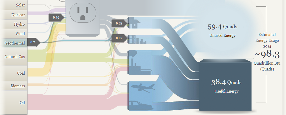
I think the Sankey graphics have some upsides and downsides. I like the interactivity of the website, and I feel like in certain ways it can give you a good perspective of the energy breakdown nationally and regionally but other places it starts to faulter. In particular I don’t like the vagueness of how certain energy streams translate to used and unused power. In the first picture you can see that geothermal energy accounts for an extremely low percentage of total energy usage nationally, but then the avenues that it goes down have varying degrees of how much power is unused. When you have this discrepancy it’s hard to tell how efficient each power source actually is.
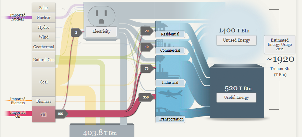
I do like the energy breakdowns for the regional map because I think this chart makes it easy to draw some conclusions about the plausibility of renewable energy reliance. As a disclaimer I am a large proponent of sustainable energy conversion, however, I think from the below two pictures you can see that this isn’t an easy task. Especially when you look at where the sources are going. The transportation sector is still dominated by oil, so there is a significant amount of progress that needs to be made in creating more efficient energy systems that can support the use of clean energy.
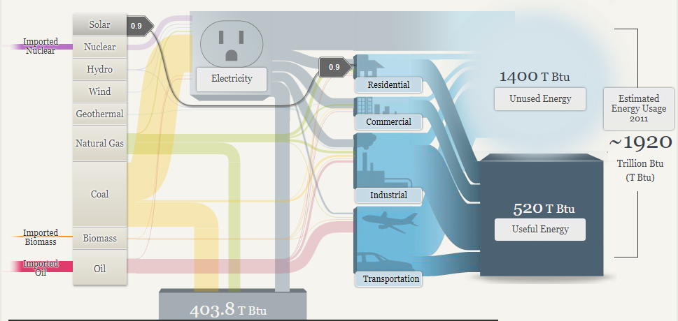
In conclusion I think that this website does some things right and some things wrong. A chart is supposed to guide the audience through the data that’s compiled, but I found myself questioning how accurate the numbers were, and without a lot of context for how much energy “.9” or “300” meant, it was hard to see the magnitude of differences. In terms of layout I thought the chart did a good job of graying out what wasn’t being actively clicked on, and that helped guide my eye through the different pathways that would otherwise be tangled up with each other.
-Jack Swenson
Sankey: Our Energy System
This interactive data visualization tool was very fun to explore. There was a lot of really good information all packed neatly into a tight and organized visualization. It was also a really good tool to compare energy sources from different areas.
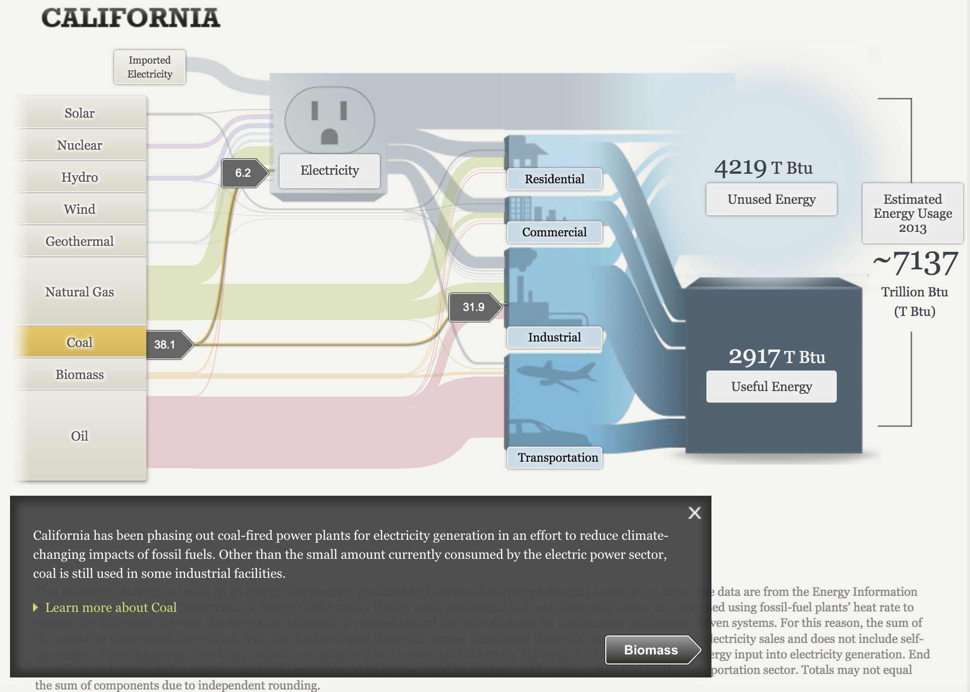
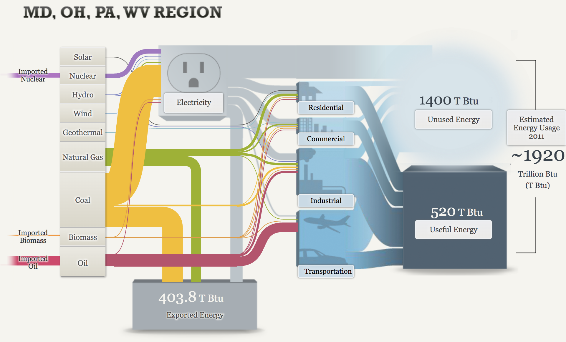
California is very anti-coal use and this graph really shows it. It gets more interesting to me when you can see the coal use in other stats such as OH, MD, WV, Pa regions.
Using those same comparisons, it is also interesting to see how much more oil California uses than Md, OH, PA, WV region.