Sankey
By Robert Fox
Though some analysis of the website, I’ve come to like the format and layout of this blog. It doesn’t have a clear start or finish from the tabs, but i still felt it was organized and had proper visualizations to boot. I liked the features they added upon clicking certain prompt and such, it made it interesting to look at.
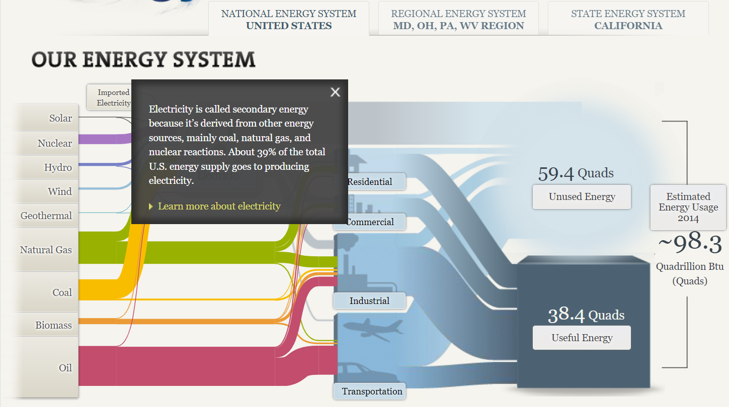
After clicking on the word text, it gives you more opinions to read. More info is also provided upon each click. The manner of making this guide go hand and hand with an electrical outlet was a clever idea as well.
After playing around on it for some time, I found it to be a great asset when it comes to the production of similar graphics. I think I would like to utilize a Sankey visualization on a future assignment as it seems easy to incorporate a easy means of laying out the visualizations.
SANKEY VISUALIZATIONS
By Emmanuel Mattey
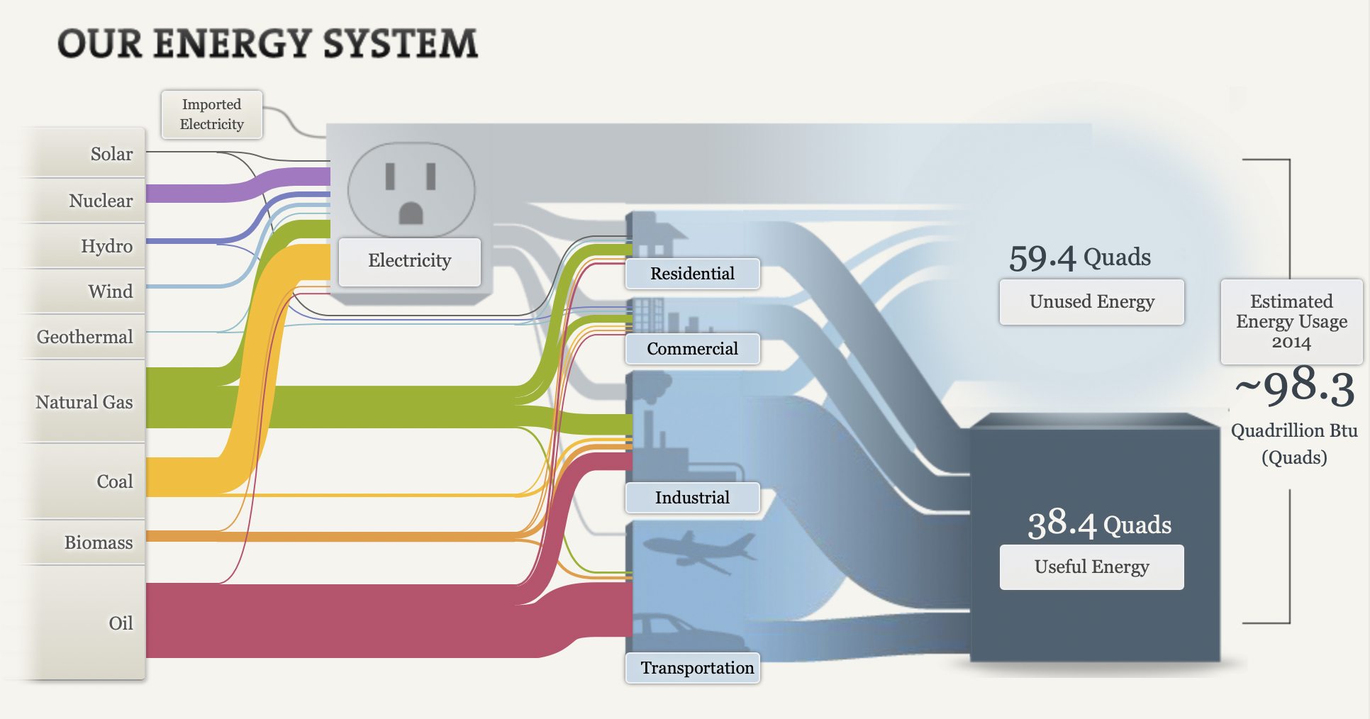
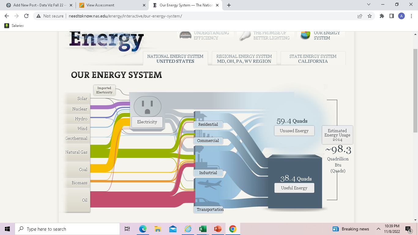
A Sankey chart/visualization is the type that provides an overview of the flows in a system, such as movements, cost, energy or materials, or in advertising, the customer journey. Elements within the chart are represented with rectangles and texts from a source with links represented by arrows or arcs that have a width proportional to the importance of the flow to a corresponding destination.
The National Academies of Sciences, Engineering and Medicine displayed Our Energy System using a Sankey chart/visualization which gives simply but detailed information on the energy sources/generation and the respective entities that use the energy in proportions and the overall useful and unused energy.
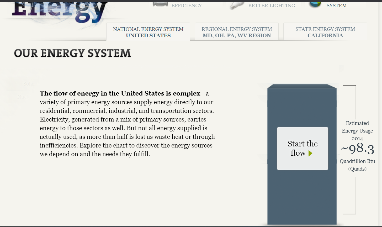
The site initially gives an overview of the energy situation and the respective end-users who make up the total. It also has tabs that lead to other important sources for more information on the subject as shown in the image below.
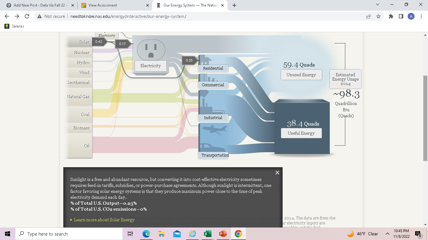
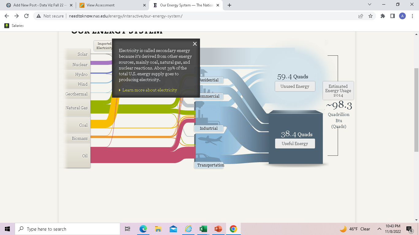
By clicking on the “start the flow” button, it displayed the chart with the sources of energy through to the respective users and the overall usage. The chart did not make much sense to me when it first opened but upon careful study and navigation, I got the concept and how it depicts the information therein. At the click of every button comes a pop-up containing (shown in the images below) information that gives the audience a better understanding of the concept/chart.
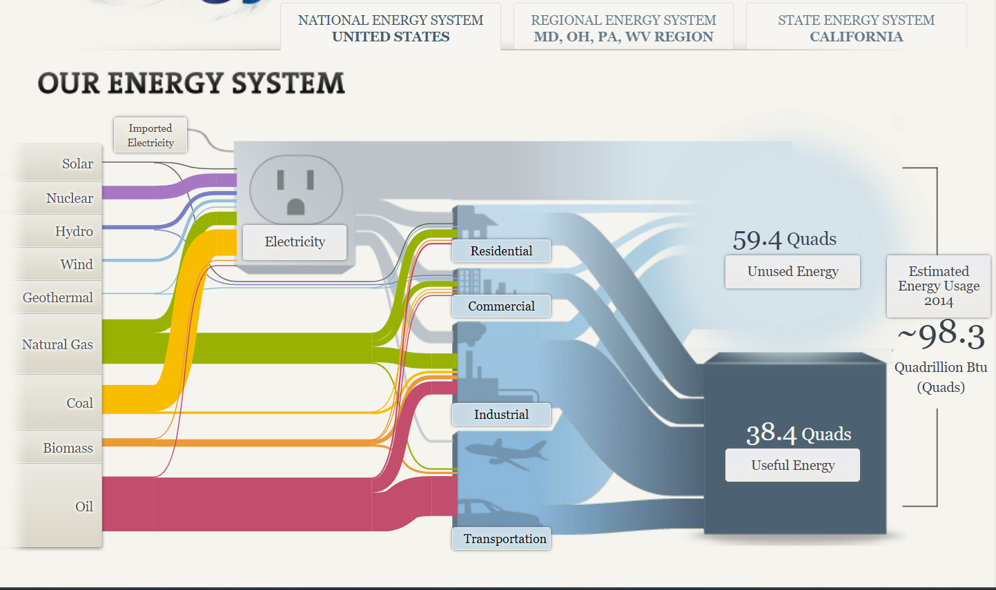
A Sankey chart/visualization is a great way of displaying information in a flow format. However, it does not readily make sense until carefully studied due to the complex look/nature with arrows/arcs crossing. It is therefore advisable to not over-clutter the figure and if possible ignore all weak connections.
Sankey
By: Veronica Perkins
Sankey is a tool that can be used to create interactive visualizations in a way that helps your audience follow. Upon exploring Sankey for over ten minutes, I was so intrigued. However, it can be a little intimidating.
Now let’s discuss the usage in our energy system…
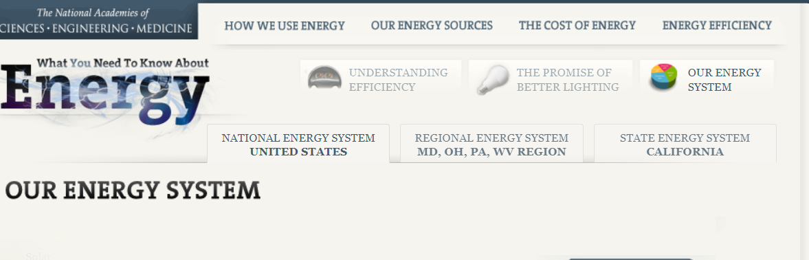
Right upon entry of this visualization, it takes you to the home screen pictured above. Within this home screen, you can see how at the top, it lists several other tabs that can move you to another data set. For example:
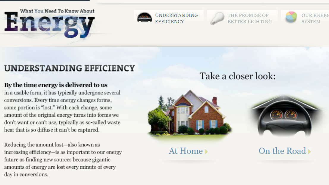
When I clicked on the “Understanding Efficiency” tab, it brought me to this page. On this page, it briefly explains the point of efficiency and what it does, while on the side it has two interactive buttons. These interactive buttons are just one great example out of the whole project. They allow the audience to click on them and explore. By having interactive features throughout your project, it allows for the audience to read, comprehend, and travel through each data set at their own pace.
Overall, I really enjoyed how interactive this project was. It was very well organized and left the reader/audience to go through each data set at their own pace. However, sometimes I feel like an entire website can feel like a bit of overkill when it comes to project like these. I feel as though there are other ways to keep your audience entertained while presenting them with data set; without having to do all of this. To be less harsh, I believe that sometimes an entire website can be a bit much and sometimes the audience can get bored or not want to participate anymore. Also, the Sankey graphs themselves can be very overwhelming to the audience and may even leave them feeling lost. Instead, providing simpler graphs with a lot of color variations and details, may be easier for both the creator and the audience.
Data Visualization Commentaries/Blog Content
After spending over 10 minutes wondering whether I like this blog and visualization as someone who cares about the environment, The website does seem confusing at first as it took a while to find the, sanity for our energy system. Honestly, it was great fun playing around with this blog as I loved clicking on the word text.
After clicking on the word text, it gives you more opinions to read. More about it, which was, honestly it was pretty entertaining and cool. I like how they used a surge protector, which was very creative. It did keep it interesting.
Then when I clicked on the solar, it was almost a circuit which was cool and very directive. Which I then thought, this site has put alot of effort into their website. I did enjoy this blog greatly.
I think I would like to use a sankey visualization in my future projects as it helps show the flow of a project.
Sankey Visualizations

The picture above is an example of a snaky visualization. It is typically used to show the flow of the information being discussed. In this example, it is being used to show the flow of energy and how it is used.
Originally, I was extremely overwhelmed when looking at this chart. I had no idea where to look or where to start. After the initial shock, I just started reading from left to right like I would any other chart. I began clicking around on all the headings and reading what they said. I ended up finding this chart very helpful and interesting!
First, I really like the creativity behind it. It is about electricity and I could tell that right off the bat without actually reading anything on it. Second, I like that the information is hidden within the chart. I think it makes it look a lot more clean than it would if all the paragraphs were jumbled all over the screen. Lastly, I really like how it ties everything together. It starts out with the different kinds of ways we get electric and ends with how much we use.
Overall, while it can be a little overwhelming, I think it is a great way to show data because there are a lot of different facts that can be rolled up in one visualization that is easy to navigate.
Website: http://needtoknow.nas.edu/energy/interactive/our-energy-system/
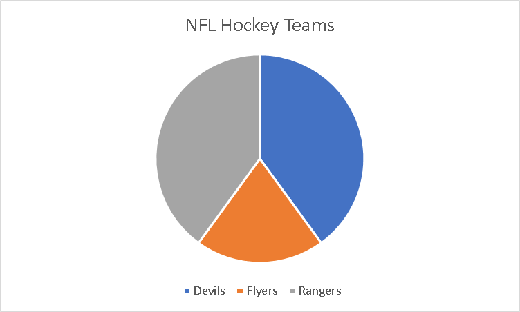
Pie Charts
A pie chart is to summarize data almost a piece of a whole. As when the word pie reminds me of a circle as it will always need to equal 100%. Each slice of the pie is component of the whole.
I took a small poll amoung my friends on which teams they prefer. It was made of small poll group between three teams that were major in the New Jersey area and the poll was taken by 10 people. It has very visualizing pleasing as it doesnt look like it is missing . It is making up a parts of a whole where the whole is the Major NFL Hockey Teams in the area and it was split into three so the subparts.
I would sugguest using these types of charts if it is to display something like this. I also would like to also put different colors of the pie chart instead of the same color to defferentiate the different teams.