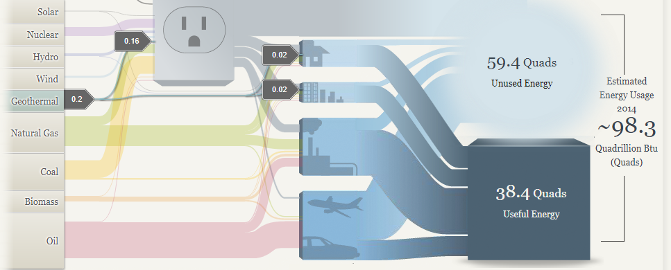
I think the Sankey graphics have some upsides and downsides. I like the interactivity of the website, and I feel like in certain ways it can give you a good perspective of the energy breakdown nationally and regionally but other places it starts to faulter. In particular I don’t like the vagueness of how certain energy streams translate to used and unused power. In the first picture you can see that geothermal energy accounts for an extremely low percentage of total energy usage nationally, but then the avenues that it goes down have varying degrees of how much power is unused. When you have this discrepancy it’s hard to tell how efficient each power source actually is.
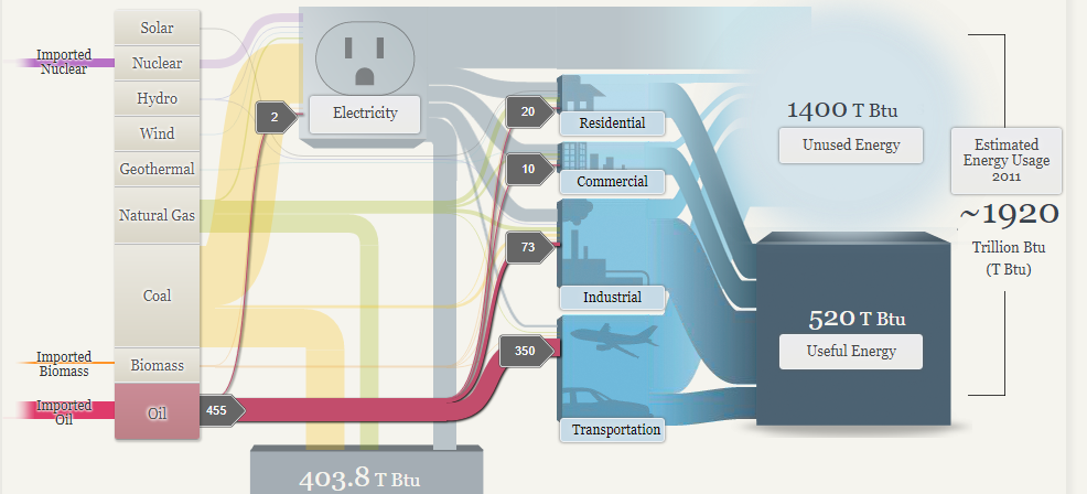
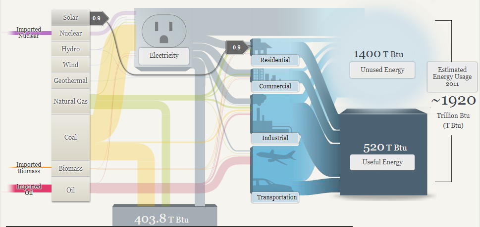
I do like the energy breakdowns for the regional map because I think this chart makes it easy to draw some conclusions about the plausibility of renewable energy reliance. As a disclaimer I am a large proponent of sustainable energy conversion, however, I think from the below two pictures you can see that this isn’t an easy task. Especially when you look at where the sources are going. The transportation sector is still dominated by oil, so there is a significant amount of progress that needs to be made in creating more efficient energy systems that can support the use of clean energy.
In conclusion I think that this website does some things right and some things wrong. A chart is supposed to guide the audience through the data that’s compiled, but I found myself questioning how accurate the numbers were, and without a lot of context for how much energy “.9” or “300” meant, it was hard to see the magnitude of differences. In terms of layout I thought the chart did a good job of graying out what wasn’t being actively clicked on, and that helped guide my eye through the different pathways that would otherwise be tangled up with each other.
-Jack Swenson