A Sankey Diagram is a visualization that Is used to depict a flow from one set of values to another. They help locate the most important contributions to a flow. Sankey visualizations are best used when the topic is energy, time, or money.
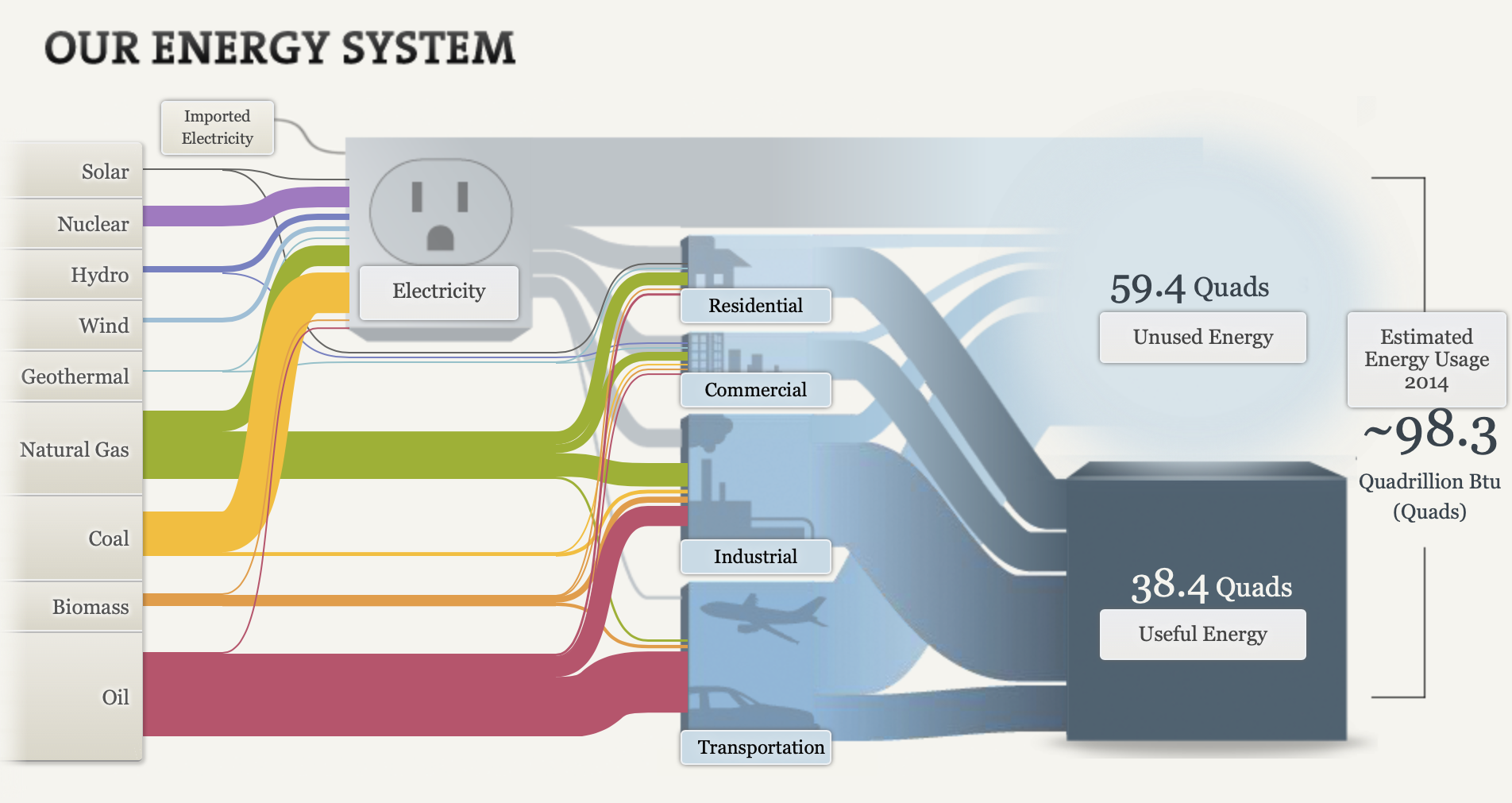
Although there is a ton of information presented in this visualization and it seems cluttered, I think this is the most effective way to view this data. This visualization is super effective considering that there are so many different aspects on this chart that are combined into one piece. Firstly, the energy system is broken down into the types of energy on the left hand side. The visualization allows you to click on each tab. When you click on each type of energy, it shows you what percentage of energy is expended and where it goes. For example, when you click on solar energy it shows you that solar energy accounts for 0.42% of all energy expended, and that 0.17% goes to electricity, and 0.25% goes to residential use. The infographic then breaks it down even more. It shows the amount of energy that is unused, and used from each category (electricity, residential, commercial, industrial, transportation). The thickness of the flow indicates the amount of energy. For example, you can see that most of the energy from transportation is unused because a larger flow moves from transportation to unused energy. All in all, there is so much information that can be digested from this visualization. It appears to be a lot, but when you break it down into pieces it is very effective. I believe this is the best way to display this information.